Showing posts with label Disneyland. Show all posts

Sunday, March 31, 2013

The Enchanted Tiki Tee


Welcome back to yet another Retro Tee concept. I hope everyone has had a swell weekend. Last week I had such an amazing amount of fan feedback on the Enchanted Tiki Room tee concept that I decided to roll out another concept I've had collecting dust in the wings.

Unlike my typography case studies, I have enough shirt concepts to get me through another two years if I just posted only concepts for apparel but I'm not a one trick pony and typography is my passion. I had some free time this weekend to actually begin tracking down original typefaces and display font used throughout The Land pavilion.  Hopefully, I will be able to find more vintage research...most likely I'll have to break down and use some of todays fonts and typefaces.

Back to this weeks concept, the design is based on one of the Disneyland marketing photos of Walt actually inside the show building. I decided I really wanted to push my experimentation with frequency and dot angle when it came to halftones, not to mention it has a nice throw back look. I scaled the color of the photo back to a darker shade of the tee shirt color. On top of the photo I overlaid a graphic from a 1963 marketing piece that came from a simple 4 color brochure. 


I went back and forth on color combinations of this design. In the end I decided to keep the color palette 85% true to that simple 4 color brochure, while the colors don't necessarily harken the themes of Adventureland, they do hold true to my original inspiration. 


I could see the shirt paired with a nice pair of deep khaki cargo shorts and sported on a warm summer day. Well that does it for this weeks post. I hope all of you have a good week and see you back here real soon!


Sunday, March 24, 2013

Enchanted Tiki Room


Welcome back to a new Designerland post. I'd like to first of all thank all of your who ordered the new edition of the Tiki Pineapple Whip shirt! I will be placing the order this week and they should be on the print production schedule for next week, be sure to tune in for my updates. Now onto this weeks post...


As I've mentioned before I just acquired a home and have been spending all my free time with this retro renovation therefore the Designerland Typography Case Studies have taken a back seat. Hopefully, I'll get around to our next one in the upcoming weeks as I have some downtime from the home. 


Now onto this weeks post. . .a new Retro '55 shirt. While the content may not be from the year 1955, the ideals and dreams surrounding it come from the yesteryears of classic Disneyland which we all love and enjoy.


This weeks concept is based on the World Engagement print advertisement put out in June of 1963 in promotion of the Enchanted Tiki Room. 


Well that will do it for this weeks post. Tune in soon for more fun Designerland updates. Thanks as always for stopping by and have a swell week!


Monday, December 3, 2012

Retro '55 Holiday Edition

Welcome back to another fun filled Retro '55 shirt concept. I hope you all had a terrific Thanksgiving and are now in full tilt Holiday mode, like we are here at Designerland. 

For this weeks shirt concept I wanted to honor the Holiday tradition that is the Disney Parks and Resorts Holiday Parades. More in point, those jaunty deer from Disney's 1961 "Christmas in Many Lands" parade that are still around to this day!


I came across a brochure advertisement with the deer on it and after some clean up I tested out a new technique I've been toying around with for the past month. While I enjoy using various aged and vintage top textures on my designs, because they align with the branding, my passion is really for tradition printing. This new look and technique is more of a woodblock/letterpress feel which I am in love with at the moment. Granted, it's more work than just overlaying a texture but the end result really pays homage to tradition press.


Well that does it for this weeks post. As you all know I'm out and about scouring the net for those fun fonts and typefaces of tomorrow in preparation for the new year when we tackle Epcot. Until next time have a great week and see you all real soon!


Monday, November 12, 2012

Matterhorn Bobsleds


Welcome back to another fun-filled edition of our Retro '55 apparel line. This week’s concept is based on one of my favorite Disneyland attractions, the Matterhorn Bobsleds.

The design of the shirt combines "fast moving" typography with an appropriated bobsled graphic. Changes to typography and the color palette give this old idea a fresh new look. Some of you (midwesterns) may catch the subtle reference not-so-hidden in the shirt!


The Matterhorn Bobsleds opened at Disneyland in 1959, but this design evokes more of an early 80's feel. I have it visualized as a four color design on a heather ringed shirt, but in all actuality, I would like the design be a full color, shiny and slick heat press graphic without the texture. Alas, those details are difficult to convey through Illustrator and Photoshop.


Well that does it for this week’s post. I will be taking a jolly holiday for the next few weeks, and my posts will be far and few between until I begin the Epcot series at the beginning of the new year. Be sure to check back from time to time as I have over 50 apparel designs sitting in the wings and a few jaunty ideas for special Christmas time posts. So until next time, thanks for stopping in and have a good week!

Sunday, October 28, 2012

Glow-in-the-Dark Cobweb Candy Cart


Welcome back to our last special Halloween holiday post. Over the summer, after watching a viral video of a cotton candy spinner, I developed a small obsession with the art of cotton candy making. I researched brands, makers, machines and various other sugary sweet offerings related to this fun delectable. When I learned about the LED light-up cones used for cotton candy over in Disney California Adventure, I had an idea for how to put a new spin on cotton candy. 

My idea was to reformulate the sugar floss so that the coloring within the sugar crystals is black light-responsive as well as safe to eat. In place of the multi-color LED lights within the cones would be mini black light LEDs. I could only think of one place where this product should live: The Haunted Mansion Glow-in-the-Dark Cotton Candy Cart.


The cotton candy would be branded as Cobweb Candy, and through the technique of double spinning—which is used to create multi-colored cotton candy on one cone—the treat would take on a ghostly appearance.


For the past six years I have had a Disney partner in crime. While he lives in Canada and I live in Indiana, our passion for all things Disney has kept us conspiring toward magical madness. I decided to run the concept by him to see if he'd like to help out with the idea. He loved it and we both agreed to work together in bringing this dream one step closer to a reality. 


We came up with the story that the cart belongs to a Mason who deals in the dead. The cart’s design has bricks, shovels, bags of mortar, trowels and other various tools a graveyard Mason would need. We incorporated the wrought iron detailing from the Mansion into the top of the cart to help tie in the Mansion’s theme. The signage plays upon various fonts used over time for the Mansion’s branding. We imagine the cast members working the cart would be dressed similarly to the caretaker within the Mansion. The cart would have an area for the cotton candy spinner machine, finished product behind glass and compartments for the ingredients and the cash register. The spinner machine itself would also have a center black light so the candy would glow while the cast member spins his webs of wonder.


The cart would only roll out at dusk and would be located near the Mansion’s entrance.

I want to give a big thanks to Ian Giles for helping out with this concept! I couldn't blue-sky without you!!!! Well that does it for this week’s post. Tune in next week as I return to my typography case studies and other random apparel goodness. Thanks for stopping by and Happy Halloween!

Sunday, September 2, 2012

Space Mountain


Welcome back to another fun-filled edition of our Retro apparel line. This week, we'll be honoring Space Mountain, seeing how a plethora of new apparel paying homage to this time-honored attraction just hit Tomorrowland shelves.

My take on this classic attraction comes from Disneyland's Easter Weekend flyer. The back of the flyer showcased a contemporary Space Mountain logo along with some creative copy on when this new attraction would open. When I stumbled across this logo I knew I had to use my talents in illustrator and font-finding to recreate it!   


After recreating the logo and tracking down the main futuristic display font, I added some layers of strokes in various widths and of course some slight wear and tear to the design. I opted not to add any park logos to the concept because the design could be used universally at many of the different Disney Parks & Resorts.


Well that does it for this edition of our Retro '55/'71 apparel concept. Be sure to stop back next weekend for more fun Designerland offerings and thanks for stopping by. Have a swell week!


In the Wild: Celeb edition


On Thursday two Designerland friends, Ian and Christa both informed that Holly Madison was spotted by the paparazzi sporting the Retro Disneyland Rainbow shirt I designed with the Disney Design Group. Here are two photos, one from US weekly and the other from Holly's twitter account. Pretty cool, hun?


Sunday, August 19, 2012

Country Bear Jamboree


Welcome back to Designerland. I hope everyone had a good weekend. This week’s post is a Retro '55 and Retro '71 combined post that I hope you all will enjoy. 


This week’s shirt design honors the beloved attraction The Country Bears Jamboree. Since it was recently announced that the show will undergo a refurbishment, I thought this would be a fitting time to pay tribute. This design is based more specifically on the Country Bear Vacation Hoedown "overlay" designed for Disneyland, which was rolled out in 1986, replacing the original Country Bear Jamboree show. In May of that same year, Walt Disney World decided to change up their classic show by using this same overlay, but in 1992, WDW restored the show to its original glory.


The shirt design is based on Henry's old camp t-shirt he sported in the show, which was meant to look like an old vintage camp tee that he got while a younger cub at Camp Grizzly. The shirt is basically the same design Disney Imagineers came up with plus our time treasured distressed texture.


Could Camp Grizzly be part of a bigger WED/WDI story dating back to the time when The Country Bears and Moonshine Express was in development? Could it somehow be related to Grizzly Peak and Grizzly Gulch? Needless to say, WDI loves using the word Grizzly when developing attractions based on bears and the frontier...is it all just a coincidence, considering that California's state animal is the Grizzly?

Well that does it for this week’s post. Tune in next week for a new Designerland typography case study and have a swell week!


Sunday, August 12, 2012

New Orleans Mint Julep


Greetings folks! Welcome back to another edition of our Retro '55 apparel line.

This week’s concept is based on the fan favorite, the Mint Julep. The idea for a Mint Julep t-shirt has been in the works since I was designing the original Tiki Pineapple Whip tee here at Designerland. I hadn't tried this delicious drink until last year while at the Disneyland Resort and I instantly fell in love. I believe I had about 15 of them over the span of a week, and when I came home, I set to work trying to pinpoint the recipe. 

The Mint Julep Bar is located in New Orleans Square and is one offering that I feel helps sell the story of that particular land. I hear that Walt Disney World offers the same jaunty brew over at Port Orleans, but there's just something about New Orleans Square and the Mint Julep that go hand in hand.


Instead of designing some fun character holding the beverage or turning the plastic cup itself into a cute character, I decided to create a shirt that had more of a vintage label look to it, as if the Mint Julep was actually manufactured at a nearby plantation and exported as a fine southern beverage. The design itself has the New Orleans Square logo above the Blue Bayou, which was recreated by scanning one of the original New Orleans Square souvenir bags. Typeset below that is the beverage title set in the same font seen in the parks, along with some added storytelling copy that helps complete the look of the label. I also put the established date when New Orleans Square opened at Disneyland, flanked by an art nouveau whiplash curl.


Well that does it for this week’s concept—hope you all have a swell week. Thanks for stopping by.


Sunday, August 5, 2012

Disney's Monorail System


Welcome back to another Designerland Attraction Case Study. This week, we'll be leaving the Magic Kingdom behind as we jump aboard our highway in the sky. For those of you standing, please hold on to the hand rails throughout our journey and stay clear of the doors. And for the comfort of others, no smoking, please.

When it comes to the Disney Parks’ Monorail Systems, there's so much history we could talk about, from the Monorail’s great beginnings at the Disneyland Resort to the majestic fleet at Walt Disney World. But here at Designerland, we talk type, so let's delve into those finicky and at times hard-to-find fonts that have appeared in, on or around the Monorail.


When thinking of the Monorail, the terms futuristic, modern and streamlined come to mind. What better typefaces to use than sans-serif fonts which often share this same description. Looking back at the first Monorail at Disneyland, most of the type used were actually hand-generated display fonts that looked like something out of a sci-fi comic. Over the years we see a transition to more classic typefaces such as Futura and Helvetica. The Walt Disney World Resorts’ Monorail signage and graphics pretty much align to those standards with a few exceptions, depending on which resort you're staying in.

A few years back when Imagineers decided to give Disneyland's Monorail a facelift, they decided to brand the attraction with a decorative display font alongside a very popular Epcot Center display font for most of their signage, merchandise and literature. When comparing the two resorts from a typographical viewpoint, Disneyland's Monorail is more fantastical in a Buck Rogers sort of way, whereas the Disney World Resort’s Monorail is more mod.


Well that does it for this week’s post. Thanks for stopping by and be sure to tune in next week for a new Disneyland Retro '55 shirt concept. Until next time!


Tuesday, July 17, 2012

Main Street Train Station


Welcome back to another fun-filled typography case study here at Designerland. This post will conclude my research into the fantastic fonts of the Magic Kingdom. We will soon move on to the resorts and then we will take a look at Epcot at the beginning of next year.

There are a few attractions within the Magic Kingdom I didn't cover simply because they didn't have enough fonts and typefaces for me to conduct a proper investigation. However, if you can think of any attractions that you feel I overlooked, let me know. I may open a special reader case study just for you! My only stipulation is that the case presented MUST come from the Magic Kingdom—other parks such as Epcot, DCA, DHS, AK and so on have their own case study files which are currently open and in the works.


With that said, let’s end our grand circle tour of font finding properly at the Main Street Train Station. As mentioned in the Main Street Case Study, the train station continues using serif fonts, but instead of over-designed, period-appropriate display fonts, the station contains 90% classic serif typefaces with a few display fonts thrown in. Some of the same typefaces found here can also be found over in Liberty Square. However, Disney Designers decided to break one rule, especially when dealing with typography and era-specific looks. Wanna know what it is? It’s the main Disneyland and Walt Disney World sign, which faces the entrances to the parks. Look closely—do you see a futuristic sans serif typeface yelling out the population of the park? I sure do. I would love to know the reason for this odd man out. Maybe they needed a semi-condensed typeface that would allow for all those zeros. Who knows?


Well that does it for this case study. I’m going to be taking a small summer break and return in the near future with more Designerland offerings, so I hope to see you back real soon. Thanks for stopping by and have a swell week.


Monday, July 9, 2012

Retro '55


Welcome back to another Retro '71 concept here at Designerland.

When I first decided to showcase some of my ideas for Disney Theme Park apparel, my original intent was to focus solely on Walt Disney World. Why? At Disneyland, the buyers understand the demand for Disneyland nostalgia, and they’ve offered up some amazing retro products over the past ten years. You really had to dig to find similar retro merchandise at Walt Disney World—it wasn’t until 2010 that WDW really started to cater to this demand.

Through Retro '71, my intent was to create a line that celebrated the history of WDW, its attractions and the memories of the visitor experience. What I didn’t anticipate was that the West Coasters would feel so left out—I've received a few emails asking why I don't showcase concepts for Disneyland. It so happens that I’ve had several designs waiting in the wings and had planned on showcasing them when the time was right.

Well that time is today! Welcome to our first installment of Designerland's Retro '55 shirt concepts.


This week’s concept is based on the original Submarine Voyage attraction. More specifically, the shirt pays homage to the years in which Disneyland showcased live mermaids in the lagoon of the attraction. A simple 3 color, day glow palette sets the theme of this advertisement-like shirt, which honors those flourishing, fin-tastic beauties that once swam the lagoon.


Well that does it for this week’s concept. I really enjoyed designing this shirt, what do you guys think? I hope to see you back soon for more fun posts. Until next time, have a swell week!

Wednesday, July 4, 2012

Retro '71


I was going to wait until Sunday to post a brand new Retro '71 Concept but how could I not celebrate our Independence Day with out some Theme Park apparel love???


This quick (and I do mean quick) design is based on the Disneyland grand finale promotional material for America on Parade from September 12, 1976.  I changed up the copy to a basic celebratory holiday phrase. I also made a counter part for the Walt Disney World Resort.  I couldn't find a display font that really matched the copy from the original promo material, so I opted for a bottom-heavy display font from that era. If I had more time I would of hand created it but like I said this was a last minute concept/post.


Of course no shirt is complete with out some vintage wear and tear! Well that does it for this special bonus concept. I hope all of you have a safe and fun Fourth of July and tune back in this Sunday for my first Disneyland shirt concept. I'm really excited about it and I hope all of you who have been asking where are my Disneyland concepts will enjoy it. See you all soon!


Monday, June 25, 2012

New Designerland Soundboard

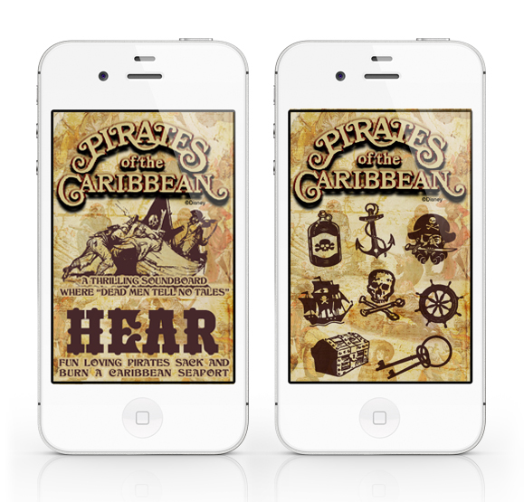
The fourth installation of the Designerland Soundboards: Pirates of the Caribbean.

The Pirates of the Caribbean Soundboard is a simple web application I created out of my appreciation for the classic attraction.  A web app will run SLOWER than a normal native app. The difference between a web app and a native app is that a web app is hosted and "lives" on the internet whereas a native app actually downloads and "lives" in your mobile device.

PLEASE NOTE: The soundclips will take a while to download, I wish that they would load faster but unfortunately that's just how web apps work.

The Pirates of the Caribbean Soundboard was developed for iphone users in mind but is supported by Google Android mobile devices as well.

For iphone users: using the internet on your phone go here: POTC
Once the page loads click on the "Add to Bookmarks" icon. Now click the "Add to Home Screen" and the Tiki Room Soundboard icon should load. That's it.

For Google Android users: using the internet on your phone go here: POTC
Bookmark the page. Now open the browser bookmarks screen, then long-press the bookmark you want, then select the add to home screen.  

The site will look odd if you just go to the link above on your desktop computer or iPad. The url/site is formatted to fit your mobile device's screen and the sounds will not work unless you're using Google Chrome or Safari.

Well I hope you guys enjoy this latest addition. If you like this app and don't mind it taking a while to load I have a few other Disney attraction soundboard apps in the wings!

Thanks again for stopping!

Sunday, June 17, 2012

Main Street USA Part 3

Welcome back to Designerland's Typography Case Study. This weeks study is our conclusion of Main Street USA as I've had to break up the post into a three part series. So sit back and enjoy more of those fantastic fonts used by Disney designers.


As stated in the first Main Street Case Study, most of the fonts used on the thoroughfare are display fonts ranging in classifications such as Victorian, Script, Tuscan, Latin, Slab Serifs, Serifs, Edwardian, Ornamental, and so on, used for the various fictitious storefront shops.


Well that does it for the final installment. . .or does it? Main Street is ever evolving with the plussing of new signage and graphics. New fonts will be added yearly and I can't wait to track more down. In my research for this three part case study I was able to locate 68 fonts and just today I found a new one making it 69. I have over 100 reference photos of fonts I have yet to track down and will always be on the hunt. Look for updates. Well that about does it. Tune in next week as I spent the last three days working on some overdue offerings for Designerland. Until next time, have a great week. Thanks for stopping by.

Friday, June 1, 2012

Out Now!!!

Sorry for the lack of a new post this week, forgot Monday was a holiday. Be sure to check out this upcoming Sunday's post...I think you guys will enjoy it.


In the meantime, I have another shirt design released in the parks this week. 


Casey Jones at the Disney Design Group came up with this jaunty idea and asked me to illustrate it! I really love this shirt. It's clever, funny and a touch retro (with the subject matter and distressed texturing).

Be sure to pick one up the next time you're in the parks and tune in Sunday evening for a triple delight!


Sunday, May 13, 2012

TomorrowLounge


Welcome back to another fun filled Designerland post. This week I have a treat for you...another musical comp inspired by Tomorrowland entitled TomorrowLounge. The comp contains 22 sci-fi sounds that remind me of the past and range in musical stylings from the 1950's up to the 1970's (a perfect mixture of retro Disneyland and Walt Disney World).


All the tracks are space themed with a few hidden gems only us Disney dorks could totally geek out over (tracks 3, 10, 21). So click the picture above and enjoy. Would love to know what you think about this comp, let me know either here or on twitter. Have a great week and thanks for stoping by! See ya real soon!

Sunday, May 6, 2012

The Rainbow Connection

Just a quick post to let everyone know another one of my shirt designs has been released in the parks.

I was asked to design a simplistic yet nostalgic rainbow shirt for both the Walt Disney World and the Disneyland Resort. Even though the content and design are minimal, I'm really proud of this shirt. I hope you guys enjoy it and be sure to pick one up!


Special thanks to Micechat and Denise Preskitt for snapping this photo and posting it. Thanks guys!

Tuesday, March 6, 2012

So Friendlyable

A few months back Casey Jones of the Disney Design Group illustrated these adorably cute park mascot characters. He then asked for my take on a tee shirt using his illustrations. After really studying the style and feel of the characters, it was simple. Casey's illustrations reminded me of the vintage Disneyland ads, so I re-imagined those printed park adverts, incorporating his new characters. It was amazing working with him again and I felt honored he let me take his illustrations and just run with them.  There are a few versions out there and YES this shirt design is available in both parks, of course with appropriate park logo.


The shirts are now in the parks. So get 'em now before they fly off the shelves.

You asked for it, Part 2!!!

So it was brought to my attention (a few hours ago) that my second shirt design I did along with the Casey Jones of the Disney Design Group has been released in the parks!!! The DDG contacted me and asked if I would create a new version on the Dole Whip shirt and this is what I came up with:


For those of you who miss out on the Designerland version here's your chance to get your hands on a tee celebrating this theme park staple and yes it will be available in both parks. Thanks to Matthew Gottula for snapping this shot and posting it on twitter. Hope you guys like this new take, it's both retro and refreshing all in one tropical flavor!!!