Showing posts with label Concept. Show all posts

Monday, April 8, 2013

Update!

For those of you who supported me and my blog by snatching up the new addition of the tiki pineapple whip tee...I wanted to give you an update!


Shirts have been printed and I'm in the process of packing them! Hold tight...tropical goodness to ensue!

Sunday, March 31, 2013

The Enchanted Tiki Tee


Welcome back to yet another Retro Tee concept. I hope everyone has had a swell weekend. Last week I had such an amazing amount of fan feedback on the Enchanted Tiki Room tee concept that I decided to roll out another concept I've had collecting dust in the wings.

Unlike my typography case studies, I have enough shirt concepts to get me through another two years if I just posted only concepts for apparel but I'm not a one trick pony and typography is my passion. I had some free time this weekend to actually begin tracking down original typefaces and display font used throughout The Land pavilion.  Hopefully, I will be able to find more vintage research...most likely I'll have to break down and use some of todays fonts and typefaces.

Back to this weeks concept, the design is based on one of the Disneyland marketing photos of Walt actually inside the show building. I decided I really wanted to push my experimentation with frequency and dot angle when it came to halftones, not to mention it has a nice throw back look. I scaled the color of the photo back to a darker shade of the tee shirt color. On top of the photo I overlaid a graphic from a 1963 marketing piece that came from a simple 4 color brochure. 


I went back and forth on color combinations of this design. In the end I decided to keep the color palette 85% true to that simple 4 color brochure, while the colors don't necessarily harken the themes of Adventureland, they do hold true to my original inspiration. 


I could see the shirt paired with a nice pair of deep khaki cargo shorts and sported on a warm summer day. Well that does it for this weeks post. I hope all of you have a good week and see you back here real soon!


Monday, March 4, 2013

Disney's Worlds of Oz


Welcome back to Designerland and a long-overdue post. By now you probably know that this upcoming Friday, Disney will release its second trip to the Wonderful World of Oz with their new major motion picture, Oz the Great and Powerful.  I'm truly excited to see how Disney handles it. I hope it fairs well as I love the mythos of Oz and would like to see a franchise with this property. 

I grew up with Disney's first Oz film, Return to Oz, which still remains one of my all-time favorite Disney films. To celebrate both the new and the old, I created a few shirt concepts. The first two are based on Return to Oz and the last is based on the new film. 

The first shirt is based on the Powder of Life and the three magical words spoken to activate it. The design plays heavily with ornate typography and flourishes that pay homage to both the time period and the movie.  For you extreme fans, take note of the typography used on the electro shock machine—the logo is brilliantly ornate. Also, the typography used for the Doctor's newspaper advertisement? The same font used for the home of 999 happy haunts. The back of the shirt has a small tag depicting the Gump.


The second shirt pays homage to my favorite character, Tic Toc. To this day, I love that one steampunk-like mechanical man is the sole army and protector of Oz. The shirt is based on the badge on his left chest. 


The last concept is based on the new movie logo and ornate typography combined with the new letterpress technique.


Well that does it for this week’s post. I apologize for my lack of posts as of late, but I'm juggling a few projects, and one in particular is rather big. I just recently purchased my first house and am in the midst of a complete renovation...so hunting down typography has been put on the back burner for now. I hope to find some time in the next two months to tackle a new Epcot Case Study. Thanks for stopping by and see you all real soon!

I almost forgot to mention, don't forget to order the LE Version 2 of the Tiki Pineapple Whip Tee. I'll be taking orders for another 3 weeks—after that, the design will be retired for good, so don't hesitate. 

Monday, February 25, 2013

Back by popular demand!

The votes are in and Concept D of the new Tiki Pineapple Whip tee is the fan favorite! Thanks to all who voted. To celebrate I'm now taking presale orders on the new tee!

Since the end of the last tiki whip sale two years ago, I've received daily emails asking for the reprint of the original. I never knew that 2 years later people would still be asking for the shirt. Now is your time to act because I don't know if I'll revisit the design again...maybe in another two years I'll be singing a different tune. LOL!

I recommend ordering a few. Think of friends, family, holidays and birthdays because once I'm done with presales I won't be taking any additional orders.

You have from now until March 24th (sale ends at Midnight EST) to order, if you have any questions please contact me at my gmail account.

You can CLICK HERE to order or simply click on the side banner over to the RIGHT.

Mahalo and thanks again for the support! Look for new Designerland content coming soon.


Friday, February 1, 2013

Cast your vote now!

I told myself I would never do a rerun of the original tiki whip shirt I created two years ago and I still stand behind that...but I never said anything about a new take on the graphic, new ink color ways and new apparel! So cast your vote now, who knows what I may do with the information!?!


Sunday, October 28, 2012

Glow-in-the-Dark Cobweb Candy Cart


Welcome back to our last special Halloween holiday post. Over the summer, after watching a viral video of a cotton candy spinner, I developed a small obsession with the art of cotton candy making. I researched brands, makers, machines and various other sugary sweet offerings related to this fun delectable. When I learned about the LED light-up cones used for cotton candy over in Disney California Adventure, I had an idea for how to put a new spin on cotton candy. 

My idea was to reformulate the sugar floss so that the coloring within the sugar crystals is black light-responsive as well as safe to eat. In place of the multi-color LED lights within the cones would be mini black light LEDs. I could only think of one place where this product should live: The Haunted Mansion Glow-in-the-Dark Cotton Candy Cart.


The cotton candy would be branded as Cobweb Candy, and through the technique of double spinning—which is used to create multi-colored cotton candy on one cone—the treat would take on a ghostly appearance.


For the past six years I have had a Disney partner in crime. While he lives in Canada and I live in Indiana, our passion for all things Disney has kept us conspiring toward magical madness. I decided to run the concept by him to see if he'd like to help out with the idea. He loved it and we both agreed to work together in bringing this dream one step closer to a reality. 


We came up with the story that the cart belongs to a Mason who deals in the dead. The cart’s design has bricks, shovels, bags of mortar, trowels and other various tools a graveyard Mason would need. We incorporated the wrought iron detailing from the Mansion into the top of the cart to help tie in the Mansion’s theme. The signage plays upon various fonts used over time for the Mansion’s branding. We imagine the cast members working the cart would be dressed similarly to the caretaker within the Mansion. The cart would have an area for the cotton candy spinner machine, finished product behind glass and compartments for the ingredients and the cash register. The spinner machine itself would also have a center black light so the candy would glow while the cast member spins his webs of wonder.


The cart would only roll out at dusk and would be located near the Mansion’s entrance.

I want to give a big thanks to Ian Giles for helping out with this concept! I couldn't blue-sky without you!!!! Well that does it for this week’s post. Tune in next week as I return to my typography case studies and other random apparel goodness. Thanks for stopping by and Happy Halloween!

Sunday, August 19, 2012

Country Bear Jamboree


Welcome back to Designerland. I hope everyone had a good weekend. This week’s post is a Retro '55 and Retro '71 combined post that I hope you all will enjoy. 


This week’s shirt design honors the beloved attraction The Country Bears Jamboree. Since it was recently announced that the show will undergo a refurbishment, I thought this would be a fitting time to pay tribute. This design is based more specifically on the Country Bear Vacation Hoedown "overlay" designed for Disneyland, which was rolled out in 1986, replacing the original Country Bear Jamboree show. In May of that same year, Walt Disney World decided to change up their classic show by using this same overlay, but in 1992, WDW restored the show to its original glory.


The shirt design is based on Henry's old camp t-shirt he sported in the show, which was meant to look like an old vintage camp tee that he got while a younger cub at Camp Grizzly. The shirt is basically the same design Disney Imagineers came up with plus our time treasured distressed texture.


Could Camp Grizzly be part of a bigger WED/WDI story dating back to the time when The Country Bears and Moonshine Express was in development? Could it somehow be related to Grizzly Peak and Grizzly Gulch? Needless to say, WDI loves using the word Grizzly when developing attractions based on bears and the frontier...is it all just a coincidence, considering that California's state animal is the Grizzly?

Well that does it for this week’s post. Tune in next week for a new Designerland typography case study and have a swell week!


Sunday, August 12, 2012

New Orleans Mint Julep


Greetings folks! Welcome back to another edition of our Retro '55 apparel line.

This week’s concept is based on the fan favorite, the Mint Julep. The idea for a Mint Julep t-shirt has been in the works since I was designing the original Tiki Pineapple Whip tee here at Designerland. I hadn't tried this delicious drink until last year while at the Disneyland Resort and I instantly fell in love. I believe I had about 15 of them over the span of a week, and when I came home, I set to work trying to pinpoint the recipe. 

The Mint Julep Bar is located in New Orleans Square and is one offering that I feel helps sell the story of that particular land. I hear that Walt Disney World offers the same jaunty brew over at Port Orleans, but there's just something about New Orleans Square and the Mint Julep that go hand in hand.


Instead of designing some fun character holding the beverage or turning the plastic cup itself into a cute character, I decided to create a shirt that had more of a vintage label look to it, as if the Mint Julep was actually manufactured at a nearby plantation and exported as a fine southern beverage. The design itself has the New Orleans Square logo above the Blue Bayou, which was recreated by scanning one of the original New Orleans Square souvenir bags. Typeset below that is the beverage title set in the same font seen in the parks, along with some added storytelling copy that helps complete the look of the label. I also put the established date when New Orleans Square opened at Disneyland, flanked by an art nouveau whiplash curl.


Well that does it for this week’s concept—hope you all have a swell week. Thanks for stopping by.


Monday, July 9, 2012

Retro '55


Welcome back to another Retro '71 concept here at Designerland.

When I first decided to showcase some of my ideas for Disney Theme Park apparel, my original intent was to focus solely on Walt Disney World. Why? At Disneyland, the buyers understand the demand for Disneyland nostalgia, and they’ve offered up some amazing retro products over the past ten years. You really had to dig to find similar retro merchandise at Walt Disney World—it wasn’t until 2010 that WDW really started to cater to this demand.

Through Retro '71, my intent was to create a line that celebrated the history of WDW, its attractions and the memories of the visitor experience. What I didn’t anticipate was that the West Coasters would feel so left out—I've received a few emails asking why I don't showcase concepts for Disneyland. It so happens that I’ve had several designs waiting in the wings and had planned on showcasing them when the time was right.

Well that time is today! Welcome to our first installment of Designerland's Retro '55 shirt concepts.


This week’s concept is based on the original Submarine Voyage attraction. More specifically, the shirt pays homage to the years in which Disneyland showcased live mermaids in the lagoon of the attraction. A simple 3 color, day glow palette sets the theme of this advertisement-like shirt, which honors those flourishing, fin-tastic beauties that once swam the lagoon.


Well that does it for this week’s concept. I really enjoyed designing this shirt, what do you guys think? I hope to see you back soon for more fun posts. Until next time, have a swell week!

Monday, June 25, 2012

New Designerland Soundboard

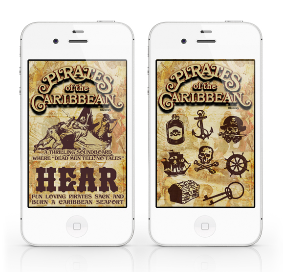
The fourth installation of the Designerland Soundboards: Pirates of the Caribbean.

The Pirates of the Caribbean Soundboard is a simple web application I created out of my appreciation for the classic attraction.  A web app will run SLOWER than a normal native app. The difference between a web app and a native app is that a web app is hosted and "lives" on the internet whereas a native app actually downloads and "lives" in your mobile device.

PLEASE NOTE: The soundclips will take a while to download, I wish that they would load faster but unfortunately that's just how web apps work.

The Pirates of the Caribbean Soundboard was developed for iphone users in mind but is supported by Google Android mobile devices as well.

For iphone users: using the internet on your phone go here: POTC
Once the page loads click on the "Add to Bookmarks" icon. Now click the "Add to Home Screen" and the Tiki Room Soundboard icon should load. That's it.

For Google Android users: using the internet on your phone go here: POTC
Bookmark the page. Now open the browser bookmarks screen, then long-press the bookmark you want, then select the add to home screen.  

The site will look odd if you just go to the link above on your desktop computer or iPad. The url/site is formatted to fit your mobile device's screen and the sounds will not work unless you're using Google Chrome or Safari.

Well I hope you guys enjoy this latest addition. If you like this app and don't mind it taking a while to load I have a few other Disney attraction soundboard apps in the wings!

Thanks again for stopping!

Wednesday, March 14, 2012

Retro '71


Welcome back to Designerland and a new Retro '71 concept. It seems out of the ordinary that I post a shirt concept during the week but today's special. Why is it special? Well one of my followers on twitter challenged me. They simply asked if I would come up with a shirt that celebrated the Sunshine Tree Terrace's Citrus Twist (which was just recently brought back to the vacation kingdom of the 
world after popular demand).


I decided to incorporate both the Orange Bird and this tropical twisted dessert in one design along with the original Walt Disney World Resort logo and the Sunshine Tree Terrace sign. I was happy that I got to do a bit of font finding for the display font seen in the Terrace's sign. Finishing the design off is our loved (not overused) vintage distressing. 


So what do you guys think? Well have a good rest of your week, it's almost over and I'll see you back real soon. Thanks for stopping by!

Sunday, February 26, 2012

Concept Design

This weeks post was to start a 3 part series on the typography of Main Street but that will have to wait for a few more weeks. While I have more than 85% of the fonts and typefaces found I have not had time to work on a the posters and write up.

Instead I figured I'd showcase the second edition to the fine writing pen set I did for the Haunted Mansion, which I posted a few weeks back.

After designing the Haunted Mansion pen set the I design a series for the Pirates of the Caribbean.


So what do you think? With the 45th Anniversary of Pirates of the Caribbean right around the corner would you through down to have this pen set?

Monday, February 13, 2012

Concept Design

A special Sunday bonus for all my readers and followers...

While I love designing softlines and apparel my other passion when it comes to consumer products is social stationery. My first job out of college was working in the social stationery category as a product developer, line designer and licensing coordinator (I wore many hats). I worked on a daily basis with such fun companies like Disney Consumer Products, DreamWorks Animation, Sony Animation and Nickelodeon.

When I'm not dreaming up Retro '71 apparel designs I'm dreaming up other products such as social stationery that goes along with the brand. Here's a concept for a set of fine writing pens based on retro art and logos for one of our all time favorite attractions, the Haunted Mansion. While the designs are complete, I've not had time to work up the packaging, but I envision a coffin shaped, spring-hinged box with purple velvet lining. The coffin case would be black leather with the Mansions logo embossed, possibly with some Rolly Crump-esque Mansion flourishes.


So what do you think? Would you through down 40 bucks for this Haunted Mansion Frighteningly Fine Writing Pen set? Let me know in the comments section! I have another series based on another attraction but I'll save that for another time.

Sunday, August 28, 2011

Retro '71


Welcome back to another edition of the Retro '71—or maybe I should say Retro '82—because this week’s design launches a new series of shirts that are all based on the Epcot Center.
The design for this week’s shirt is based on the vintage hand-illustrated artwork Disney designers used in various promotional materials for Epcot. These beautiful layered montage-style drawings were seen in brochures, letterhead and even buttons. This week’s design was lifted from a vintage 1982 button promoting none other than the World Showcase.


I scanned the retro image into the computer and through my illustrator magic, converted it into a new design for the apparel line. I decided to use the color palette from the 1982 Epcot Center park map, which depicts the World Showcase in dusty pinks, deep maroons, white and aqua colors. Of course no design is complete without a touch of light textured distressing.


Well that does it for this week’s design. Tune in next week as we continue the new series, and as always, thanks for stopping in. Have a great week.

Sunday, August 14, 2011

Retro '71


This week’s Retro '71 concept concludes the faux real estate/land development companies used to purchase the land for the Walt Disney World Resort.


Our final design is for Reedy Creek Ranch Incorporated. The name is a play on the Reedy Creek Improvement District (RCID) which played a huge roll in the history of the Walt Disney World Resort (don't worry folks—I have a proper RCID shirt in the wings). The logo was inspired by the name of the company, but is very different from the minimalist official RCID logo. I took a more western theme to coincide with the word “ranch”.  The color palette is a simple monochromatic color scheme in washed out reds. Finishing the design, I used a distressed texture to help give it a worn look.


Well that does it for this week’s concept. I hope you enjoyed this fun and imaginative series within the Retro '71 apparel line, but before we go, I've been asked if I ever use more than a simplistic one-color scheme for my designs. Well I dream in technicolor, so here's my vision in color for these last 6 shirts. Thanks for tuning in, and see you guys either at the D23 Expo or shortly after. Have a great week!