Monday, May 30, 2011

Retro '71


I would like to extend a big thanks to all the visitors and fans that have shown interest in the Adventureland Dole Whip Shirt. At present I have roughly 25 people interested, and if we're going to actually get these printed off, I would need to get that number up to 100 people!  The more people we can get, the lower the cost is for everyone. If you're still serious about the shirt, let's get the news out there. Please help me by hitting up the various Disney forums, Facebook pages, Twitter and so on . . . it's time to summon the twilight bark!!!!! And now on to this week’s post . . .
This week’s Retro '71 shirt is another concept inspired by an old park brochure. Drawing inspiration from the 1981 Walt Disney World Resort brochure, I recreated the Tomorrowland logo. The logo depicts an almost Transformers-like type treatment with its glossy gradients and pairs it with a spaceman Mickey in weightless orbit high above.


When recreating this art, one begins to pick up on subtle clues that the original was hand illustrated/created, such as the weights and heights of the characters are slightly off.
This has been one of the more time-consuming Retro' 71 designs. While I'm happy with the outcome, this design would be rather pricey to actually produce due to the amount of colors used within the design. Remember the more ink, the more money that goes into production. Also, Retro '71 shirts are all water-based inks, and these are more expensive than standard plastisol inks.


Typography is usually the first thing I look at—if the type treatment is unusual, interesting or just plain cool, then the chances are good that I’ll feel compelled to recreate and manipulate the design. However, I really enjoyed recreating the character artwork for a change, and I may add a few others to the line. That about does it for this week—once again, thanks for visiting!

Saturday, May 28, 2011

Color Study


A new color palette has been added to the DisneyDesignerland Kuler account! Before you jump on over to check it out can you guess where this color palette is used?


Give up??? Find out the answer over at Disneydesignerland's Kuler page found here.

Check back for more random updates to Wonderful World of Kuler. See you guys back here on Monday for a new Retro '71 concept.

Thursday, May 26, 2011

A Cause for Celebration

In celebration of Disneyland's Trader Sam's Enchanted Tiki Bar which opened two days ago, I've designed this:


You all should know by now that I'm a huge sucker for all things tiki. I'm counting down the days until the D23 Expo so I can experience this new tropical treasure first hand. I have a feeling it'll be my nightly dive during the entire trip. My goal is to try as many of their potable Polynesian potions and various Bali Hai brews. If you're gonna be attending the Expo and you want to tackle a volcano bowl with me be sure to hit me up or follow me on twitter, oh and don't forget to click on the picture above!

Twitter

Small update: Designerland is now on Twitter! Follow me @Designerland71 for updates to the blog and random happenings from new soundboard apps to Retro '71 concepts and more!

Sunday, May 22, 2011

Retro '71


I’ve received several reader emails asking if my Retro '71 shirts are available for sale. It saddens me to tell you that none of my shirts are for purchase due to obvious copyright issues. However, this week’s Retro '71 shirt concept is another story—this shirt design could be for sale if fans enjoyed it and there was a demand. No Disney copyrighted art in this one!
The design is not based on a show or attraction, but on a rite of passage when it comes to the Disney Theme Parks. Within Adventureland at both Disneyland and Walt Disney World, there's a "must eat" on every visitor's list: the Dole Pineapple Whip! If it's not on your bucket list, it should be. It's the most amazing frozen concoction in the parks! The Dole Pineapple Whip is a staple and is so popular that Disney added a whip machine in the Polynesian Resort back when the quick service area was refurbished. I'm assuming Disney will also add this frozen treat to the new Trader Sam Tiki Bar and the Tangaroa Terrace Restaurant at the Disneyland Resort Hotel.


For this week’s shirt I tried to take a whimsical yet kitschy approach with the design. I wanted to not only represent the whip itself, but to also reflect the tropical Tahitian feel of Adventureland. What better icon to represent the spirit of Oceania than a Tiki warrior? To throw a bit of tongue-in-cheek humor into the design, I thought it would be clever to have him holding a whip in his hands. Of course this fierce tropical warrior couldn't be so mean when enjoying this delectable treat, so his intimidating frown has been turned upside down. I can imagine after the park closes that the statues, carvings and idols from around Adventureland break their poses and all hit up the Dole Whip stand to reward their hard day’s work of entertaining guests.


So, would you sport the shirt? If enough people are interested I might be able to produce a small run! Let me know in the comments section if you're a Yay or a Nay. Well that's it for this week’s concept. Thanks for visiting Designerland, and remember: when a good time comes around, you must whip it!

Monday, May 16, 2011

Another Poster Design

New poster design. Taking a small break from attractions. This design is based on the Burle Marx - esque layout of the Walt Disney World Resort which was modeled after Walt's own personal sketch. Possibly one of my most favorite pieces of concept work ever done by Disney and if you don't know who Burle Marx is I suggest you look into him...amazing!


Note: Poster is not to scale.

Sunday, May 15, 2011

Retro '71


This week’s Retro '71 concept is based on one of my favorite attractions, Pirates of the Caribbean. What better timing than with the fourth installment of the Pirates film series opening this Friday? I've been awaiting this film ever since that fog started to roll in and the stage began to turn revealing none other than Jack Sparrow himself at the first D23 Expo.
I have many favorites when it comes to attractions within the Disney Parks, and usually it's a toss up between the Haunted Mansion and POTC. However, I had to ride one attraction over and over, it would be Pirates of the Caribbean, hands down!
I was raised on Walt Disney World's version until the summer of 2005 when I first got to experience the original at Disneyland. It blew my mind—it had additional scenes, extra drops and it was longer. If I could combine the facade and queue of Disney Word's Pirates with a carbon copy of Disneyland's ride, I think I would be in attraction heaven! The only problem would be the Blue Bayou—it's my favorite restaurant at Disneyland, but a southern plantation-style estate wouldn't fit in with the more Spanish look of Disney World's Pirates. I wouldn't be opposed to a different waterfront inside-dining experience appropriated for the attraction.


The artwork on this week’s apparel comes from the original POTC logo that was painted on the stucco walls of the attraction. It was also seen on matchbooks that one could acquire in Adventureland. The typeface is a modified version of Bookman Swash and if you've been following the Designerland Attraction typography case studies, you would know by now that the designers LOVED this typeface.
I roughened the edges of the logo and then placed a set of crossed pirate swords in the background to keep with the motif of the attraction. Once again, the shirt is a simple 2 color water based print with no underlay to give the ink that faded sun look, plus some of the usual distressed texture.


Well that's it for this week. I hope you all go out and see On Stranger Tides. I hope to see you back here soon for more Disney Designerland fun! Have a great week!

Friday, May 13, 2011

Poster Design Part II

I've created another poster to go along with the set. What do you guys think? More to come! Stay tuned.

Color Study


A new color palette has been added to the DisneyDesignerland Kuler account! Before you jump on over to check it out can you guess where this color palette is used?


Give up??? Find out the answer over at Disneydesignerland's Kuler page found here.

Check back for more random updates to Wonderful World of Kuler. See you guys back here on Monday for a new Retro '71 concept.

Sunday, May 8, 2011

Retro '71


This week’s Retro 71 shirt concept is another design that celebrates the year in which the Vacation Kingdom opened its gates, 1971.


The shirt is classic 1970's retro. Using the original Magic Kingdom castle icon alongside the original resort logo, I opted for a funky, chunky font to set the year in. The display font is simplistic but reads “groovy” at the same time.
The design is a cost-effective two color design with some slight textured distressing. It would be printed in water-based ink with no underlay in order to make the ink look sun-faded from spending all day out in the parks.


Well that's it for this week’s post—have a great week. I'm off to work on my D23 painting. Speaking of paintings, I just sent out my painting to Burbank for The Haunted Mansion Group Art Show presented by The Parlour Gallery at Halloween Town. So if you're in the area, stop by the gallery on opening night, Saturday June 4th at 7pm. For you readers who aren't in the LA area, don't worry folks—I'll be sure to post a few pictures here at Designerland. Until next week then, see you soon!

Happy Mother's Day

I would like to take this time to wish my mom a Happy Mother's Day and to thank her for everything she's done for me thus far in my life. My mom is an amazing woman—I’m sure that's how we all feel about our mothers. She taught me that it was okay to be different, she fostered the creativity in me, she helped me look outside the box and most importantly she raised me with the help of pixie dust.


I would like to share one of my favorite stories about my mom, and of course, the Happiest Place on Earth, Walt Disney World. Now I ask my mom to tell me this story all the time because I enjoy hearing it so much. I've tried to confirm if this story is true or not—not that I don't believe my mom—I just cannot find any other Disney literature or lore that supports it. I've even contacted Disney historians to ask if there's truth in it or if my mom has some dates mixed up. I've never heard back from them. My father is the only one that can back the story up, so it has always been an exciting mystery.
It was the summer of 1970 and my mother and father decided to take a road trip to the Sunshine State. My parents are old school and still drive everywhere, even to this day. They take their time and enjoy the scenic route, stopping at various points of interest all along the way. They made their way down to Florida and arrived in St. Augustine. While enjoying the town, my mom and dad did all sorts of touristy, road side attraction stuff, like stopping at the Ripley's Believe It or Not Museum. After touring the grounds, my mom asked one of the workers what else there was to do in the area. The lady told her that Disney was opening a resort over in Orlando, which sparked my mom's interest, so my mom and dad drove over to Orlando.
Mom loves to tell me how small Orlando was at the time and how nothing was grown out around the Disney Resort area. It was literally in the middle of nowhere. They stayed at a hotel in Buena Vista. I'd like to also add that my mom was pregnant with my older brother at the time and she had to make her own maternity swimsuit since back then, you couldn't find swimwear fashion for the pregnant. The next day, they made their way into the park, parked in the parking lot and took the ferry over. Mom and Dad both tell the tale of how the Contemporary was mid-construction as they were ushered across the Seven Seas Lagoon. My dad is a contractor so I know looking at construction in progress always interests him. They say the Monorail was not running at the time. They arrived in the park and mom said only Main Street USA and Fantasyland were open to explore as the other lands were still being worked on. I always ask if there were other people in the park, and she said a few were there, but not a huge crowd because the park wasn't even open yet. She says she distinctly remembers Fantasyland, in particular Pinocchio's Village Haus. She and Dad only spent a few hours in the park, but Mom remembers telling my dad that it looked like a place they needed to revisit when the park officially opened.
Do my parents have their dates wrong? Were my parents subject to a special sneak peek day? Who knows. I love the story and wanted to share. If it weren't for amazing parents, especially moms, none of us would have been able to experience the magic that is a Disney Theme Park. 


Happy Mother's Day Mom. Thanks for all the Magical Memories!  I love you!

UPDATE: After my mom read this she called and provided me some other information about the mysterious story:
- All the highways were just 2 lane highways all the way down from Indiana to Florida
- They stayed at a hotel with multiple floors(which is still there but has changed names) in Buena Vista which she thinks was a Sheridan at the time
- None of the shops on Main Street where open
- None of the attractions were running in Fantasyland (from what she remembers, being pregnant with my older brother who was born in August of 1970, she might have chosen not to ride anything because of being pregnant).

Poster Design

So I'm really missing my normal Case Study posts. It's been hard to pull myself away from them and actually focus on my painting. The good news is that I've made progress! When my painting is in a drying stage I jump on the computer and work on some new designs for the blog... this week I've created two attraction posters in my down time. What do you guys think? Would you like to see more?


 Okay back to the painting. Tune in tomorrow for a new Retro '71 concept.

Friday, May 6, 2011

A Tropical Treat


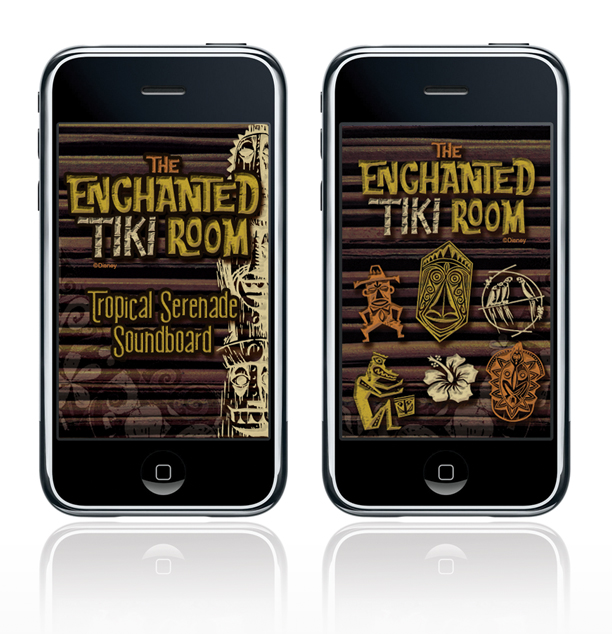
As promised here is the second installation of the Designerland Soundboard: The Enchanted Tiki Room.


The Enchanted Tiki Room Soundboard is a simple web application I created out of my appreciation for the classic attraction.  A web app will run SLOWER than a normal native app. The difference between a web app and a native app is that a web app is hosted and "lives" on the internet whereas a native app actually downloads and "lives" in your mobile device.

PLEASE NOTE: The soundclips will take a while to download, I wish that they would load faster but unfortunately that's just how web apps work.

The Enchanted Tiki Room Soundboard was developed for iphone users in mind but is supported by Google Android mobile devices as well.

For iphone users: using the internet on your phone go here: TikiRoomSoundboard
Once the page loads click on the "Add to Bookmarks" icon. Now click the "Add to Home Screen" and the Tiki Room Soundboard icon should load. That's it.

For Google Android users: using the internet on your phone go here: TikiRoomSoundboard
Bookmark the page. Now open the browser bookmarks screen, then long-press the bookmark you want, then select the add to home screen. 

The site will look odd if you just go to the link above on your desktop computer. The url/site is formatted to fit your mobile device's screen and the sounds will not work unless you're using Google Chrome and Safari.

Well I hope you guys enjoy this latest addition. If you like this app and don't mind it taking a while to load I have a few other Disney attraction soundboard apps in the wings ready to go!

Thanks again guys for coming to my blog! See you back here on Monday for a new Retro '71 concept. Have a great weekend.

Monday, May 2, 2011

Retro '71


After such amazing response to the first Retro '71 Haunted Mansion shirt, I decided to design another concept based on this all-time favorite attraction.
This week's design is inspired by the vintage Disneyland Record and Book series. The original product was designed for Disneyland and features a stunning 24 page book that accompanied the long playing record with some amazing illustrations. I adapted one of the illustrations to feature Walt Disney World's Mansion instead of Disneyland’s, and I changed up the color palette. It was tricky tracking down that amazing font used on those old Haunted Mansion vinyls.


I added the original Walt Disney World Resort logo to the bottom of the art and scaled back the opacity to give it a worn, ghostly look.  Overall, it's a very vintage homage to one of my favorite attractions at the parks. 


Well that's about it for this week’s Retro '71 concept. Turn in Friday for an all new Designerland Attraction Soundboard and have a great week! Thanks for stopping by

Sunday, May 1, 2011

Retro '71

As you all know, I'm pretty excited for the D23 Expo. In my downtime I have dreamed about the launch of the Retro '71 apparel line, and what better platform to roll out the announcement of the t-shirts hitting the Vacation Kingdom than at the Expo itself? But first, what apparel line can be complete without a logo? It took me some time to come up with the logo for Retro '71, simply because I couldn't find the right typeface that spoke to me. After many versions I've finally nailed one down that I feel says, "nostalgic vacation wear with a vintage flair". The logo would be present on the labels and tags for the product line. Within the style guide I've created a simple one-color logo, the care and content label that would be printed inside the shirts instead of on a scratchy tag, and lastly, the garment hang tag.


 I see fans getting their first taste of the line with actual printed garments at the Expo, and I've been working on designing a simple but effective booth where guests can see the shirts up close, feel the vintage eco-friendly fabrics and maybe even get some free swag for stopping by.


The booth would consist of a simple wall that would be fashioned out of that horrible 70's paneling that most would stick their noses up at today. It's tacky, funny, kitschy and most of all, retro. The wall would have a large white protruding sign/frame that is made up by the original “D” from the classic Walt Disney World Resort logo, along with the Retro '71 logo. The inset area of the sign is made up of an oversized graphic of various vacation postcards from the past. 


At the far end of the booth, we would have the apparel line where guests could get a sneak peak of the first wave of shirts to hit the Walt Disney World Resort. Located in front of the shirts would be two cantilever product tables that will showcase some of the other consumer products that we will also roll out alongside some of your favorite Retro '71 shirt designs. Flanking each side of the entire wall would be our mannequins that will be of course sport some of the shirts, along with other vintage vacation apparel found from thrift stores to really set the tone of what we used to wear when visiting the parks. Lastly, the entire booth will be carpeted with a mod-patterned, high traffic rug modeled after one of the original carpet designs found in the Contemporary Resort.
We wouldn't turn you away empty-handed—for stopping by, guests would receive a free Retro '71 UV sun visor modeled after the visors sold in the parks back in the late 70's and early 80's.


What do you guys think? Would you be excited? Would you stop by our booth, and lastly, would you sport that wicked visor?