Sunday, July 29, 2012

Wedway Peoplemover


Welcome back to another edition of our vastly growing Retro '71 apparel line.

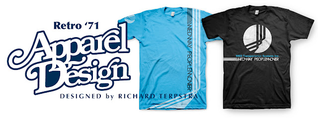
This week’s concept is based on the WED Transportation System’s branding from a 1982 marketing brochure. Once upon a time, Disney branded, marketed and packaged various park specialties such as the Monorail and the WEDWAY Peoplemover to outside cities and businesses. If you'd like to know more or see this jaunty brochure in action, jump on over to Progress City, U.S.A. by clicking here.


The design for this week is a simplistic black shirt with graphics based on the logo and various type from the brochure. The color palette was taken directly from the brochure and its branding. When printed, the white sections of the design would be discharge ink to give it even more of a vintage feel.


Well that does it for this week’s Designerland installation. Hope to see you back next week as we move on to the wonderful world of the Monorail typography. Have a great week and see you soon.


Tuesday, July 17, 2012

Main Street Train Station


Welcome back to another fun-filled typography case study here at Designerland. This post will conclude my research into the fantastic fonts of the Magic Kingdom. We will soon move on to the resorts and then we will take a look at Epcot at the beginning of next year.

There are a few attractions within the Magic Kingdom I didn't cover simply because they didn't have enough fonts and typefaces for me to conduct a proper investigation. However, if you can think of any attractions that you feel I overlooked, let me know. I may open a special reader case study just for you! My only stipulation is that the case presented MUST come from the Magic Kingdom—other parks such as Epcot, DCA, DHS, AK and so on have their own case study files which are currently open and in the works.


With that said, let’s end our grand circle tour of font finding properly at the Main Street Train Station. As mentioned in the Main Street Case Study, the train station continues using serif fonts, but instead of over-designed, period-appropriate display fonts, the station contains 90% classic serif typefaces with a few display fonts thrown in. Some of the same typefaces found here can also be found over in Liberty Square. However, Disney Designers decided to break one rule, especially when dealing with typography and era-specific looks. Wanna know what it is? It’s the main Disneyland and Walt Disney World sign, which faces the entrances to the parks. Look closely—do you see a futuristic sans serif typeface yelling out the population of the park? I sure do. I would love to know the reason for this odd man out. Maybe they needed a semi-condensed typeface that would allow for all those zeros. Who knows?


Well that does it for this case study. I’m going to be taking a small summer break and return in the near future with more Designerland offerings, so I hope to see you back real soon. Thanks for stopping by and have a swell week.


Monday, July 9, 2012

Retro '55


Welcome back to another Retro '71 concept here at Designerland.

When I first decided to showcase some of my ideas for Disney Theme Park apparel, my original intent was to focus solely on Walt Disney World. Why? At Disneyland, the buyers understand the demand for Disneyland nostalgia, and they’ve offered up some amazing retro products over the past ten years. You really had to dig to find similar retro merchandise at Walt Disney World—it wasn’t until 2010 that WDW really started to cater to this demand.

Through Retro '71, my intent was to create a line that celebrated the history of WDW, its attractions and the memories of the visitor experience. What I didn’t anticipate was that the West Coasters would feel so left out—I've received a few emails asking why I don't showcase concepts for Disneyland. It so happens that I’ve had several designs waiting in the wings and had planned on showcasing them when the time was right.

Well that time is today! Welcome to our first installment of Designerland's Retro '55 shirt concepts.


This week’s concept is based on the original Submarine Voyage attraction. More specifically, the shirt pays homage to the years in which Disneyland showcased live mermaids in the lagoon of the attraction. A simple 3 color, day glow palette sets the theme of this advertisement-like shirt, which honors those flourishing, fin-tastic beauties that once swam the lagoon.


Well that does it for this week’s concept. I really enjoyed designing this shirt, what do you guys think? I hope to see you back soon for more fun posts. Until next time, have a swell week!

Wednesday, July 4, 2012

Retro '71


I was going to wait until Sunday to post a brand new Retro '71 Concept but how could I not celebrate our Independence Day with out some Theme Park apparel love???


This quick (and I do mean quick) design is based on the Disneyland grand finale promotional material for America on Parade from September 12, 1976.  I changed up the copy to a basic celebratory holiday phrase. I also made a counter part for the Walt Disney World Resort.  I couldn't find a display font that really matched the copy from the original promo material, so I opted for a bottom-heavy display font from that era. If I had more time I would of hand created it but like I said this was a last minute concept/post.


Of course no shirt is complete with out some vintage wear and tear! Well that does it for this special bonus concept. I hope all of you have a safe and fun Fourth of July and tune back in this Sunday for my first Disneyland shirt concept. I'm really excited about it and I hope all of you who have been asking where are my Disneyland concepts will enjoy it. See you all soon!


Sunday, July 1, 2012

Poster Design

New attraction poster designed to accompany the series from back in 2011. If you need a trip down memory lane the series can be see here.


Tune back into Designerland next week as I release my first DISNEYLAND retro shirt. Hope to see you all back here until then, have a great week and see you soon.