Sunday, August 28, 2011

Retro '71


Welcome back to another edition of the Retro '71—or maybe I should say Retro '82—because this week’s design launches a new series of shirts that are all based on the Epcot Center.
The design for this week’s shirt is based on the vintage hand-illustrated artwork Disney designers used in various promotional materials for Epcot. These beautiful layered montage-style drawings were seen in brochures, letterhead and even buttons. This week’s design was lifted from a vintage 1982 button promoting none other than the World Showcase.


I scanned the retro image into the computer and through my illustrator magic, converted it into a new design for the apparel line. I decided to use the color palette from the 1982 Epcot Center park map, which depicts the World Showcase in dusty pinks, deep maroons, white and aqua colors. Of course no design is complete without a touch of light textured distressing.


Well that does it for this week’s design. Tune in next week as we continue the new series, and as always, thanks for stopping in. Have a great week.

More. . .

The Crossman clan sent me this fun family photo of them inside Disneyland in their shirts. Thanks for the photo and the support. Side note: I really love that Indiana Jones hat!


I snatched a few photos of fans in their shirts while at the Expo. I haven't gotten around to uploading them yet. Stay tuned for more photos from the wild.

Friday, August 26, 2011

Pinocchio's Daring Journey | Village Haus


I'm back from D23 and I’d like to say thank you to everyone who made my trip so special—it was one for the books. I got to see things I'd only ever dreamed about and meet people I never thought I'd get to meet. I made a few new friends and saw some familiar faces. It was an unbelievable adventure—thanks again!
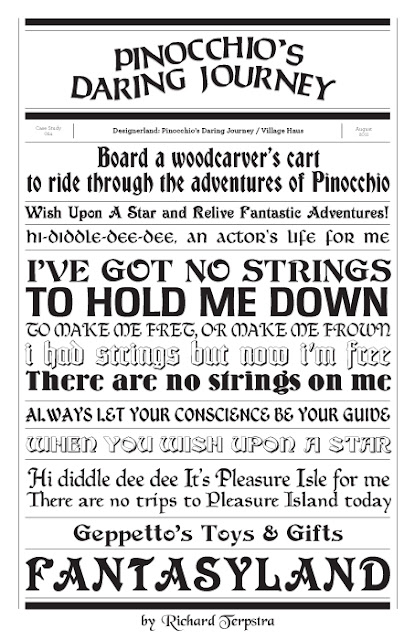
In this week’s typography case study we'll look at the fonts used throughout Fantasyland to help brand one of the most beautiful movie properties ever created by Disney, Pinocchio. Within the parks, two main areas focus on this classic tale: Pinocchio's Village Haus and Pinocchio's Daring Journey. Pinocchio's Daring Journey is another classic dark ride located within Disneyland. The attraction takes guests along with Pinocchio on a journey of right and wrong that was lifted straight from the full length animated feature and edited down to a dark ride format. Tokyo Disneyland and Disneyland Paris each house their own versions of this dark ride. The Walt Disney World Resort opted out of this attraction and instead chose to use Pinocchio as a setting for a quick service dining experience in Pinocchio's Village Haus. The inside of the restaurant is absolutely beautiful and is one of my favorite quick service locations. If you care to know more about the Village Haus, I suggest jumping over to DisneyShawn's blog, which features an amazing write up about it. 


When breaking down the various fonts used for both the attraction and quick service restaurant, we first notice the classic fonts used on some of our other favorite Fantasyland attractions. Once again, the designers at Disney stayed true to the established font palette that was developed to brand all of Fantasyland. It ties the attractions together even if their fantasy origins may be from different times and locations. Throughout this attraction, we see typography from many different classifications: Calligraphic, Blackletter, German, Grotesk, Fraktur and a few odd ones such as Victorian and Western. The fonts used for Pinocchio remind me of the typography from another Disney attraction: The Matterhorn Bobsleds. The parallel makes sense: Disney's version of Pinocchio takes place in what appears to be a quaint German village, and the designers used German-esque fonts for the Matterhorn, even though the real Matterhorn is located in Switzerland.


Well that does it for this week’s case study. Tune in on Monday for a new Retro '71 concept. I'm happy to say I found tons of inspiration while at the Expo. I searched for hours through the collectors’ sections at the Expo to find new ideas inspired by the old. It was tough to see that most of the merchandise was for Disneyland and not Disney World, but I did come back with some treasures. Thanks for tuning in and see you soon.

Tuesday, August 16, 2011

California Dreamin'

I'm heading out to the expo here in 5 hours! The magic begins as soon as I get off the plane. I'm so excited. Hope to see you there!

Sunday, August 14, 2011

Retro '71


This week’s Retro '71 concept concludes the faux real estate/land development companies used to purchase the land for the Walt Disney World Resort.


Our final design is for Reedy Creek Ranch Incorporated. The name is a play on the Reedy Creek Improvement District (RCID) which played a huge roll in the history of the Walt Disney World Resort (don't worry folks—I have a proper RCID shirt in the wings). The logo was inspired by the name of the company, but is very different from the minimalist official RCID logo. I took a more western theme to coincide with the word “ranch”.  The color palette is a simple monochromatic color scheme in washed out reds. Finishing the design, I used a distressed texture to help give it a worn look.


Well that does it for this week’s concept. I hope you enjoyed this fun and imaginative series within the Retro '71 apparel line, but before we go, I've been asked if I ever use more than a simplistic one-color scheme for my designs. Well I dream in technicolor, so here's my vision in color for these last 6 shirts. Thanks for tuning in, and see you guys either at the D23 Expo or shortly after. Have a great week!


More...

Frank just sent me this picture from the Walt Disney Resort. He says it's extremely hot there today, glad he has such a delicious treat to cool him down! Thanks for the photo Frank and enjoy the rest of your vacation!


Side note: I'll be on the look out during the expo to see if I can spot anyone sporting the tee. If I spot ya I may come up to you and ask to have a picture taken! Be warned! :)

Kuler in Action

Last Wednesday I received a rather nice e-mail from Kristen who recently had her blog redesigned. She e-mailed me to say that she had her designer use one of the Kuler palettes from the Wonderful World of Kuler segments here on Designerland. Jump on over to DCVMOM.COM to see the Sleeping Beauty Castle Kuler palette in action.  Thanks Kristen!

Friday, August 12, 2011

Color Study


A new color palette has been added to the DisneyDesignerland Kuler account! Before you jump on over to check it out can you guess where this color palette is used?


Give up??? Find out the answer over at Disneydesignerland's Kuler page found here.

Check back for more random updates to Wonderful World of Kuler.

Monday, August 8, 2011

Retro '71


This week’s Retro '71 concept is the fifth installation of the faux real estate/land development companies used to purchase the land for the Walt Disney World Resort.


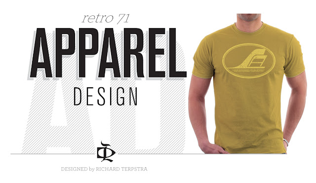
This design is for the Latin-American Development and Management Corporation. The logo I came up with was inspired by vintage airline logos from the late sixties along the lines of TWA, SwissAir, Lufthansa, PanAm, Delta and so on.  The color palette is a simple monochromatic color scheme in mustard yellow and deep golds. Finishing the design, I used a distressed texture to help give it a worn look.


Well that does it for this week’s concept. I will be taking another small sabbatical from the typography case studies as I need to get ready for the D23 Expo. But stay tuned, because I will continue to make other updates to Designerland, including the final installment of our real estate/land development concepts. I hope to see some of you at the Expo.

Friday, August 5, 2011

Country Bear Jamboree


Welcome back to another edition of Designerland's theme park attraction typography case studies. This week we'll be looking at one of Walt Disney World's classic show attractions, the Country Bear Jamboree.
The Country Bear Jamboree was originally designed for Disney's Mineral King Ski Resort by Imagineer and show designer, Marc Davis. As we know, the Disney's Mineral King Ski Resort never made it off the drawing board, but Marc still felt the show would be a perfect attraction for Disney World's opening day back in 1971. The Country Bear Jamboree became an instant classic amongst east coast vacationers—it became so popular that WED Imagineers brought the show to Disneyland on the west coast. Over time, the Imagineers toyed around with seasonal overlays but quickly changed the show back after guest attendance declined. Sadly, Disneyland's show was shut down due to the lack of interest. Today you can find the original classic show at the Walt Disney World Resort and at Tokyo Disneyland, which is the only version that still hosts three seasonal overlays.


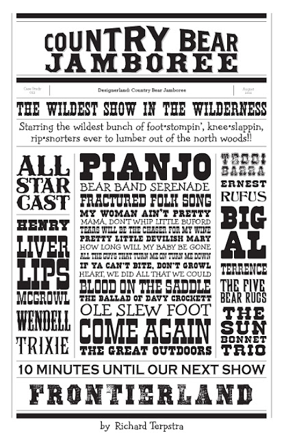
When looking at the typography from Country Bears Jamboree, we notice all the display fonts have a western theme, which fits the location of the attraction within the parks. Under the generic umbrella of western display fonts we can dissect them even further into a few categories: Wood Type, Tuscan, Iron Work, Slab Serif, Spurred, 1800's and even 1970's. Most of the typefaces used throughout the signage are the more stereotypical western looking fonts (similar to those found in other surrounding Frontierland attractions), while others are straight from the 70's with their curvy flared serifs, stems and descenders. Those 70’s looking western-like fonts are both whimsical and funny to reflect the Country Bear Jamboree show.  Also, we have to remember that attraction was created during this era. I've tracked down the typefaces that still exist today. While other fonts can be found within the attraction, many are custom, hand-drawn fonts which were most likely created by show designers at WDI.


Well that does it for this week’s case study. Check back on Monday for another Retro '71 shirt concept and thanks for stopping by! Have a great weekend.

Thursday, August 4, 2011

Kinda neat

Last night two of my non-disney related shirt designs were sported on the TV show So You Think You Can Dance. Tadd Gadduang and Melanie Moore both sported designs I created for the Dance/Lifestyle apparel company Sugar & Bruno.

Wednesday, August 3, 2011

Poster Design

Here's a jaunty little design I whipped up a couple of months ago. I tried to combine the look of an old world map/vintage metal globe with one of the maps from the back page of a park brochure.


I image the poster be tall, almost 6' tall and in a nice chunky black wood frame which would be leaning up against a wall in my studio.

More. . .

My friend Erica snapped this photo today for the blog while she was at one of her many weekly Magic Kingdom adventures! Thanks for the picture and I can't wait to see you at the Expo.

Monday, August 1, 2011

Retro '71


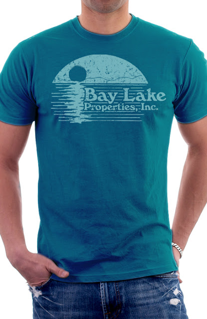
This week’s Retro '71 concept is the fourth installation of the faux real estate/land development companies used to purchase the land for the Walt Disney World Resort. 


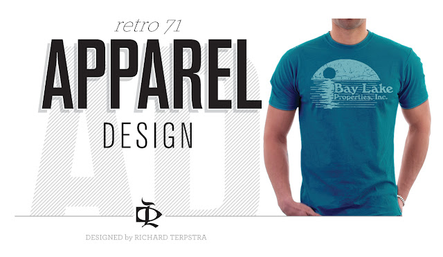
This design is for Bay Lake Properties, Incorporated. I placed a "summer camp" looking sunset and lake illustration alongside the company’s name set in a late 60's/early 70's typeface.  The color palette is a simple monochromatic color scheme in teals. Finishing the design, I used a distressed texture to help give it a worn look. 


Well that does it for this week’s concept. Hope to see you back on Friday as we look further into the fonts and typefaces used by Disney designers on some of our most beloved attractions. See you then and have a good week!