
Friday, April 29, 2011
Designerland Update
I heard back from the Disney Archives and I have been accepted into the D23 Fan Art Exhibit! They picked the first concept I came up with and the one I really wanted to work on! In all actuality I thought they may pass it up for one of the other two ideas. Needless to say I will be taking a short sabbatical from the Designerland Typography Case Studies so that I can focus on my painting for the exhibition. That's not to say I won't be updating Designerland. I plan on continuing every Monday with the Retro '71 Apparel Line concepts as well as the Wonderful World of Kuler not to mention the soundboard apps I have waiting in the wings. Once the painting is sent off to Burbank I will continue back up with the attraction case studies. Until Monday, have a great weekend!
Snow White's Scary Adventures

Welcome back, and for you first-time visitors, welcome! In this week’s Designerland Typography Case Study we'll be looking at the typefaces from another one of Disney's classic dark ride attractions, Snow White's Scary Adventures. Snow White's Scary Adventures is one of the original attractions that remain from Disneyland's opening day back in 1955. The attraction originally opened under the name Snow White and her Adventures. At the time, Imagineers might have been a little too avant garde in having guests take on the role of the beloved beauty. Guests didn't quite understand the attraction from this perspective and often asked why Snow White wasn't featured. Needless to say, the Imagineers quickly added her to the attraction to please the guests. Over time, the attraction has seen some minor upgrades to the show-building facade and also a name change due to parents complaining that the ride was a tad on the scary side. I have to agree with the parents: that attraction scared me as a child—when that wicked Queen turns from her mirror, I would always look away. Such a simple gag but HIGHLY effective.

The attraction loosely follows the plotline of the animated feature we all know and love. While Disneyland had it first, the attraction quickly became a staple of the other theme parks. The Walt Disney World Resort, Tokyo Disneyland and Disneyland Paris have their own versions as well, but that's soon to change. With the plussing of Walt Disney World's Fantasyland, Imagineers have decided to step it up a notch with an entirely new attraction based on this Oscar award-winning feature. I can only imagine the typography and signage the designers will come up with!
When looking at the typography of Snow White's Scary Adventures, there actually aren’t too many fonts to be found. This is pretty much the case with most Fantasyland attractions: limited space, shorter-length queues, and not too heavy on the thematics and atmospheric details of the attraction. Most of the typefaces of Snow White's Scary Adventures come from what I call the classic Disney Fantasyland font palette: Black Letter, Gothic, Old English, and Serif. While the fonts listed are mainly European fonts derived from British origins, the classic Brothers Grimm tale of Snow White was from Germany. Even though the main typefaces aren't really from the story’s point of origin, they still work with the overall look and feel of Fantasyland. In addition to these more typical fonts, this attraction also features Art Nouveau. But what does the Art Nouveau period have to do with Fantasyland and Snow White??? Actually, it really fits when you study some of the stylings that Disney's Animators brought to the feature film. When watching the movie, one can notice the Queen’s elaborate peacock throne—the throne’s design slightly resembles the work of famed Art Nouveau artist, Frederik Mucha. It just so happens that Disney's designers used an Art Nouveau display font for signage warning of the Wicked Witch. Was this planned from the start or simply a happy accident? I'd like to hope it was all a part of the designers’ plan.

That concludes this week's adventure in typography. See you back on Monday for a new addition to the Retro '71 apparel line. Until next time, have a great weekend!
Sunday, April 24, 2011
Retro 71

This week’s Retro 71 concept is an homage to the dreamers and doers of the Disney Theme Parks: The Imagineers.
It has been my dream since I was 12 to become an Imagineer—I would make my parents take me to the bookstore so I could drool over the pages of the Architecture of Reassurance and Building a Dream. I've mentioned before how it's one of my goals to work for WDI. Back in 2005, I got my first taste of WDI when I was chosen as a finalist in the Walt Disney Imagineering ImagiNations Design Contest. Being a finalist and winner solidified the fact even more. I have tried really hard to get my foot in that door at 1401 as well as WDW's campus. No luck thus far, but one doesn't just give up on their dreams.

Most all Disney dorks know that the only place to score official WDI merch is at Mickey's of Glendale, and if you ever get the privilege to shop there, I suggest you have a hefty amount of spending money on your person. It's spectacular. I will add that Disney is missing out on a HUGE market by only selling WDI merchandise in this one store, but it makes complete sense. The store is designed for the employees, although D23 has opened it up to a select few fans in the area. I would love to find a small line of WDI/WED merchandise within the parks for which some of the Imagineers would design limited edition shirts. I know Imagineers create limited edition items for Mickey's of Glendale, so I have to ask, why not for the parks?!?!? It would create an entirely new segment within the park merchandise and I feel the category would be well received.
This week’s concept is a shirt design that I imagine would sell at a place like Mickey's of Glendale. The shirt is inspired by the vintage WED line from a few years back. I used one of my favorite Walt Disney Quotes on the front that really sums up what Disney and his Imagineers did and still do to this day. I then signed the quote with the original WED Imagineering logo. As you can see, the quote is set in the same typeface the WED logo was created in—what a brilliant typeface! The overall design is simplistic and crisp in a very 1950's/1960's fashion.

Well that does it for this week’s Retro 71 installation. I hope you've enjoyed it as much as I have. Until Friday, have a great week and see ya soon!
Thursday, April 21, 2011
Indiana Jones

In this week’s attraction typography case study, we'll look at the typography used in the various Indiana Jones attractions within the theme parks. Indiana Jones has a huge presence within some of the Disney Theme Parks across the globe: Indiana Jones Epic Stunt Spectacular at Disney Hollywood Studios; Indiana Jones and the Temple of Peril at Disneyland Paris; Indiana Jones Adventure: The Temple of the Forbidden Eye at Disneyland; and lastly, Indiana Jones and the Temple of the Crystal Skull at DisneySea. These attractions take the forms of audience participation shows, state-of-the-art dark rides and simple themed roller coasters.
When looking at the typography from all of the Indy attractions, one in particular stands out: the Indiana Jones Adventure: The Temple of the Forbidden Eye. With its elaborate queue and pre-show, the Imagineers really set the stage for guests. The typography throughout the queue is one of the key elements in presenting a believable story. If you're a fan of Indy movies, you immediately think of adventure, 1800's & early 1900's archeology, distressed and aged artifacts, art deco, the arts and crafts period and so on. These same themes are present within all of the display fonts designers used in and around the attraction.

What makes this one attraction even more exciting for typeractive people like myself is that designers at WDI created their own typeface for this attraction . . . well, more of a hieroglyphic. Hieroglyphics were one of the earliest forms of character (letter) writing, even though they're more closely related to pictograms and ideograms. When the attraction first opened, Imagineers provided clue cards that assigned the various characters of this ancient language to letters that closely matched our alphabet so that guests could decipher the messages. This was a simple but amazing feature to this attraction—I only wish the line didn't run so long so that I could one day explore the temple and decode the messages for myself.
The other Indy-based shows and attractions include more of the standard Indiana Jones fonts with some subtle changes here and there. Not enough typography to build and design an entire case study around, so you will see some of the typefaces from other locales within this week’s poster. I hope that one day I can visit the other Disney Theme Parks so that I can continue my research, but for now, photos on the web will have to do.

Growing up with Indiana Jones films, I can only hope that Disney and Lucas will continue to plus this property and bring more amazing attractions and offerings to the theme parks, along with some more amazing thematic typography. Well that does it for this week’s case study. Tune in on Monday for another Retro 71 concept and as always, thanks for stopping by.
Wednesday, April 20, 2011
Color Study

A new color palette has been added to the DisneyDesignerland Kuler account! Before you jump on over to check it out can you guess where this color palette is used?

Give up??? Find out the answer over at Disneydesignerland's Kuler page found here.
Check back for more random updates to Wonderful World of Kuler. See you guys back here on Friday for a new Disney Theme Park Attraction typography case study.
Sunday, April 17, 2011
Retro 71

This week’s Retro 71 concept is a special twofer. The concepts are based on my favorite resort, The Polynesian Resort. The Polynesian Resort was one of the original hotel concepts dreamed up by WED Imagineering for the Walt Disney World Resort, and it opened the same year as the theme park in 1971 under its original name, The Polynesian Village. The resort has not only grown in size due to its popularity, but it has also seen some changes in its look and branding. From fonts to color palettes, to pools to interior decor, the resort has evolved over the years.

When thinking of shirt concepts for the Polynesian Resort, I wanted to pay tribute to the original name of the resort and use the original logo with the iconic tiki idol. I love all the old branding where the designers used the main tiki idol on pretty much everything from hand soap wrappers to shot glasses (aka tooth pick holders), from frosted libation mugs to even "privacy please" door hanger signs. Nowadays he's seen in a few places around the resort, most notably on trash cans.

The first shirt concept is the classic logo. I tried to plus the design by changing the colors to match the original tile floor of the resort. The original color palette of the resort consisted of deep browns, aqua teals and mossy looking yellowish greens, and I wanted to bring that back to keep it consistent with the overall look of these shirts. I picture this design on a vintage ringer that has color banding around the arms and neck in either a dark brown or the same color as the resort name depicted on the shirt.

The second shirt concept is our favorite tiki idol, but with his legs! Today, only a couple of locations remain where you can still see him depicted with his jaunty little legs. Keeping the color story consistent with the first shirt, I incorporated the same color palette. I believe it really captures the feel and tone of the resort from back in the day. When looking at the shirts next to each other, I can imagine seeing them sold together at the Boutiki in the Great Ceremonial House. In my downtime, I've come up with an entire product line that includes these two shirts along with a few other fun tropical treasures that celebrate the history and traditions of this amazing resort.

Well that about does it for this week’s Retro 71 segment. I hope you enjoyed the designs! Until next time, have a swell week and be on the lookout for a new soundboard coming soon, not to mention even further looks into the typefaces used on some of our favorite Disney Theme Park attractions. See ya soon!
Thursday, April 14, 2011
Backstage Magic with Mickey Mouse

In this week’s case study we'll be looking at the magical typography used throughout the new Backstage Magic with Mickey Mouse character meet and greet.
On April 1st of this year, the Main Street Exposition Hall changed its name to the newly renovated Town Square Theater. The Theater now includes two elaborate character meet and greets: one for the Disney Princesses and one for the main mouse. The new character meet and greets are the first to utilize Disney's FASTPASS ticketing system, which now guarantees guests an audience with the beloved mouse.
Imagineers designed this new experience to resemble a turn-of-the-century magic show, where Mickey is the main magician and the guests get to venture backstage to interact with him before his next act of people-pleasing prestidigitation.

While in line, guests are treated to humorous and clever advertising bills for Mickey the Magnificent. The posters depict Mickey and some of his noteworthy feats of illusion. Using cutting edge technology mixed with some good old fashioned mathematical magic, a few posters actually interact with guests as they wait.
These posters set the stage for some amazing type specimens. The designers of the various posters and signage really streamlined the font palette. Most of the typography comes from one particular type foundry, which is noted for producing turn-of-the-century, elaborate display fonts. Some of the classifications of fonts seen throughout the new meet and greet area are: Western, Victorian, Script, Late 1800's, Early 1900's, and Decorative. Main Street U.S.A. has a great many fonts used from this foundry, and if one were to ask me where to find Disney Park fonts with that Main Street feeling, I would recommend this one foundry right off the bat. What is this foundry you ask? Well . . . a true type magician never reveals his secrets.

I think that does it for this week’s typography case study. Tune in Monday for another Retro 71 concept and for those of you who have enjoyed the Haunted Mansion Soundboard app, I pleased to inform you that I have created 2 new soundboard apps and have a 4th one in the works, so tune in for these real soon! Thanks for stopping by and have a great weekend.
I think that does it for this week’s typography case study. Tune in Monday for another Retro 71 concept and for those of you who have enjoyed the Haunted Mansion Soundboard app, I pleased to inform you that I have created 2 new soundboard apps and have a 4th one in the works, so tune in for these real soon! Thanks for stopping by and have a great weekend.
Sunday, April 10, 2011
Retro 71

This week’s Retro 71 concept is another design based on the classic Disney Theme Park souvenir bags. Epcot Center merchandising used this particular bag design back in the early 80's. It mimics the same off-set style seen on other Disney Resort bags from a few years earlier, which I've already worked into a shirt design a few months back. The original bag’s color palette uses periwinkle purples, burnt reds, golden rod yellows and bright oranges. The overall design is a perfect transition between the late 70's and early 80's.

Recreating the graphic in Illustrator would have given this design a crisp new look, so I opted to distress and texture the design before turning it into a vector in order to pay homage to the fact the art came from a paper bag. Most of the bags still floating around from this time period have seen some wear and tear, and I wanted to reflect said wear with this design instead of just recreating it. Also, I wanted to retain that off-set registration look. I decided to change the color palette up by replacing the purple with a brighter aqua and by using a gradient of vintage colors seen in other Epcot Center branding from the time period.

Overall I think it's one of my favorite Retro 71 designs, but then again I'm a little partial to all of them. That concludes this week’s Retro 71 segment. I look forward to seeing you back on Friday for a new Designerland Case Study. Have a good week and see you soon!
Saturday, April 9, 2011
Color Study

A new color palette has been added to the DisneyDesignerland Kuler account! Before you jump on over to check it out can you guess where this color palette is used?

Give up??? Find out the answer over at Disneydesignerland's Kuler page found here.
Check back for more random updates to Wonderful World of Kuler. See you guys back here on Monday for a new Retro 71 concept.
Thursday, April 7, 2011
Mad Tea Party | Alice in Wonderland

In this week’s Designerland typography case study, we'll look at the wild fonts from the Alice in Wonderland dark ride and the Mad Tea Party. The Alice in Wonderland dark ride is a classic of the Disneyland Resort. Opened in 1958, the attraction honors the time-treasured animated classic where guests follow Alice down the rabbit hole and through her many adventures in Wonderland. As an East Coaster, I’d never had the privilege of riding this attraction until about two years ago while visiting the Disneyland resort for the D23 Expo week. I truly enjoy this dark ride, but what dark ride don’t I enjoy?
Having grown up with the Disney World Resort as a second home, my only experience with Alice in the parks was the Mad Tea Party. Mad Tea Party is a copy of Disneyland's version, only Walt Disney World Resort's Mad Tea Party features an elaborate pavilion-type awning that offers relief from the harsh Floridian sun and tropic storms.

The classic spinning tea cups and saucers have become a staple in Disney Theme Parks across the globe. Every park has its own version with only a few differences, such as adjustments in the names of the attractions, the color palettes, and the pattern designs on the tea cups. Also, some have awnings while others do not.
Disney designers took a whimsical and wacky approach when selecting fonts for the signage and logo treatments. The theme is extremely fitting, seeing how the attractions are based on Wonderland and the famous Mad Hatter tea party scene. All of the fonts used in this attraction are display fonts that include curled or swirl serifs (which mimic the theme of the spinning tea cups) and fonts that look as if they bounce up and down the baseline. This attraction doesn’t feature some of the highly-used fonts of Fantasyland, such as Bradley Gratis. However, Devinne Swash, another favorite font of Fantasyland, is present in the signage for both of these Alice attractions. In my research, I could only find one bit of signage that pays tribute to the fact that Alice in Wonderland is a classic British novel. Other than that, this attraction abandons the storybook village look of Fantasyland, but does it appropriately well.

That about does it for this week’s case study. Tune in on Monday for another Retro 71 concept design and look forward to some new colors added to our Wonderful World of Kuler account. As always, thanks for popping in and have a swell weekend.
Tuesday, April 5, 2011
A Thrilling Treat
As promised here's my special treat for those of you who have visited designerland and continue to do so: The Haunted Mansion Sound Board.
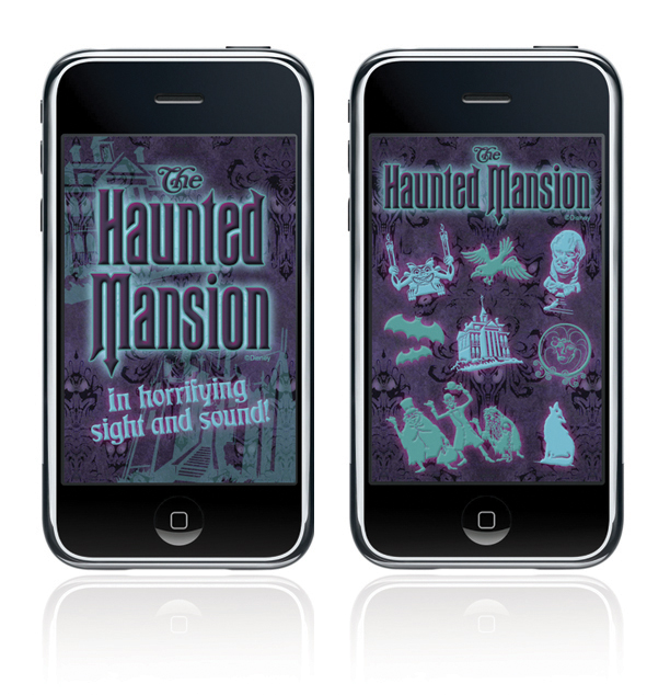
The Haunted Mansion Sound Board is a simple web application I created out of my appreciation for the classic attraction. A web app will run SLOWER than a normal native app. The difference between a web app and a native app is that a web app is hosted and "lives" on the internet whereas a native app actually downloads and "lives" in your mobile device.
HEED THIS WARNING: The soundclips will take a while to download, I wish that they would load faster but unfortunately that's just how web apps work.
The Haunted Mansion Sound Board was developed for iphone users in mind but is supported by Google Android mobile devices as well.
For iphone users: using the internet on your phone go here: HMSoundBoard
Once the page loads click on the "Add to Bookmarks" icon. Now click the "Add to Home Screen" and the Haunted Mansion Sound Board icon should load. That's it.
For Google Android users: using the internet on your phone go here: HMSoundBoard
Bookmark the page. Now open the browser bookmarks screen, then long-press the bookmark you want, then select the add to home screen.
The site will look odd if you just go to the link above on your desktop computer. The url/site is formatted to fit your mobile device's screen and the sounds will not work unless you're using Google Chrome and Safari.
Well I hope you guys enjoy it, if it weren't for copyright issues I would make it a native app in a bride's heart beat and publish it to the app store! If you like this app and don't mind it taking a while to load I have another Disney attraction sound board app in the wings ready to go!
Thanks again guys for coming to my blog! See you back here on Friday for a new Disney attraction typography case study!
Sunday, April 3, 2011
Retro 71

This week’s Retro 71 shirt concept is based on the 1989 Walt Disney World Resort ticket art. I remember this particular design among others from my childhood, from a time before the key card tickets came into play. I always enjoyed the iconography of the tickets, so what better place to appropriate these designs than for the Retro 71 line.

The color palette is taken from a ticket from a later date, but the design remained the same. The muted teal greens and washed-out creams remind me of how the tickets would look toward the end of our vacations: highly used with lots of wear and tear. I always enjoyed the paper/cardstock Disney used for the older tickets. By the end of our trips, the paper would become soft from wear and the cotton fibers would begin to pill. With that in mind, I added some aging and distressed textures to the design.

Well that does it for this week’s Retro 71 installation. The apparel line is really taking shape, and judging by the responses from readers, I think it could be a huge success. Thanks for stopping by and have a good week. Make sure to come back this week—I have a special treat in store. See you soon!
Subscribe to:
Posts (Atom)