Showing posts with label Walt Disney World. Show all posts

Wednesday, June 26, 2013

SpectroMagic


Welcome back to Designerland. Yes, I know...it's been ages since I've posted anything. Life does carry on and between my full time job, freelance clients and renovating a home there's not enough hours in the day for font finding and other fun stuff. Granted, I have enough shirt concepts in the wings to last me until next Christmas but I just can't keep posting that. I'm not a one trick pony, there's many tricks up this magician's sleeve.

Speaking of fonts, I just locked into snatching up a ton of new photos from Epcot and hope to continue our Designerland Typography Tour of Epcot Center come late this fall. In the mean time here's a new shirt concept based on one of my favorite parades, SpectroMagic.


The main logo of the parade along with the Mickey globe icon and original WDW Resort logo have all been treated with a vintage "Hamilton Type" letterpress like look. The color palette is a simple 2 color, over print method in aqua and carrot orange. I was channeling my inner Kevin and Jody when I picked this palette out.


 Well that does it for this installment. Tune in soon for more fun Designerland offerings.


Sunday, November 4, 2012

The Grand Floridian Resort & Spa


Welcome back to a long-overdue Designerland Typography Case Study. This week we will look at the wonderful typefaces seen throughout the Grand Floridian Resort. Before we start, I'd like to give a BIG shout out to Cristy Greene for helping me with this post. Her photos helped me out in more ways than one. Thanks so much!

When looking at the typefaces used throughout the Grand Floridian, one thing can be certain: there are no frills or wacky display fonts. The font palette used for most of the signage and way-finding graphics use classic fonts to evoke a sense of tradition and elegance. When looking at type, the branding is very consistent with one main typeface used on most of the graphics. There are a few elegant yet classy display fonts, usually in the form of scripts used as well.


One font in particular was somewhat tough to track down since type foundries come and go. About a month ago, I stumbled across a fellow font aficionado whose mission is to track down typefaces from one particular foundry that was big in the 60s and 70s but is no longer. As I went through the collection, I noticed many fonts that Disney used in the early days of the park. In fact, one font that I had believed to be custom was included in the collection! Since this font appears on a graphic from a current project, I suspect Disney has the entire collection of this gone-but-not-forgotten foundry and are still using it today. Perhaps Disney acquired the rights to use these fonts when they were still developing Walt Disney World. 


While I have an appreciation for the fonts used within the Grand Floridian, they're not my favorite used within the parks. But my favorites will have to wait for another post, so tune in after Christmas when we head over to Epcot and begin our journey looking into the fonts and faces used to brand the 21st century. In the meantime, if there's an attraction or graphic that hasn't been covered within the Magic Kingdom thus far, let me know. I'd love to cover it between now and the holidays.

Well that does it for this week’s post. Tune in next week as I have a plethora of new Retro '71 and '55 shirt concepts just waiting to be released. Thanks for stopping by and have a swell week.

Sunday, October 28, 2012

Glow-in-the-Dark Cobweb Candy Cart


Welcome back to our last special Halloween holiday post. Over the summer, after watching a viral video of a cotton candy spinner, I developed a small obsession with the art of cotton candy making. I researched brands, makers, machines and various other sugary sweet offerings related to this fun delectable. When I learned about the LED light-up cones used for cotton candy over in Disney California Adventure, I had an idea for how to put a new spin on cotton candy. 

My idea was to reformulate the sugar floss so that the coloring within the sugar crystals is black light-responsive as well as safe to eat. In place of the multi-color LED lights within the cones would be mini black light LEDs. I could only think of one place where this product should live: The Haunted Mansion Glow-in-the-Dark Cotton Candy Cart.


The cotton candy would be branded as Cobweb Candy, and through the technique of double spinning—which is used to create multi-colored cotton candy on one cone—the treat would take on a ghostly appearance.


For the past six years I have had a Disney partner in crime. While he lives in Canada and I live in Indiana, our passion for all things Disney has kept us conspiring toward magical madness. I decided to run the concept by him to see if he'd like to help out with the idea. He loved it and we both agreed to work together in bringing this dream one step closer to a reality. 


We came up with the story that the cart belongs to a Mason who deals in the dead. The cart’s design has bricks, shovels, bags of mortar, trowels and other various tools a graveyard Mason would need. We incorporated the wrought iron detailing from the Mansion into the top of the cart to help tie in the Mansion’s theme. The signage plays upon various fonts used over time for the Mansion’s branding. We imagine the cast members working the cart would be dressed similarly to the caretaker within the Mansion. The cart would have an area for the cotton candy spinner machine, finished product behind glass and compartments for the ingredients and the cash register. The spinner machine itself would also have a center black light so the candy would glow while the cast member spins his webs of wonder.


The cart would only roll out at dusk and would be located near the Mansion’s entrance.

I want to give a big thanks to Ian Giles for helping out with this concept! I couldn't blue-sky without you!!!! Well that does it for this week’s post. Tune in next week as I return to my typography case studies and other random apparel goodness. Thanks for stopping by and Happy Halloween!

Sunday, September 16, 2012

Trader Jack's


Welcome back to another Designerland post--I hope you all had a great weekend! This week, I'd like to share a thought. Now it’s nothing new or original, just once again dusting off the past for the fans of today! After last week’s Polynesian Resort type post, I received some emails from readers who really enjoyed the case study, so I decided to roll out this concept today for us Poly fans.

With the ever-growing popularity of Disneyland's Trader Sam's, I feel that TDO and WDI should seriously consider bringing something similar to the east coast, now that the Adventurers Club is gone. Some of you may recall that Disney World once had a tropical-themed dive located at the Polynesian Resort--Trader Jack's Grog Hut! I, for one, would love to see Disney roll out a similar, updated Tiki bar based on the long-forgotten Trader Jack's...new menu, new look, new gags but the same vibe.


Personally, I wish they would just bring Trader Jack's back to the Polynesian Resort. It could also fit in at Downtown Disney where there is more traffic passing through, but with the ever in-flux state of DTD and what once was Pleasure Island, I'm not sure how well it would work in that locale. Regardless of where it turns up, it could be the east coast’s version of Trader Sam's.


With that said, here are a few merchandise concepts I worked up for this hypothetical Tiki bar. One apparel concept displays a logo I came up with (in an off-set matchbook print look) that draws inspiration from the original Polynesian Village/Resort logo. The second apparel concept is just something whimsical and wacky, hence the display font.


Now no good Tiki bar is complete without the option to take home a Tiki mug, so I combined the two main Polynesian Tiki icons into one to create the Kapu Cup. If I could have only one Tiki mug in my collection, I would want something similar to this.


Well that's all for this week. Hope you enjoy the concepts and thanks for stopping by. Have a great week and see you all real soon!


Sunday, September 9, 2012

The Polynesian Resort


Welcome back to another edition of our Designerland typography case studies. This week, we'll jump back on the monorail and head over to another Disney home away from home, the Polynesian Resort.

When looking at the type treatments throughout the resort, one thing is certain: this resort is loaded with display fonts. These are all heavily-themed tropical (and sometimes comical) display fonts. This makes sense, given the tropical theme, but if you compare these fonts to a Disney resort actually located on a Polynesian island, you'll see a big difference. The Aulani doesn't need to really need to shove the tropical theme in your face since you're actually IN Hawaii, so the typography there is a little more subdued.


When the Polynesian first opened under the original name, the Polynesian Village, Disney designers used a more 70’s, non-tropical font to brand the hotel. The font Blippo, designed by typographer Robert Trogman, was used to typeset the logo, but over time those whimsical tropical display fonts crept their way in and made the Poly their home. In the 90’s we see Blippo replaced with Rusticana, which was designed by Frutiger as part of a type revival for the Linotype Foundry.  


I'm a huge fan of the Poly and I always loved how even down to the fonts, the resort reflects the beloved kitsch from the late 50’s and early 60’s. The fonts help tell the story even if sometimes it hits us over the head with tiki goodness (although in my opinion you can never have enough). Well that does it for this week’s post. Tune in next week for a new Retro '71 shirt concept. Thanks for dropping in and I hope you all have a swell week!


Sunday, September 2, 2012

Space Mountain


Welcome back to another fun-filled edition of our Retro apparel line. This week, we'll be honoring Space Mountain, seeing how a plethora of new apparel paying homage to this time-honored attraction just hit Tomorrowland shelves.

My take on this classic attraction comes from Disneyland's Easter Weekend flyer. The back of the flyer showcased a contemporary Space Mountain logo along with some creative copy on when this new attraction would open. When I stumbled across this logo I knew I had to use my talents in illustrator and font-finding to recreate it!   


After recreating the logo and tracking down the main futuristic display font, I added some layers of strokes in various widths and of course some slight wear and tear to the design. I opted not to add any park logos to the concept because the design could be used universally at many of the different Disney Parks & Resorts.


Well that does it for this edition of our Retro '55/'71 apparel concept. Be sure to stop back next weekend for more fun Designerland offerings and thanks for stopping by. Have a swell week!


Sunday, August 26, 2012

The Contemporary Resort

Welcome back to another edition of Designerland's Typography Case Studies. This week, we'll be looking at some of the various fonts and typefaces used at the Contemporary Resort Hotel.


When it comes to typography and the Contemporary, not too much can be said that I haven't already mentioned here at Designerland. When I view the resorts at a glance, I liken it to looking at a "simplified" version of the Magic Kingdom itself. The Polynesian mirrors Adventureland, the Contemporary mirrors Tomorrowland and the Grand Floridian mirrors Main Street. So it comes as no surprise that most of the fonts used at the Contemporary are sleek, modern sans serif typefaces, some of which are actually seen in use over in Tomorrowland. This is what I like to call the three C's of design: Concise, Coordinated, and Cohesive.  


Over the years, the Contemporary Resort has seen a handful of changes in its graphic design and typography. If we look at the resort’s logo alone, we can see just how many changes the resort has gone through over the years. Disney designers have kept true to the original feel for the most part with a few liberties taken here and there in the typography, mainly in the form of fanciful display fonts used for various dining and shopping features.


Next time you're staying at the Contemporary, take notice of those classic typefaces used throughout the resort, then see if you can find those same faces used on the Monorail and throughout Tomorrowland. I bet you can! Okay folks, that does it for this week’s post. Tune in next week for a new Retro 71 shirt concept and have a swell week!


Sunday, August 19, 2012

Country Bear Jamboree


Welcome back to Designerland. I hope everyone had a good weekend. This week’s post is a Retro '55 and Retro '71 combined post that I hope you all will enjoy. 


This week’s shirt design honors the beloved attraction The Country Bears Jamboree. Since it was recently announced that the show will undergo a refurbishment, I thought this would be a fitting time to pay tribute. This design is based more specifically on the Country Bear Vacation Hoedown "overlay" designed for Disneyland, which was rolled out in 1986, replacing the original Country Bear Jamboree show. In May of that same year, Walt Disney World decided to change up their classic show by using this same overlay, but in 1992, WDW restored the show to its original glory.


The shirt design is based on Henry's old camp t-shirt he sported in the show, which was meant to look like an old vintage camp tee that he got while a younger cub at Camp Grizzly. The shirt is basically the same design Disney Imagineers came up with plus our time treasured distressed texture.


Could Camp Grizzly be part of a bigger WED/WDI story dating back to the time when The Country Bears and Moonshine Express was in development? Could it somehow be related to Grizzly Peak and Grizzly Gulch? Needless to say, WDI loves using the word Grizzly when developing attractions based on bears and the frontier...is it all just a coincidence, considering that California's state animal is the Grizzly?

Well that does it for this week’s post. Tune in next week for a new Designerland typography case study and have a swell week!


Sunday, August 5, 2012

Disney's Monorail System


Welcome back to another Designerland Attraction Case Study. This week, we'll be leaving the Magic Kingdom behind as we jump aboard our highway in the sky. For those of you standing, please hold on to the hand rails throughout our journey and stay clear of the doors. And for the comfort of others, no smoking, please.

When it comes to the Disney Parks’ Monorail Systems, there's so much history we could talk about, from the Monorail’s great beginnings at the Disneyland Resort to the majestic fleet at Walt Disney World. But here at Designerland, we talk type, so let's delve into those finicky and at times hard-to-find fonts that have appeared in, on or around the Monorail.


When thinking of the Monorail, the terms futuristic, modern and streamlined come to mind. What better typefaces to use than sans-serif fonts which often share this same description. Looking back at the first Monorail at Disneyland, most of the type used were actually hand-generated display fonts that looked like something out of a sci-fi comic. Over the years we see a transition to more classic typefaces such as Futura and Helvetica. The Walt Disney World Resorts’ Monorail signage and graphics pretty much align to those standards with a few exceptions, depending on which resort you're staying in.

A few years back when Imagineers decided to give Disneyland's Monorail a facelift, they decided to brand the attraction with a decorative display font alongside a very popular Epcot Center display font for most of their signage, merchandise and literature. When comparing the two resorts from a typographical viewpoint, Disneyland's Monorail is more fantastical in a Buck Rogers sort of way, whereas the Disney World Resort’s Monorail is more mod.


Well that does it for this week’s post. Thanks for stopping by and be sure to tune in next week for a new Disneyland Retro '55 shirt concept. Until next time!


Sunday, July 29, 2012

Wedway Peoplemover


Welcome back to another edition of our vastly growing Retro '71 apparel line.

This week’s concept is based on the WED Transportation System’s branding from a 1982 marketing brochure. Once upon a time, Disney branded, marketed and packaged various park specialties such as the Monorail and the WEDWAY Peoplemover to outside cities and businesses. If you'd like to know more or see this jaunty brochure in action, jump on over to Progress City, U.S.A. by clicking here.


The design for this week is a simplistic black shirt with graphics based on the logo and various type from the brochure. The color palette was taken directly from the brochure and its branding. When printed, the white sections of the design would be discharge ink to give it even more of a vintage feel.


Well that does it for this week’s Designerland installation. Hope to see you back next week as we move on to the wonderful world of the Monorail typography. Have a great week and see you soon.


Tuesday, July 17, 2012

Main Street Train Station


Welcome back to another fun-filled typography case study here at Designerland. This post will conclude my research into the fantastic fonts of the Magic Kingdom. We will soon move on to the resorts and then we will take a look at Epcot at the beginning of next year.

There are a few attractions within the Magic Kingdom I didn't cover simply because they didn't have enough fonts and typefaces for me to conduct a proper investigation. However, if you can think of any attractions that you feel I overlooked, let me know. I may open a special reader case study just for you! My only stipulation is that the case presented MUST come from the Magic Kingdom—other parks such as Epcot, DCA, DHS, AK and so on have their own case study files which are currently open and in the works.


With that said, let’s end our grand circle tour of font finding properly at the Main Street Train Station. As mentioned in the Main Street Case Study, the train station continues using serif fonts, but instead of over-designed, period-appropriate display fonts, the station contains 90% classic serif typefaces with a few display fonts thrown in. Some of the same typefaces found here can also be found over in Liberty Square. However, Disney Designers decided to break one rule, especially when dealing with typography and era-specific looks. Wanna know what it is? It’s the main Disneyland and Walt Disney World sign, which faces the entrances to the parks. Look closely—do you see a futuristic sans serif typeface yelling out the population of the park? I sure do. I would love to know the reason for this odd man out. Maybe they needed a semi-condensed typeface that would allow for all those zeros. Who knows?


Well that does it for this case study. I’m going to be taking a small summer break and return in the near future with more Designerland offerings, so I hope to see you back real soon. Thanks for stopping by and have a swell week.


Wednesday, July 4, 2012

Retro '71


I was going to wait until Sunday to post a brand new Retro '71 Concept but how could I not celebrate our Independence Day with out some Theme Park apparel love???


This quick (and I do mean quick) design is based on the Disneyland grand finale promotional material for America on Parade from September 12, 1976.  I changed up the copy to a basic celebratory holiday phrase. I also made a counter part for the Walt Disney World Resort.  I couldn't find a display font that really matched the copy from the original promo material, so I opted for a bottom-heavy display font from that era. If I had more time I would of hand created it but like I said this was a last minute concept/post.


Of course no shirt is complete with out some vintage wear and tear! Well that does it for this special bonus concept. I hope all of you have a safe and fun Fourth of July and tune back in this Sunday for my first Disneyland shirt concept. I'm really excited about it and I hope all of you who have been asking where are my Disneyland concepts will enjoy it. See you all soon!


Sunday, July 1, 2012

Poster Design

New attraction poster designed to accompany the series from back in 2011. If you need a trip down memory lane the series can be see here.


Tune back into Designerland next week as I release my first DISNEYLAND retro shirt. Hope to see you all back here until then, have a great week and see you soon.


Monday, June 25, 2012

New Designerland Soundboard

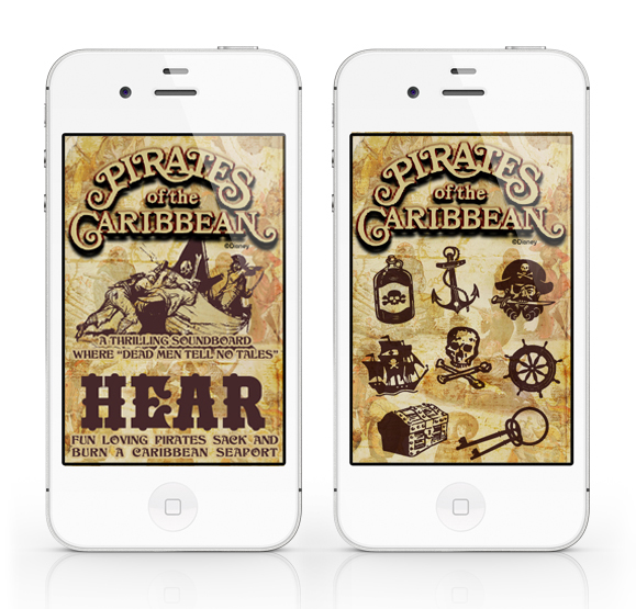
The fourth installation of the Designerland Soundboards: Pirates of the Caribbean.

The Pirates of the Caribbean Soundboard is a simple web application I created out of my appreciation for the classic attraction.  A web app will run SLOWER than a normal native app. The difference between a web app and a native app is that a web app is hosted and "lives" on the internet whereas a native app actually downloads and "lives" in your mobile device.

PLEASE NOTE: The soundclips will take a while to download, I wish that they would load faster but unfortunately that's just how web apps work.

The Pirates of the Caribbean Soundboard was developed for iphone users in mind but is supported by Google Android mobile devices as well.

For iphone users: using the internet on your phone go here: POTC
Once the page loads click on the "Add to Bookmarks" icon. Now click the "Add to Home Screen" and the Tiki Room Soundboard icon should load. That's it.

For Google Android users: using the internet on your phone go here: POTC
Bookmark the page. Now open the browser bookmarks screen, then long-press the bookmark you want, then select the add to home screen.  

The site will look odd if you just go to the link above on your desktop computer or iPad. The url/site is formatted to fit your mobile device's screen and the sounds will not work unless you're using Google Chrome or Safari.

Well I hope you guys enjoy this latest addition. If you like this app and don't mind it taking a while to load I have a few other Disney attraction soundboard apps in the wings!

Thanks again for stopping!

Sunday, June 17, 2012

Main Street USA Part 3

Welcome back to Designerland's Typography Case Study. This weeks study is our conclusion of Main Street USA as I've had to break up the post into a three part series. So sit back and enjoy more of those fantastic fonts used by Disney designers.


As stated in the first Main Street Case Study, most of the fonts used on the thoroughfare are display fonts ranging in classifications such as Victorian, Script, Tuscan, Latin, Slab Serifs, Serifs, Edwardian, Ornamental, and so on, used for the various fictitious storefront shops.


Well that does it for the final installment. . .or does it? Main Street is ever evolving with the plussing of new signage and graphics. New fonts will be added yearly and I can't wait to track more down. In my research for this three part case study I was able to locate 68 fonts and just today I found a new one making it 69. I have over 100 reference photos of fonts I have yet to track down and will always be on the hunt. Look for updates. Well that about does it. Tune in next week as I spent the last three days working on some overdue offerings for Designerland. Until next time, have a great week. Thanks for stopping by.

Sunday, June 3, 2012

Retro '71


Welcome back to Designerland and another fun-filled Retro '71 shirt concept. This week’s post is a special three-for-one that I hope you'll all enjoy.

When WED Enterprises started dreaming and scheming up the Walt Disney World Resort, Imagineers had dreamed of 5 home-away-from-home domiciles that surrounded the Kingdom: The Contemporary Resort, The Polynesian Village, The Asian Resort, The Venetian Resort and lastly, The Persian Resort. Sadly, the latter three never saw it past the model phase within the halls of 1401 Flower Street. Various sites have already documented the history of the "Resorts that Never Were" and if you'd like to find out more about these resorts, I suggest you take a look here, here and here.


Much like I did with the shirt series for the faux real estate companies that purchased the land for the Walt Disney World Resort, I decided I would try coming up with logos for these “lost” resorts. I'm sure somewhere in the halls of WDI, in some flat file, there may be some concept renderings of logos for the resorts. Seeing how I don't have access to that type of stuff I just decided to use my imagination...after all, imagination is the heart of all creation, right? I tried focusing on simple iconography mixed with display fonts that I felt carried the story of each resort. The real trick was trying to get them to stylistically flow with the Contemporary and Polynesian Village's original logos.


The shirt colors and ink colors are derived from color combinations that are true to the countries these resorts were themed around. An homage to ideas that never made it, but should have....


Well that does it for this week’s special post. Tune in next week for the final Main Street Type Case Study I've been promising you. Have a great week and see you all soon.