Monday, April 30, 2012

Color Study

A new color palette has been added to the DisneyDesignerland Kuler account! Before you jump on over to check it out can you guess where this color palette is used?


Give up??? Find out the answer over at Disneydesignerland's Kuler page found here.

Check back for more random updates to Wonderful World of Kuler.


Retro '71


Welcome back to another edition of Retro '71. This week’s design is my second homage to the lakes and lagoons of the Walt Disney World Resort. The last concept I designed honored the Seven Seas Lagoon so for this week’s concept, I honor Bay Lake.


The concept behind the design is a tongue-in-cheek, retro-inspired shirt for a fictitious boating club to which the Walt Disney World Resort offered membership in the early 70's. Using retro-style art and fonts that evoke both sailing and typography from the 70's, paired with a color palette that plays off the first design, the shirt is a perfect tribute to leisure activities the resort offered.


Well that does if for this week’s concept. I'm still working on the Orange Bird feltie patterns and the second installment of our Main Street USA typography case study. Tune in soon for those fun posts and I hope all of you have a great week.


Sunday, April 22, 2012

Future World


Welcome back to another edition of our Retro '71 apparel line. This week’s concept is based on art from a vintage Epcot Center Future World button.

Back in the early days of the Walt Disney World Resort, Disney designers created a series of montage collage-based illustrations that really captured the feel of the parks. These collage illustrations were used on paper bags, tin trays, buttons and various print materials. I've already created designs based on a few of these collages and this Epcot Future World button was the last in the series. I had meant to present it a few months back when a few people were discussing it on Twitter, but find myself just now getting around to it.


I created the design in a three color, off-set print look in the early branding color palette of Future World, as seen in the Epcot Center maps of the time. The design would be printed in water-based inks or plastisol ink run through a high mesh count so the ink would be soft to the touch. Finishing out the illustration is a distressed texture to set the vintage look and feel of the design.


Well that does it for this week’s concept. Tune in next week for part 2 of the Designerland's Typography Main Street U.S.A. Case Study. Hope you all have a wonderful week and see you soon. Thanks for stopping by!


Monday, April 16, 2012

Retro '71


Welcome back to another addition of our Retro '71 apparel line. This weeks concept is based on vintage Walt Disney World Resort merchandise. Over the past few weeks I've been out visiting the various antique and thrift shops Indianapolis has to offer. I've come across some amazing artifacts and now have officially become obsessed with vintage theme park merchandise. I know that I could easily acquire vintage merchandise via ebay but what's the fun in that? I do however use ebay as a reference before I begin hunting. 

During my research I came across a series of 4 mini glass plate coaster from the Magic Kingdom, simple in design and in colors of aqua blue, green, black and white depicting Adventureland, Liberty Square, Fantasyland and Main Street U.S.A. I knew right away that I must incorporate these designs into apparel for Retro '71 as well as find them for my collection.


I used the art directly from the plate, recreating it in Illustrator. The only changes I made were the main typeface for Adventureland (I reset it in a display font Disney used back in '71 for the branding of Adventureland), using the original Walt Disney World flag logo and adding the distressed textures.


I placed the design on a heathered green shirt. The printing technique would be waterbase inks or plastisol ran through an extremely high mesh count in order to get a soft hand.  The design would be printed without an underlay so that the print really looks vintage. 

There's a fine line when trying to make something look vintage when it comes to printing. Simply adding a texture to your art file only takes you so far. You need to find the happy medium with not only your art but with print production as well. Most if not all my shirts would be printed in similar fashion as Junk Food apparel. Fact: they have the best printers and printing techniques when it comes to authentic faux vintage looks. 

Well that does it for this weeks addition. Tune in next week for part 2 of our Main Street U.S.A. typography case study. Hope to see you back here soon and have a great week.


Monday, April 9, 2012

A sneak peek!!!

Working on something fun for Designerland. . .


Check back soon to see the finished product and to download instructions (including a pattern) for you to make your own! See ya soon!
 

Main Street USA Part 1

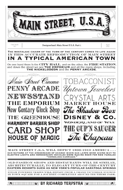
Welcome back to a long-awaited Designerland Typography Case Study. As promised, this week we're looking at the amazing typography used on Main Street U.S.A. Main Street is a typographer’s paradise full of amazing vintage display fonts. In fact, Main Street is the one place within the Kingdom that is most saturated with typography—you could spend hours if not days trying to document all the fonts within this land. This is too much content for just one case study, so we’ll look at the typography through a three part series.


Most of the fonts used on Main Street are display fonts, which are decorative in nature and used for logo design. In this case, most appear in logos for the various storefront businesses that call Main Street U.S.A. home. These display fonts include Victorian, Script, Tuscan, Latin, Slab Serifs, Serifs, Edwardian, Ornamental, and so on, but you won't find any sans serif fonts in this section of the Magic Kingdom. Through the process of locating these fonts, I found that the display fonts, while vintage in nature, actually come from type foundries from the 1950s, and some even come from foundries from today. 


This large variety in typography is another layer that helps the thematic atmosphere, and Disney Designers do it well. As of late, designers have taken a keen interest in one particular type foundry, and this brand of ornate, vintage type not only appears on Main Street, but also in the new Fantasyland expansion. So the next time you stroll down the street on your way to the hub stop, this typography is sure to catch your eye. Well that about does it for this week’s post—tune in next week for a new Retro '71 shirt concept. Have a greet week and see you all soon.


Sunday, April 1, 2012

Retro '71


Welcome back to another edition of our vintage vacation wear with a retro flair. For this weeks shirt I had the idea of honoring one of the unsung heroes of the Walt Disney World Resort; The Seven Seas Lagoon. I come from a time when I can remember spending ours playing on the sandy white beaches and taking a quick dip in the Lagoon to cool off from those humid Orlando afternoons. What better way to pay homage than with it's very own Retro '71 shirt.

I wanted to design a more masculine concept that played upon the notion of a fictitious activity guests partook in while vacationing at the resort while also bordering on tongue in cheek humor. I came up with the idea of using a scuba diving team. . .basically for a slight play on alliteration. I can image the daily activity being one of the Polynesian Village perks and guests diving down into the clean, crystal depths of the Lagoon to discover sunken Spanish Galleons (designed by WED Enterprises) and various undersea life.


Since we all know what today's Seven Seas Lagoon is like, I wanted to also spark the imagination of people who don't remember it in all its glory of what it might have been. The typography palette plays upon display fonts that were used heavily in the 70's along side a retro illustration of a diver. Finishing the design is our worn out, distressed texture. 


What do you guys think? Wait to you see what I have in the vaults for Bay Lake! Well that does it for this edition of Retro '71. I'm happy to report that next Sunday will by our first in a series of three Main Street USA typography case studies. I also have a new, exciting and special segment I'm currently working on for Designerland that I think you will love. Check back soon for more updates and thanks for stopping by. Have a swell week and see ya soon!