Showing posts with label Idea. Show all posts

Sunday, June 19, 2011

Retro '71


I'd like to start of this week’s post by saying thanks once again to all my readers who have bought the Tiki Pineapple Whip shirt. There's only one week left to order! If you know anyone who might be interested in buying one, please let them know. I would feel bad if someone contacted me after this upcoming Friday wanting one. Please hit Twitter, various message boards, forums and other blogs letting them know that this upcoming week IS the last week the shirt will be available!
Some of you have expressed interest in wanting to know how it's going, and I will say extremely well. After I stop taking orders, I'll share more information on how many were sold and whatnot. Now onto this week’s post.
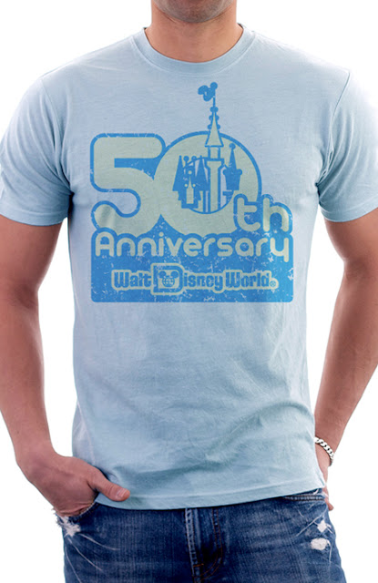
Walt Disney was said to be a man who had one foot in the past and one foot in the future. For this week’s Retro '71 design, I took that phrase to heart and started looking ahead. I've created a shirt for the 50th Anniversary of Walt Disney World. The design is based on one of the Tencennial logos created for the Walt Disney World Resort back in 1981. I absolutely love this Tencennial logo and remember seeing it while attending the celebration. Something about the logo just speaks to me as it evokes the feel of that in-between, transitional era from the 70’s into the 80's.


For the design, I tracked down a font that was similar to the one used for the logo. The actual logo was probably hand-created because I couldn't find the exact font the designers used. It's a simple two color design in water-based blue ink with a tinted discharge cream, plus we’ve added some slight distressing.


I know we're just now celebrating 40 years of magical fun, but I always like to plan ahead. Even though my designs are based on the past, I love looking toward the future. I know this won't be the direction the design group will take for branding the 50th, but this is Retro '71's way of branding and honoring the celebration even if it is 10 years away!


Well that does it for this week’s Retro '71 concept. Since the D23 painting is almost done, I’ll soon get back into the normal routine of this blog and will continue my typography case studies in just one more week. I also have another soundboard app coming soon. Thanks for visiting and have a great week!

Sunday, May 22, 2011

Retro '71


I’ve received several reader emails asking if my Retro '71 shirts are available for sale. It saddens me to tell you that none of my shirts are for purchase due to obvious copyright issues. However, this week’s Retro '71 shirt concept is another story—this shirt design could be for sale if fans enjoyed it and there was a demand. No Disney copyrighted art in this one!
The design is not based on a show or attraction, but on a rite of passage when it comes to the Disney Theme Parks. Within Adventureland at both Disneyland and Walt Disney World, there's a "must eat" on every visitor's list: the Dole Pineapple Whip! If it's not on your bucket list, it should be. It's the most amazing frozen concoction in the parks! The Dole Pineapple Whip is a staple and is so popular that Disney added a whip machine in the Polynesian Resort back when the quick service area was refurbished. I'm assuming Disney will also add this frozen treat to the new Trader Sam Tiki Bar and the Tangaroa Terrace Restaurant at the Disneyland Resort Hotel.


For this week’s shirt I tried to take a whimsical yet kitschy approach with the design. I wanted to not only represent the whip itself, but to also reflect the tropical Tahitian feel of Adventureland. What better icon to represent the spirit of Oceania than a Tiki warrior? To throw a bit of tongue-in-cheek humor into the design, I thought it would be clever to have him holding a whip in his hands. Of course this fierce tropical warrior couldn't be so mean when enjoying this delectable treat, so his intimidating frown has been turned upside down. I can imagine after the park closes that the statues, carvings and idols from around Adventureland break their poses and all hit up the Dole Whip stand to reward their hard day’s work of entertaining guests.


So, would you sport the shirt? If enough people are interested I might be able to produce a small run! Let me know in the comments section if you're a Yay or a Nay. Well that's it for this week’s concept. Thanks for visiting Designerland, and remember: when a good time comes around, you must whip it!

Monday, May 2, 2011

Retro '71


After such amazing response to the first Retro '71 Haunted Mansion shirt, I decided to design another concept based on this all-time favorite attraction.
This week's design is inspired by the vintage Disneyland Record and Book series. The original product was designed for Disneyland and features a stunning 24 page book that accompanied the long playing record with some amazing illustrations. I adapted one of the illustrations to feature Walt Disney World's Mansion instead of Disneyland’s, and I changed up the color palette. It was tricky tracking down that amazing font used on those old Haunted Mansion vinyls.


I added the original Walt Disney World Resort logo to the bottom of the art and scaled back the opacity to give it a worn, ghostly look.  Overall, it's a very vintage homage to one of my favorite attractions at the parks. 


Well that's about it for this week’s Retro '71 concept. Turn in Friday for an all new Designerland Attraction Soundboard and have a great week! Thanks for stopping by

Sunday, May 1, 2011

Retro '71

As you all know, I'm pretty excited for the D23 Expo. In my downtime I have dreamed about the launch of the Retro '71 apparel line, and what better platform to roll out the announcement of the t-shirts hitting the Vacation Kingdom than at the Expo itself? But first, what apparel line can be complete without a logo? It took me some time to come up with the logo for Retro '71, simply because I couldn't find the right typeface that spoke to me. After many versions I've finally nailed one down that I feel says, "nostalgic vacation wear with a vintage flair". The logo would be present on the labels and tags for the product line. Within the style guide I've created a simple one-color logo, the care and content label that would be printed inside the shirts instead of on a scratchy tag, and lastly, the garment hang tag.


 I see fans getting their first taste of the line with actual printed garments at the Expo, and I've been working on designing a simple but effective booth where guests can see the shirts up close, feel the vintage eco-friendly fabrics and maybe even get some free swag for stopping by.


The booth would consist of a simple wall that would be fashioned out of that horrible 70's paneling that most would stick their noses up at today. It's tacky, funny, kitschy and most of all, retro. The wall would have a large white protruding sign/frame that is made up by the original “D” from the classic Walt Disney World Resort logo, along with the Retro '71 logo. The inset area of the sign is made up of an oversized graphic of various vacation postcards from the past. 


At the far end of the booth, we would have the apparel line where guests could get a sneak peak of the first wave of shirts to hit the Walt Disney World Resort. Located in front of the shirts would be two cantilever product tables that will showcase some of the other consumer products that we will also roll out alongside some of your favorite Retro '71 shirt designs. Flanking each side of the entire wall would be our mannequins that will be of course sport some of the shirts, along with other vintage vacation apparel found from thrift stores to really set the tone of what we used to wear when visiting the parks. Lastly, the entire booth will be carpeted with a mod-patterned, high traffic rug modeled after one of the original carpet designs found in the Contemporary Resort.
We wouldn't turn you away empty-handed—for stopping by, guests would receive a free Retro '71 UV sun visor modeled after the visors sold in the parks back in the late 70's and early 80's.


What do you guys think? Would you be excited? Would you stop by our booth, and lastly, would you sport that wicked visor?

Sunday, April 17, 2011

Retro 71


This week’s Retro 71 concept is a special twofer. The concepts are based on my favorite resort, The Polynesian Resort. The Polynesian Resort was one of the original hotel concepts dreamed up by WED Imagineering for the Walt Disney World Resort, and it opened the same year as the theme park in 1971 under its original name, The Polynesian Village. The resort has not only grown in size due to its popularity, but it has also seen some changes in its look and branding. From fonts to color palettes, to pools to interior decor, the resort has evolved over the years.

When thinking of shirt concepts for the Polynesian Resort, I wanted to pay tribute to the original name of the resort and use the original logo with the iconic tiki idol. I love all the old branding where the designers used the main tiki idol on pretty much everything from hand soap wrappers to shot glasses (aka tooth pick holders), from frosted libation mugs to even "privacy please" door hanger signs. Nowadays he's seen in a few places around the resort, most notably on trash cans.


The first shirt concept is the classic logo. I tried to plus the design by changing the colors to match the original tile floor of the resort. The original color palette of the resort consisted of deep browns, aqua teals and mossy looking yellowish greens, and I wanted to bring that back to keep it consistent with the overall look of these shirts. I picture this design on a vintage ringer that has color banding around the arms and neck in either a dark brown or the same color as the resort name depicted on the shirt.


The second shirt concept is our favorite tiki idol, but with his legs! Today, only a couple of locations remain where you can still see him depicted with his jaunty little legs. Keeping the color story consistent with the first shirt, I incorporated the same color palette.  I believe it really captures the feel and tone of the resort from back in the day. When looking at the shirts next to each other, I can imagine seeing them sold together at the Boutiki in the Great Ceremonial House. In my downtime, I've come up with an entire product line that includes these two shirts along with a few other fun tropical treasures that celebrate the history and traditions of this amazing resort.


Well that about does it for this week’s Retro 71 segment. I hope you enjoyed the designs! Until next time, have a swell week and be on the lookout for a new soundboard coming soon, not to mention even further looks into the typefaces used on some of our favorite Disney Theme Park attractions. See ya soon!

Sunday, April 10, 2011

Retro 71


This week’s Retro 71 concept is another design based on the classic Disney Theme Park souvenir bags. Epcot Center merchandising used this particular bag design back in the early 80's. It mimics the same off-set style seen on other Disney Resort bags from a few years earlier, which I've already worked into a shirt design a few months back. The original bag’s color palette uses periwinkle purples, burnt reds, golden rod yellows and bright oranges. The overall design is a perfect transition between the late 70's and early 80's.


Recreating the graphic in Illustrator would have given this design a crisp new look, so I opted to distress and texture the design before turning it into a vector in order to pay homage to the fact the art came from a paper bag. Most of the bags still floating around from this time period have seen some wear and tear, and I wanted to reflect said wear with this design instead of just recreating it. Also, I wanted to retain that off-set registration look. I decided to change the color palette up by replacing the purple with a brighter aqua and by using a gradient of vintage colors seen in other Epcot Center branding from the time period.


Overall I think it's one of my favorite Retro 71 designs, but then again I'm a little partial to all of them. That concludes this week’s Retro 71 segment. I look forward to seeing you back on Friday for a new Designerland Case Study. Have a good week and see you soon!

Sunday, March 27, 2011

Retro 71


This week’s Retro 71 concept is my take on Disneyland's "coming soon" attraction sign for the Haunted Mansion. The sign, created by WED, was posted on the gates of the Mansion in the mid 60's. The simple wood cut sign featured the clever writings of Mr. Marty Sklar. This hand-painted sign featured a skull-bat icon at the top, with copy that advertised "post-lifetime leases” which included a "license to scare the daylights out of guests visiting the Portrait Gallery, Museum of the Supernatural, graveyard, and other happy haunting grounds."


I recreated this sign in Illustrator then changed up the body copy slightly—my version directs ghosts to contact Walt Disney World's Ghost Relations Department rather than Disneyland's. I removed the spider web icon from behind the text and placed a photo of Walt Disney World's Mansion from the early 70's that was taken through one of my all-time favorite filters in Photoshop. After that, I adjusted the Mansion photo in Illustrator to make it a vector object so that separations for screen printing films would be possible. The color palette consists of washed-out, ghostly grays and eerie whites. I have a few other color combinations for this shirt, but I feel the distressed texture and faded look lends itself to the established branding that is Retro 71. 


Well that about does it for today. Tune in this Friday for another theme park typography case study. Thanks for dropping in and hurry back!

Sunday, March 20, 2011

Retro 71


This week’s Retro 71 concept is a simplistic design based on another souvenir bag from Disney Theme Parks. The bag I looked to for inspiration was used at Disneyland back in the early 80's, I believe. I had found the retro bag on the blog, Jungle is 101, and instantly fell in love with the design. More recently, two of my favorite Disney Consumer Product gurus, Kevin Kidney and Jody Daily, designed a limited edition ceramic version of a classic paper cup that featured the same design, which makes me suspect that souvenir bag could be from even further back, seeing how the ceramic cup was based off of a design from 1955.


For my take on this look, I simply replaced the icon of Sleeping Beauty's Castle with the classic retro icon of Cinderella's Castle. I kept the color palette similar to the bag design as I really enjoyed the color combinations. The clothing marker below shows the design on a simple white t-shirt however the real shirt would be a vintage ringer tee with yellow contrast banding around the arms and neckline. The simplistic design is fun and whimsical, and was classic enough to stand alone without any distressing or texture. 


Well that about does it for this installment of Retro 71. I look forward to seeing you back soon for my Designerland updates. Have a good week!

Sunday, March 13, 2011

Retro 71


This week’s Retro 71 concept is based on one of the early Walt Disney World Resort logos. The logo depicts Cinderella Castle, the Contemporary Resort with the Monorail, and a sailboat, which I assume is sailing on either the Seven Seas Lagoon or Bay Lake. I've always enjoyed this logo, and I fell even more in love with it when 2719 Hyperion posted the logo as a desktop wallpaper download back in 2007. The color palette that designer Dan Cunningham used was simply amazing.


Using the wallpaper, I recreated the logo in illustrator, put a few outer strokes on it so that it could stand alone, and added some distressing and texture. I think it reads well in t-shirt form, what do you guys think? 


 Well that does it for this week’s concept. Come back soon for more vintage vacation apparel, typography from the parks and our new feature, the wonderful world of kuler. Thanks for dropping by.

Sunday, February 6, 2011

Retro 71


This week’s product post is something different. Don't worry, next week we'll continue with more Retro 71 shirt concepts, but this week I wanted to showcase another avenue of product development. I have ideas for more than just softlines, guys. 
The one thing that Disney Theme Park Merchandise lacks is “story”. With Disney putting so much emphasis on the theme park attractions telling guests a story, I have to ask, why then, doesn't the merchandise? Now, granted, we all know that most of the in-park merchandise is lacking. We all want more than just keychains and ink pens—we want more specific stuff. Case in point: Wizarding World of Harry Potter. The merchandise sold within the Islands of Adventure land is doing it right. The product supports the entire story, right down to the packaging. Each gift shop supports the attraction, which supports the story, which makes it more thematic and believable. Every element works together to create one giant magical package. As Disney guests, we also want to take the magic back home with us. It's like the old shops on Main Street U.S.A. that helped support the overall concept of what one would find and/or see on the main street in any small town in America. The real working barbershop, the tobacconist shop, the hat shop, and the clock shop – forty years ago you would buy merchandise that supported the overall theme and not just browse through five stores of the same product.


 What better attraction to use as an example than the Haunted Mansion? A year ago, I was using the Mansion for another product development concept when that spark of inspiration lit up. I began looking at one character in particular, Madame Leota. After all, she has a cart of merchandise outside Walt Disney World's Mansion. However, the merchandise on said cart leaves a lot to be desired—if I ever met Madame Leota, I don’t think she'd actually have bobble heads or plush Jack Skellington dolls in her traveling caravan. So I began to think of what a gypsy/physic/medium would actually store on her traveling home when I came up with the notion of the Spirit Board, a twist on the classic Ouija Board game.


The packaging and overall design of the product is simplistic, era-driven, funny, and yet believable. It's something I could imagine Madame Leota using.

Instead of branding the product with the Haunted Mansion, I centered it on the character. This one product has since expanded into an entire product line based on this look and Madame Leota – products I feel help support the overall story and themes of the Mansion: magic, ghosts, the unexplained, etc.


So what do you guys think? Would you pay for a Madame Leota Spirit Board and try to speak to ghosts from the beyond, or would you rather have a Haunted Mansion key chain?