Monday, June 25, 2012

New Designerland Soundboard

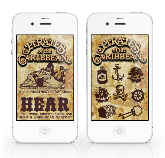
The fourth installation of the Designerland Soundboards: Pirates of the Caribbean.

The Pirates of the Caribbean Soundboard is a simple web application I created out of my appreciation for the classic attraction.  A web app will run SLOWER than a normal native app. The difference between a web app and a native app is that a web app is hosted and "lives" on the internet whereas a native app actually downloads and "lives" in your mobile device.

PLEASE NOTE: The soundclips will take a while to download, I wish that they would load faster but unfortunately that's just how web apps work.

The Pirates of the Caribbean Soundboard was developed for iphone users in mind but is supported by Google Android mobile devices as well.

For iphone users: using the internet on your phone go here: POTC
Once the page loads click on the "Add to Bookmarks" icon. Now click the "Add to Home Screen" and the Tiki Room Soundboard icon should load. That's it.

For Google Android users: using the internet on your phone go here: POTC
Bookmark the page. Now open the browser bookmarks screen, then long-press the bookmark you want, then select the add to home screen.  

The site will look odd if you just go to the link above on your desktop computer or iPad. The url/site is formatted to fit your mobile device's screen and the sounds will not work unless you're using Google Chrome or Safari.

Well I hope you guys enjoy this latest addition. If you like this app and don't mind it taking a while to load I have a few other Disney attraction soundboard apps in the wings!

Thanks again for stopping!

Thursday, June 21, 2012

Special Retro '71 Concept


I was going to wait for another four weeks to post a new shirt concept but I had to get this out there because it's been on my mind for the last few days.

When Disney announced the "Glow with the Show" merchandise I was rather upset by the news, but this soon dissolved into shear happiness. Why was I upset? You see, when I'm not looking for fonts, designing shirts or collecting retro theme park merchandise, I'm sketching away ideas in a little journal...a kind of blue sky journal. One of my ideas was to incorporate sound-activated LEDs in the balloons sold nightly throughout the parks. Those balloons would then be synchronized to the nightly entertainment extravaganzas. I shared this idea with one of my fellow Disney dreamer friends and we thought of a new show to incorporate the technology. When I saw the official "Glow with the Show" Mickey ears, I was blown away! Mickey ears make much more sense. Not only are they a MUST for most Disney theme parkers, but they also have a higher price point and make better keepsakes than a simple balloon. After watching the YouTube videos of the new technology synched along with the World of Color, I was simply blown away. Talk about interactivity with guests!


Now if I know Disney—and I do—I know those mad men of merchandising are dreaming and scheming other ways to use this concept with other theme park merchandise. It's pretty much a no-brainer to say that t-shirts MUST be on their product line lists! LED light-up shirts have been around for ages—I remember going to one of my first parties (read: a rave) back in 1998. One of the DJs was sporting one and all the little kandy kids were flipping out over it. Over time, they became more and more available to mainstream audiences and the price point has since lowered. In fact, the company I work for is working on some LED shirts right now for a big event next week. However, the one thing these shirts appear to lack is that they aren't really programmed to music...not like Disney can do!

When turning this idea around in my head, I imagined Epcot seemed the most likely place where Disney World theme park merchandise would debut this new offering. That’s when it hit me: a Designerland reader shared with me an old logo from Illuminations under the notion that I should recreate the design. I thought to combine the new "Glow with the Show" technology along with this old logo. Now if only they would show the original IllumiNations for the 30th anniversary and sell a shirt like this, I would be in Disney Dork heaven.


Well that does it for this special Retro '71 post. Tune in this Sunday for a new Designerland offer. Until then, see you soon!


Sunday, June 17, 2012

Main Street USA Part 3

Welcome back to Designerland's Typography Case Study. This weeks study is our conclusion of Main Street USA as I've had to break up the post into a three part series. So sit back and enjoy more of those fantastic fonts used by Disney designers.


As stated in the first Main Street Case Study, most of the fonts used on the thoroughfare are display fonts ranging in classifications such as Victorian, Script, Tuscan, Latin, Slab Serifs, Serifs, Edwardian, Ornamental, and so on, used for the various fictitious storefront shops.


Well that does it for the final installment. . .or does it? Main Street is ever evolving with the plussing of new signage and graphics. New fonts will be added yearly and I can't wait to track more down. In my research for this three part case study I was able to locate 68 fonts and just today I found a new one making it 69. I have over 100 reference photos of fonts I have yet to track down and will always be on the hunt. Look for updates. Well that about does it. Tune in next week as I spent the last three days working on some overdue offerings for Designerland. Until next time, have a great week. Thanks for stopping by.

Tuesday, June 12, 2012

Special Post

Hey guys sorry it's taken me a few days to get to this weeks post...for this weeks shirt concept click on the image below.


Please sign up and vote for my concept and help bring another Designerland concept to reality.

It would mean the world to me.

Thanks again for all the support!!!!


Sunday, June 3, 2012

Retro '71


Welcome back to Designerland and another fun-filled Retro '71 shirt concept. This week’s post is a special three-for-one that I hope you'll all enjoy.

When WED Enterprises started dreaming and scheming up the Walt Disney World Resort, Imagineers had dreamed of 5 home-away-from-home domiciles that surrounded the Kingdom: The Contemporary Resort, The Polynesian Village, The Asian Resort, The Venetian Resort and lastly, The Persian Resort. Sadly, the latter three never saw it past the model phase within the halls of 1401 Flower Street. Various sites have already documented the history of the "Resorts that Never Were" and if you'd like to find out more about these resorts, I suggest you take a look here, here and here.


Much like I did with the shirt series for the faux real estate companies that purchased the land for the Walt Disney World Resort, I decided I would try coming up with logos for these “lost” resorts. I'm sure somewhere in the halls of WDI, in some flat file, there may be some concept renderings of logos for the resorts. Seeing how I don't have access to that type of stuff I just decided to use my imagination...after all, imagination is the heart of all creation, right? I tried focusing on simple iconography mixed with display fonts that I felt carried the story of each resort. The real trick was trying to get them to stylistically flow with the Contemporary and Polynesian Village's original logos.


The shirt colors and ink colors are derived from color combinations that are true to the countries these resorts were themed around. An homage to ideas that never made it, but should have....


Well that does it for this week’s special post. Tune in next week for the final Main Street Type Case Study I've been promising you. Have a great week and see you all soon.

Friday, June 1, 2012

Out Now!!!

Sorry for the lack of a new post this week, forgot Monday was a holiday. Be sure to check out this upcoming Sunday's post...I think you guys will enjoy it.


In the meantime, I have another shirt design released in the parks this week. 


Casey Jones at the Disney Design Group came up with this jaunty idea and asked me to illustrate it! I really love this shirt. It's clever, funny and a touch retro (with the subject matter and distressed texturing).

Be sure to pick one up the next time you're in the parks and tune in Sunday evening for a triple delight!


Sunday, May 20, 2012

Retro '71


Welcome back to Designerland and another fun-filled Retro '71 shirt concept. This week’s shirts are based on the House of Magic Shop on old Main Street. 

As a child and growing up on the Magic Kingdom, no visit could be complete without a stop to this store. As the evening would come to an end and the fireworks finished, we'd start to make our way back to the monorail. To avoid crowds we would stop into the many great stores the Magic Kingdom had to offer at the time. My mom would be off in the classier stores looking for something to bring back my grandmother while my dad and I would head over to one of the coolest stores imaginable, The House of Magic.


As a young boy I was fascinated with all sorts of things: monster makeups (thank you Dick Smith), haunted houses, skulls, pirates, masks, puppets and so on and the House of Magic catered to all those odd interests. I only visited the House of Magic during the evening hours right before the park closed, which made the shop even more mystical. As I recall, the shop was dark and mysterious. The shelves were lined with Adam's Prank and Magic products, books on studying magic, card decks, those invisible dog leash gags, rubber monster masks, some Haunted Mansion carryover items and black light/glow-in-the-dark skulls by Randotti. It was pure heaven.

Being so young, the more advanced magical merchandise that the House of Magic offered didn't interest me. I would pass up those cheesy invisible dog leashes and make my way straight to the display of molded ceramic spookiness, the Randotti skulls. The Randotti Company was a small mom and pop operation out of California that manufactured chalk and plaster skulls, totems, tikis, tombstones, and plaques for various stores, amusement parks and theme parks. Most of the products were treated with glow in the dark paint. They would glow forever, bright and strong all night long it seemed. I remember many a night dozing off to sleep as the eerie, ghostly glow illuminated my night stand.


 I would purchase the same skull each year (skull #829 to be exact, but also had #891 in my collection at one time).  I don't think my mom cared too much for the macabre merchandise because it would seem to disappear a few months after our vacations. I would ask her if she had seen it and she would say that she packed it up with the Halloween decorations. Moms can be so fickle but Dads are so great because like clockwork he'd let me buy one each year while Mom was on the other side of Main Street. It was like our little thing. 


The House of Magic and the infamous Randotti Skulls play a big role in my Disney World childhood, so what better way to pay homage than with a shirt design of their very own, slightly distressed and printed in glow in the dark ink of course.

Well that does it for this week’s post. Tune in next week when we conclude our Main Street Typography Case Study. Have a greek week and see you soon!