Showing posts with label WED. Show all posts

Friday, August 5, 2011

Country Bear Jamboree


Welcome back to another edition of Designerland's theme park attraction typography case studies. This week we'll be looking at one of Walt Disney World's classic show attractions, the Country Bear Jamboree.
The Country Bear Jamboree was originally designed for Disney's Mineral King Ski Resort by Imagineer and show designer, Marc Davis. As we know, the Disney's Mineral King Ski Resort never made it off the drawing board, but Marc still felt the show would be a perfect attraction for Disney World's opening day back in 1971. The Country Bear Jamboree became an instant classic amongst east coast vacationers—it became so popular that WED Imagineers brought the show to Disneyland on the west coast. Over time, the Imagineers toyed around with seasonal overlays but quickly changed the show back after guest attendance declined. Sadly, Disneyland's show was shut down due to the lack of interest. Today you can find the original classic show at the Walt Disney World Resort and at Tokyo Disneyland, which is the only version that still hosts three seasonal overlays.


When looking at the typography from Country Bears Jamboree, we notice all the display fonts have a western theme, which fits the location of the attraction within the parks. Under the generic umbrella of western display fonts we can dissect them even further into a few categories: Wood Type, Tuscan, Iron Work, Slab Serif, Spurred, 1800's and even 1970's. Most of the typefaces used throughout the signage are the more stereotypical western looking fonts (similar to those found in other surrounding Frontierland attractions), while others are straight from the 70's with their curvy flared serifs, stems and descenders. Those 70’s looking western-like fonts are both whimsical and funny to reflect the Country Bear Jamboree show.  Also, we have to remember that attraction was created during this era. I've tracked down the typefaces that still exist today. While other fonts can be found within the attraction, many are custom, hand-drawn fonts which were most likely created by show designers at WDI.


Well that does it for this week’s case study. Check back on Monday for another Retro '71 shirt concept and thanks for stopping by! Have a great weekend.

Friday, July 29, 2011

Rocket to the Moon | Flight to the Moon | Mission to Mars


In this attraction typography case study, we will look at some of the typefaces used for Rocket to the Moon/Flight to the Moon/Mission to Mars.

Rocket to the Moon was one of Disneyland's original opening day attractions.  It was a simplistic show that utilized circular screens in the center of the floor and ceiling. It seated the guests in the round, and a screen on the floor would show the guests where they had been, while the above screen showed the destination. Over time the attraction began to show its age and was reimagineered to Flight to the Moon. After six years, the attraction was rebranded yet again to Mission to Mars. Disneyland's Mission to Mars shut its doors in 1998 while Walt Disney Word's attraction closed in 1995. 


The typography for this long-forgotten attraction focused heavily on popular Sans Serif typefaces. The simplistic, classical typefaces represent progress and the future, and the italic-set fonts convey the feeling of movement and speed as if we the guests were thrusting into a world of Tomorrow. A few classic Serif fonts do make their appearance in the font palette, but these are more secondary to the Sans Serifs. With all the rebranding and re-themeing of the attraction, a few small decorative display fonts made their way into the palette, like the main font used for the attraction signage spelling out "Mission to Mars", which is a wide-set, italicized stencil font that looks extremely sci-fi/space race. 


Well that about does it for this week's case study. Thanks for stopping by and be sure to come back on Monday for a new Retro '71 shirt concept. Have a great weekend!

Friday, July 22, 2011

Peter Pan's Flight


In this week’s case study we'll be looking at the simplistic font palette of one of the most popular rides within the Magic Kingdom, Peter Pan's Flight. Peter Pan's Flight is one of the original attractions designed by WED for opening day at Disneyland and quickly became one of the staples of Fantasyland, so it comes as no surprise that most every Fantasyland from here on out would have its own version of the attraction.
When the attraction first opened, Imagineers were giving guests too much creditability by casting them as Peter Pan. Guests couldn't quite grasp the concept of this first-person point-of-view, and they often asked where Peter Pan was within the ride, as was the case with the original Snow White and her Adventures. When Imagineers began re-imagineering the attraction for the Walt Disney World Resort, they quickly added Peter Pan into the attraction’s storyline. Peter Pan wouldn’t make his grand appearance at the Disneyland attraction until 1983 when Disneyland's Fantasyland underwent a major face-lift.


This attraction only uses a few different fonts, which is the case with most of the attractions within Fantasyland as these generally feature simpler thematic detailing. Peter Pan's Flight uses some of the same classic fonts used to brand other attractions within Fantasyland, with the two main classifications being Serif and Blackletter. These two classifications are the perfect mix of British and Medieval typography which reflect the story of Peter Pan by author J.M Barrie (born Scottish but lived and worked in London) and Fantasyland’s overall theme of a Medieval fair.


Well that concludes this week’s short but sweet post. Tune in on Monday for another Retro '71 concept and thanks for visiting. Have a great weekend!

Tuesday, July 19, 2011

Poster Design

Yesterday we heard more about what would be showcased at the D23 Expo and needless to say I'm excited...really excited. I was so excited I had to create a poster.


I know I'm such a Disney design dork but I'm okay with that!

Friday, July 15, 2011

Mark Twain & Liberty Belle Riverboats


In this week's Attraction Typography Case Study we'll look at the fonts used for Disneyland's Mark Twain Riverboat and its counterpart, the Walt Disney World Resort's The Liberty Belle. The Mark Twain Riverboat, located in Disneyland's Frontierland, is a simple 12-minute leisurely ride aboard a Mississippi-style steamboat along the scenic Rivers of America. The Mark Twain Riverboat, also known as the Mark Twain Steamboat, was one of the original 1955 opening day attractions at Disneyland. The Mark Twain quickly became one of the main icons of Frontierland (before Big Thunder Mountain's rock silhouettes become more noted), and was re-imagined by WED for the Walt Disney World Resort, Tokyo Disneyland and Disneyland Paris.


When dissecting the typography of the Disneyland and Disney World attraction, the most notable distinction is the location. The Mark Twain is set in Frontierland, whereas The Liberty Belle is located in Liberty Square. These locations greatly impacted what typefaces were used to brand the attraction. The Mark Twain Riverboat uses several classifications of fonts, most of which reflect the early 19th century. Within the main 1800's theme we can start to pick out a few other classifications: Western, Latin, Tuscan, Slab Serif and Geometric.

The font palette for The Liberty Belle is less ornate and incorporates more classical serif fonts that characterize the mid 20th century. While these fonts are associated with historical time periods, they're actually not historically accurate. Colonial typography would have been more distressed in nature due to the printing capabilities of the period. It was also more common to see hand-written pen and ink scripts along with other hand-tooled lettering. Most of the fonts used for the Liberty Belle and surrounding areas are from the late 50's to the early 80's, and were designed by various type foundries to represent the ideology of early classical Americana - not the reality.


Well that does it for this week's attraction typography case study. Tune in on Monday for a new Retro '71 shirt, where I'll release the second in the series of the faux companies created to acquire the land for the Walt Disney World Resort. Thanks for stopping by and see ya soon!

Monday, June 27, 2011

Poster Design

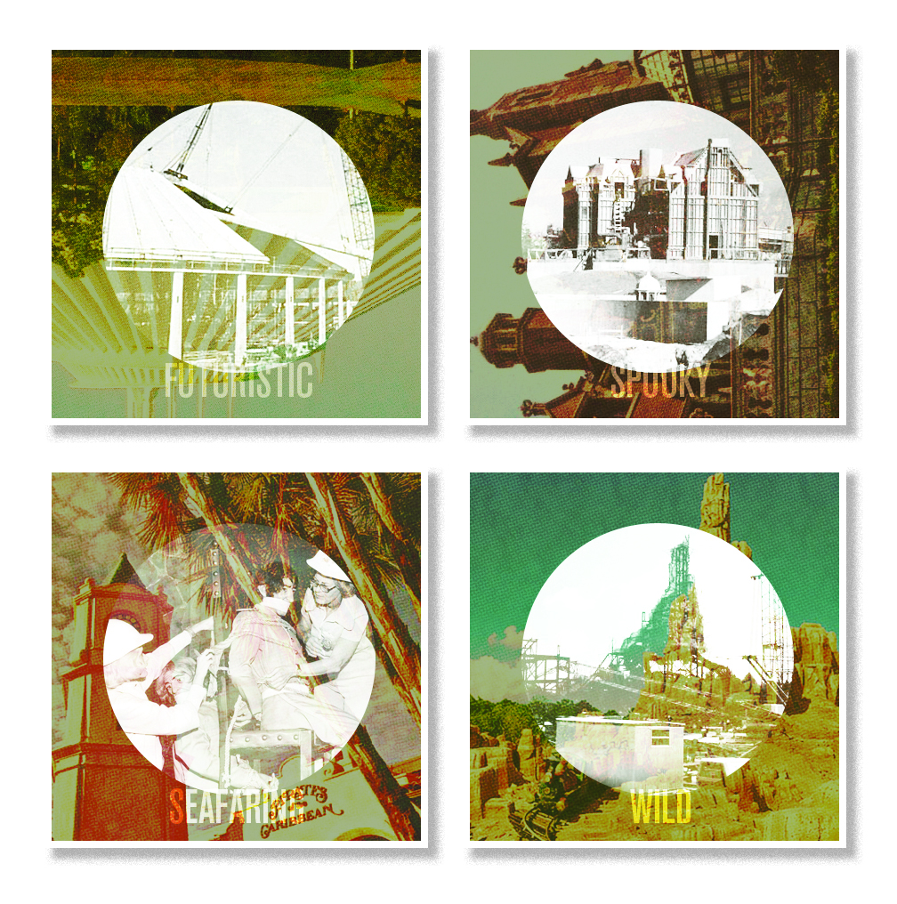
So in my down time I've been toying around with the concept of vintage posters that play upon construction and the final product. These are just roughs but I really enjoy where they're going. I plan on flushing out the series and have a few others already done but plan on saving them for another post.


In the meantime does anyone have any pictures of Walt Disney World's Pirates of the Caribbean being built/construction photos???? There are tons for Disneyland but none for the Walt Disney World Resort. I've searched everywhere on the net and in most of my theme park books but alas nothing. It's like those sneaky Imagineers just beamed over the attraction. If you know or have any photos you wouldn't mind lending to the project I would be grateful.

Wednesday, June 8, 2011

The Haunted Mansion Group Art Show

Over this past weekend The Parlour Gallery at Halloween Town presented their 2nd annual tribute to the Haunted Mansion. I was so excited to be one of the many talented artists that got to showcase their work in this popular exhibit. 


Seeing how I'm in the Midwest I couldn't make it out to California for the opening. However I was there in "spirit" so to speak. One of my good friends attended the opening and gave me a full rundown and snapped a few shots of my piece.


My painting was a simple acrylic painting with acrylic transfers and glow in the dark medium. The transfers were of various blueprints and schematics WED enterprises used to design the time honored attraction. Cleverly enough I titled my piece "Supernatural Structures & Eerie Engineering."


If you're on the west coast I suggest you stop on by and check it out. The exhibition will be running from now until July 3rd!

Sunday, April 24, 2011

Retro 71


This week’s Retro 71 concept is an homage to the dreamers and doers of the Disney Theme Parks: The Imagineers.
It has been my dream since I was 12 to become an Imagineer—I would make my parents take me to the bookstore so I could drool over the pages of the Architecture of Reassurance and Building a Dream. I've mentioned before how it's one of my goals to work for WDI. Back in 2005, I got my first taste of WDI when I was chosen as a finalist in the Walt Disney Imagineering ImagiNations Design Contest. Being a finalist and winner solidified the fact even more. I have tried really hard to get my foot in that door at 1401 as well as WDW's campus. No luck thus far, but one doesn't just give up on their dreams.


Most all Disney dorks know that the only place to score official WDI merch is at Mickey's of Glendale, and if you ever get the privilege to shop there, I suggest you have a hefty amount of spending money on your person. It's spectacular. I will add that Disney is missing out on a HUGE market by only selling WDI merchandise in this one store, but it makes complete sense. The store is designed for the employees, although D23 has opened it up to a select few fans in the area. I would love to find a small line of WDI/WED merchandise within the parks for which some of the Imagineers would design limited edition shirts. I know Imagineers create limited edition items for Mickey's of Glendale, so I have to ask, why not for the parks?!?!? It would create an entirely new segment within the park merchandise and I feel the category would be well received. 
This week’s concept is a shirt design that I imagine would sell at a place like Mickey's of Glendale. The shirt is inspired by the vintage WED line from a few years back. I used one of my favorite Walt Disney Quotes on the front that really sums up what Disney and his Imagineers did and still do to this day. I then signed the quote with the original WED Imagineering logo. As you can see, the quote is set in the same typeface the WED logo was created in—what a brilliant typeface!  The overall design is simplistic and crisp in a very 1950's/1960's fashion. 


Well that does it for this week’s Retro 71 installation. I hope you've enjoyed it as much as I have. Until Friday, have a great week and see ya soon!

Sunday, April 17, 2011

Retro 71


This week’s Retro 71 concept is a special twofer. The concepts are based on my favorite resort, The Polynesian Resort. The Polynesian Resort was one of the original hotel concepts dreamed up by WED Imagineering for the Walt Disney World Resort, and it opened the same year as the theme park in 1971 under its original name, The Polynesian Village. The resort has not only grown in size due to its popularity, but it has also seen some changes in its look and branding. From fonts to color palettes, to pools to interior decor, the resort has evolved over the years.

When thinking of shirt concepts for the Polynesian Resort, I wanted to pay tribute to the original name of the resort and use the original logo with the iconic tiki idol. I love all the old branding where the designers used the main tiki idol on pretty much everything from hand soap wrappers to shot glasses (aka tooth pick holders), from frosted libation mugs to even "privacy please" door hanger signs. Nowadays he's seen in a few places around the resort, most notably on trash cans.


The first shirt concept is the classic logo. I tried to plus the design by changing the colors to match the original tile floor of the resort. The original color palette of the resort consisted of deep browns, aqua teals and mossy looking yellowish greens, and I wanted to bring that back to keep it consistent with the overall look of these shirts. I picture this design on a vintage ringer that has color banding around the arms and neck in either a dark brown or the same color as the resort name depicted on the shirt.


The second shirt concept is our favorite tiki idol, but with his legs! Today, only a couple of locations remain where you can still see him depicted with his jaunty little legs. Keeping the color story consistent with the first shirt, I incorporated the same color palette.  I believe it really captures the feel and tone of the resort from back in the day. When looking at the shirts next to each other, I can imagine seeing them sold together at the Boutiki in the Great Ceremonial House. In my downtime, I've come up with an entire product line that includes these two shirts along with a few other fun tropical treasures that celebrate the history and traditions of this amazing resort.


Well that about does it for this week’s Retro 71 segment. I hope you enjoyed the designs! Until next time, have a swell week and be on the lookout for a new soundboard coming soon, not to mention even further looks into the typefaces used on some of our favorite Disney Theme Park attractions. See ya soon!

Thursday, March 31, 2011

Pirates of the Caribbean


This week we set sail with some of the wildest fonts to ever terrorize the Spanish Main as we look at the typography of Disney's Pirates of the Caribbean. What can be said about this all-time classic that hasn't already been covered on many a Disney blog, book or fan site? 
On a personal note, Pirates of the Caribbean is my all-time favorite Disney attraction. I have many memories of my dad and I at Disney World late at night during the extended hours. We would end our nights continuously riding this classic, seeing how many times in a row we could get in. My dad loves to tell the story of how he could never keep up with me as I ran from the exit, through the gift shop and back to the entrance. The only time I would ever pause was to stop and purchase one of my MUSTS from the shop: a mini skull necklace which was made of plaster with a rhinestone “diamond” in one of the eyes. How I treasured it! Despite the countless times my parents had to buy that exact same necklace, I haven’t managed to keep a single one. I keep a weathered eye out on eBay from time to time, but have never seen one up for grabs.
The first Pirates of the Caribbean opened at Disneyland in 1967, and it was originally designed as a walk-through wax museum-like attraction. However, the plans changed when WED decided to incorporate some of the new animatronic technologies they had created for the World’s Fair. The attraction became an instant success. When Walt Disney World opened its gates in 1971, fans demanded that the show be brought to the Sunshine State. Disney World's Pirates attraction opened in 1973 with some slight modifications from the original. As we all know, most every park Disney has built from here on out has a version of this masterpiece.


When looking at the type used by designers, we see a wide variety in classification of display fonts. Most of the typography is based on classic 60's and 70's fonts with a few subtle nods to the sea fairing, scripty, pirate-looking fonts like Caslon Antique. It wasn’t until the Pirates of the Caribbean film franchise that some of the typography changed, mainly at the Walt Disney World attraction, where we now see the font from the films’ titles now branding the attraction. Once again, we see our favorite font, Bookman Swash, along with some other notable 70's fonts like Columbus. Disneyland's attraction has a larger variety of typography as compared to the Walt Disney World attraction, so most of the fonts in this week’s study come from the Anaheim original.


The one thing I enjoy about the typography of the Pirates of the Caribbean attractions is the use of such dated and classic fonts. This one attraction features the works of such time-honored typographers such as William Caslon, John Baskerville and Ed Benguiat. If a Pirates attraction were designed today, I'm apt to say the designers would probably choose more aged and distressed fonts. To a type nut like me, the typography tells the story of when this attraction was created—it has a refinement that doesn't rely on gimmicks to enhance the story. It is truly one of my favorite font palettes within the Disney Parks. 
Well that about does it for this week’s case study. Tune in for more fun Designerland updates. Thanks for stopping by and have a great weekend.

Sunday, March 27, 2011

Retro 71


This week’s Retro 71 concept is my take on Disneyland's "coming soon" attraction sign for the Haunted Mansion. The sign, created by WED, was posted on the gates of the Mansion in the mid 60's. The simple wood cut sign featured the clever writings of Mr. Marty Sklar. This hand-painted sign featured a skull-bat icon at the top, with copy that advertised "post-lifetime leases” which included a "license to scare the daylights out of guests visiting the Portrait Gallery, Museum of the Supernatural, graveyard, and other happy haunting grounds."


I recreated this sign in Illustrator then changed up the body copy slightly—my version directs ghosts to contact Walt Disney World's Ghost Relations Department rather than Disneyland's. I removed the spider web icon from behind the text and placed a photo of Walt Disney World's Mansion from the early 70's that was taken through one of my all-time favorite filters in Photoshop. After that, I adjusted the Mansion photo in Illustrator to make it a vector object so that separations for screen printing films would be possible. The color palette consists of washed-out, ghostly grays and eerie whites. I have a few other color combinations for this shirt, but I feel the distressed texture and faded look lends itself to the established branding that is Retro 71. 


Well that about does it for today. Tune in this Friday for another theme park typography case study. Thanks for dropping in and hurry back!

Friday, March 18, 2011

Mr. Toad's Wild Ride


This week we're merrily, merrily, merrily, merrily, merrily on our way to nowhere in particular as we look at the terrific typography of the Mr. Toad's Wild Ride.
Mr. Toad's Wild Ride is one of the classic dark rides of Fantasyland. It's one of the last remaining attractions from Disneyland's opening day back in 1955. The attraction is based on the Disney short, The Adventures of Ichabod and Mr. Toad, and loosely based on the classic tale of The Wind in the Willows. Disneyland wasn't the only park to feature this attraction—Walt Disney World had its own version which was much larger and boasted a two track system. Sadly, on September 7th of 1998, Winnie the Pooh evicted J. Thaddeus Toad, Esq. from Toad Hall. To this day, fans are still upset over the loss. Thaddeus, however, still roams around the park to this day. You can see him handing over the deed to Mr. Owl in The Many Adventures of Winnie the Pooh; a few retro t-shirt designs pay homage to the attraction, and at one time you could see a grave marker dedicated to the loss of the beloved character over at the Haunted Mansion’s pet cemetery.


As with any attraction in Fantasyland, you’ll notice the heavy hand of Fraktur, Blackletter, Gothic, Medieval and Old English fonts, which is fitting to the themes of fantasy and fairy tales, not to mention Mr. Toad. The classic novel of The Wind in the Willows is set in a pastoral version of England, the country from which many of these type classifications originated. Amongst the classic typography of the attraction, designers incorporated wacky and fun display fonts to carry out the theme of a wild ride. Unlike Walt Disney World's version, Disneyland's typography consists strictly of classic font specimens and doesn't incorporate the silly and fun display fonts. When WDI remodeled Disneyland’s Fantasyland back in the early eighties, all of the classic dark ride attractions received new facades to better fit their respective themes. It appears Tony Baxter nixed any crazy display fonts that broke the theme and tight integration of the story. 


Mr. Toad's Wild Ride will always be my favorite classic Disney dark ride. I have fond memories of me and my mother speeding through Toad Hall and the British countryside. Each time I visit Disneyland, it's one the highlights of my trip. Well that does it for this week’s installment of typography from the parks. Tune in for another fun Retro 71 concept and a few new Kuler palettes. Thanks for stopping by and have a swell day.

Thursday, March 10, 2011

Skyway


It's a two-for-one typography treat this week as we look at the gone-but-not-forgotten Disney Skyway, so let's jump aboard for a one-way trip into this week’s case study!
The Skyway was a simple gondola lift attraction that ushered guests back and forth between Fantasyland and Tomorrowland. The first Skyway was built at Disneyland and tunneled through the icy slopes of the majestic Matterhorn. Disneyland wasn't the only park to feature this attraction: both Walt Disney World and Tokyo Disneyland had Skyways of their own. Sadly, the Skyway at Disneyland was closed in the early 90's, and like falling dominoes, Tokyo Disneyland closed theirs a few years later, followed shortly by Walt Disney World.
The Skyway still has some presence in the parks, but that's all about to change shortly. The Skyway station still sits to this day in Fantasyland at both Disneyland and Walt Disney World. Walt Disney World's station is about to undergo a major refurbishment to house larger restrooms, feature lush landscapes and possibly some water features as well. I'm looking forward to what the Imagineers have in mind, but I’m also hoping they'll retain a subtle nod to the original attraction.


Now on to the type. Let's start by looking at the Fantasyland Skyway first. Like all attractions in Fantasyland, the Skyway used decorative display fonts such as Old English, Blackletter and Fraktur, which all combine the themes of English/European fairytales with a Swiss edge to convey the theme of a gondola taking us high into the snowy alps. Once again, the designers have used more German-based fonts to represent Switzerland. Swiss typography does get featured—just not in Fantasyland.
The Tomorrowland Skyway Station used only one classification of fonts, sans serif. The main font used on the signage was the classic typeface Helvetica, which was designed by typographer Max Miedinger back in 1957 in none other than Switzerland. Various weights and sizes where incorporated on the signage along with another popular yet overused typeface, Impact. A few decorative futuristic fonts made their appearance later on in the years. One specific typeface was used to brand Walt Disney World's second gate.


I miss the Skyway—it was a great way to get off your feet for a few minutes and get a bird’s eye view of the park. It was a small thrill as well—I remember being scared as a child that the cables would snap. I even miss those out-of-place pylons positioned right in the middle of Fantasyland. One thing I do not miss is seeing the unfinished tops of the show buildings within the park—it was the first time I had ever seen the illusion revealed. Ever since, I've been interested in the art of illusioneering, if you will, which has been perfected by those mad geniuses over on Flower Street.
Well that about does it for today. I look forward to seeing you back on Monday for a new Retro 71 design. Thanks for stopping by and have a great weekend.

Thursday, January 20, 2011

It's a Small World


This week we look at a Disney theme parks time-honored classic: It's a Small World! So climb aboard and let’s sail with the happiest set of typefaces that ever sailed!

When it comes to Small World, people tend to love it or hate it.... personally, I love it. I love it even more now as an adult, especially as a designer. As a child I tended to focus on the children from around the world, the fun yet repetitive theme song by the Sherman Brothers, and the copious amounts of glitter (be honest, who doesn't love glitter?). But now as an adult, I'm more intrigued by how this one attraction is a perfect example of the elements and principles of design.

One of the primary designers of It's a Small World was artist, designer and Imagineer Mary Blair. I believe Mary's success was due to her understanding of classic design elements and principles, along with her stylistic approach and background in fine art. Her style was somewhat avant-garde for the time and if she were at WDI today, her style would still be considered innovative. To be honest, I don't think anything would get green lit if the storyboards looked like some of Mary's concept treatments . . . my how the times have changed!


Over the years, from the original Small World designed for the 1964 World's Fair to Hong Kong Disneyland's version, It's a Small World has used a variety of fonts and typefaces to brand itself. From posters to merchandise, the stylistic approach in terms of type has changed over the years. Italics, bolds, curls, serifs, sans serifs and display fonts have all been used in conjunction with this attraction. Currently, a whimsical childlike display font sets the tone for the main signage. I believe this is a custom typeface designed in-house by Disney's design team. Sometimes designers will design just the characters needed to spell out the attraction name for the logo or signage—they usually never create the entire alphabet, punctuation marks, numerals or glyphs (there are exceptions and we'll discuss that later on when we look at the Indiana Jones case study).

Lucky for us, we have typographers who are Disney dorks!!! These typographers, paying homage, have created entire fonts (including some amazing glyphs) based on their appreciation and love for Disney attractions. Their designs come close in matching what you see in the parks—they are usually about 95% accurate and could fool most any viewer. Disney has even gone so far as to purchase some of these re-imagined fonts to go back and use in the parks.  As a designer and Disney dork, I could only imagine the thrill of walking into the parks and seeing a font of my creation in use.

Aside from the main signage of It's a Small World, the only other type treatments seen on or near the attraction are closure signs that pop-up from time to time, and the final show scene of the attraction itself. The last show scene consists of various languages bidding riders farewell. What better way to use typography than to match the good-byes in a font found from that native country?


Well that about does it for this week. Tune in next week and thanks for stopping by!

Sunday, January 16, 2011

The Wedway Peoplemover


This week’s case study is the Wedway Peoplemover. As well all know, the Peoplemover was rebranded back in 1994 and reintroduced as the Tomorrowland Transit Authority (TTA). Then, in 2010, it was magically changed back to the Peoplemover. Well…sort of. The name today is the Tomorrowland Transit Authority Peoplemover. I still call it the Wedway or the Peoplemover for nostalgic reasons.

For this case study I focused mainly on Disneyland and the Walt Disney World Resort's Peoplemover prior to 1994. Call me a traditionalist, but personally, I prefer the early Tomorrowland look (right down to the even fonts) to what is now present in the parks.

In the world of fonts nothing says “Tomorrowland” like sans serif typefaces. Back when Disneyland, and even Walt Disney World, were being built, sans serif typefaces where used to convey simplicity, modernism and the future. Sans serif typefaces are fonts that lack the small features called "serifs" at the end of the strokes. The term comes from the French word sans, meaning "without".  All sans serif typefaces have relatively little stroke contrast and are highly legible as display, and with added spacing, are successful as text. Today, however, more sci-fi themed display fonts are being used throughout the land. Because sans serif fonts are plentiful in today's world, simply using one would not convey the same message as it did back in the day.


I began looking at both Wedway Peoplemover attraction posters before starting my font hunt. What is interesting about Disneyland's poster is that the designer used a typeface similar to that of the attraction’s sponsor, Goodyear, seeing how it utilized the propulsion system of rotating Goodyear tires. If you jump over to the Disney Park Attraction Posters Blog you can see a comp of Disneyland's original Wedway poster. Notice the main typeface of the Peoplemover does not resemble the Goodyear font at the time of it's conception.

 Walt Disney World's Peoplemover opted for new technology. Instead of using tires, they used state-of-the-art linear induction motors. Disney World's attraction poster uses the display font, Geometric Stencil (originally designed by the famous typographer Paul Renner), but manipulated it to look like it has been italicized.  Designers sometimes use italic fonts to imply movement or speed with their diagonal stress.  This was a simple but effective solution by the designer.  However, some may consider the use of italic fonts to convey that something is fast or speedy to be a sort of designer’s crutch. This same type treatment is then used for Disneyland's Peoplemover through the Super Speed Tunnel poster by Jim Michaelson, which was designed a few years after the creation of Disney World's Peoplemover attraction poster.


Signage and fonts are limited when it comes to the Wedway Peoplemover, but through my research and various closure signage I was able to design this simple yet futuristic case study poster. Well, that's about it for this week. Once again thanks for visiting and see you back here next week!

Tuesday, December 28, 2010

Walt Disney Imagineering


I've decided to give you all a taste of things to come. Here's my first "test run" of my typeface case study poster designs. 

Starting on the first of January I'll begin with actual attractions found within the parks but for now I give you my dream: Walt Disney Imagineering.

I, like most Disney dorks, have dreamed of being an Imagineer since I was young. I've tried extremely hard to become one and I will continue to keep that dream alive but in the mean time let's talk type.

For this case study I began by looking at mostly logos and signage. My main focus was on the classic WED Enterprises Logo. Who doesn't love that mod retro design, right? Sadly it's not a real font. It was hand generated by one of the designers at the time...but who????

Well according to Mr. Roland Crump the designer of the original WED logo was none other than Paul Hartley. You see, being so obsessed with this logo I got together with another designer who specializes in custom made typefaces and they designed a font based on it for me at a said price. I even contacted Rolly and asked him is he created the WED Enterprises logo. I thought he'd shed some light on the topic seeing how the Tower of the Four Winds model that resides in the Contemporary Resort has that same D character from the WED logo.

Rolly actually enjoyed the typeface and provided some great feedback. As for now, the designer of this reimagined font has not went public with it yet, but if and when they do I'll let you know.

Other than the custom WED typeface, the poster displays fonts found in the current WDI logo, the WDI ImagiNations logo and website, The Blue Sky Cellar, and a few WDI Construction signs that have popped up in the parks.