Monday, June 27, 2011

Retro '71


This week’s Retro '71 shirt concept is based on the Lake Buena Vista Shopping Village, which opened in 1975 and changed its name to the Walt Disney World Village in 1977. Serving as a shopping district for Disney World vacationers, the area was much more intimate and relaxed than what you would find today. As a child, I only remember visiting the area maybe twice as it appealed more to an older adult demographic.


I recreated the logo and added an outer stroke in a color that is brighter than the shirt then a second stroke in a muted green to make it pop. I tried to keep the colors very simplistic in tones of creams and browns. Finishing the design is a simple crackle texture.


Well that does it for this week’s Retro '71 concept. I've had quite a week and sadly have to push off the typography case study until next week, with the new soundboard app to follow soon. Stick with me folks, they are coming, I promise. Until next time, thanks for visiting and see ya soon.

Poster Design

So in my down time I've been toying around with the concept of vintage posters that play upon construction and the final product. These are just roughs but I really enjoy where they're going. I plan on flushing out the series and have a few others already done but plan on saving them for another post.


In the meantime does anyone have any pictures of Walt Disney World's Pirates of the Caribbean being built/construction photos???? There are tons for Disneyland but none for the Walt Disney World Resort. I've searched everywhere on the net and in most of my theme park books but alas nothing. It's like those sneaky Imagineers just beamed over the attraction. If you know or have any photos you wouldn't mind lending to the project I would be grateful.

Sunday, June 19, 2011

Retro '71


I'd like to start of this week’s post by saying thanks once again to all my readers who have bought the Tiki Pineapple Whip shirt. There's only one week left to order! If you know anyone who might be interested in buying one, please let them know. I would feel bad if someone contacted me after this upcoming Friday wanting one. Please hit Twitter, various message boards, forums and other blogs letting them know that this upcoming week IS the last week the shirt will be available!
Some of you have expressed interest in wanting to know how it's going, and I will say extremely well. After I stop taking orders, I'll share more information on how many were sold and whatnot. Now onto this week’s post.
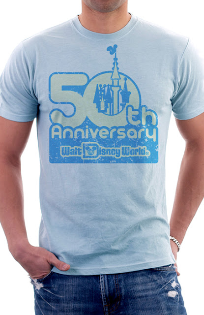
Walt Disney was said to be a man who had one foot in the past and one foot in the future. For this week’s Retro '71 design, I took that phrase to heart and started looking ahead. I've created a shirt for the 50th Anniversary of Walt Disney World. The design is based on one of the Tencennial logos created for the Walt Disney World Resort back in 1981. I absolutely love this Tencennial logo and remember seeing it while attending the celebration. Something about the logo just speaks to me as it evokes the feel of that in-between, transitional era from the 70’s into the 80's.


For the design, I tracked down a font that was similar to the one used for the logo. The actual logo was probably hand-created because I couldn't find the exact font the designers used. It's a simple two color design in water-based blue ink with a tinted discharge cream, plus we’ve added some slight distressing.


I know we're just now celebrating 40 years of magical fun, but I always like to plan ahead. Even though my designs are based on the past, I love looking toward the future. I know this won't be the direction the design group will take for branding the 50th, but this is Retro '71's way of branding and honoring the celebration even if it is 10 years away!


Well that does it for this week’s Retro '71 concept. Since the D23 painting is almost done, I’ll soon get back into the normal routine of this blog and will continue my typography case studies in just one more week. I also have another soundboard app coming soon. Thanks for visiting and have a great week!

Happy Father's Day

I'd like to wish my father a happy Father's Day! As the "odd one out" in my family, it was hard for my dad to relate to me as I got older—I was interested in fantasy, art, creation, expression, design, and so forth, while my other siblings were more sports-oriented (more of my dad's forte). So it may seem to him at times that we weren’t that close during my preteen and teenage years, but really that wasn't the case—I understood it was hard to relate to someone like me.


Most of my Disney World memories primarily involve my dad— my older brother and sister usually ran off with friends they had made at the resort, and my mom spent her time shopping on Main Street—so it was usually me and my dad running amuck throughout the Magic Kingdom. I have two favorite Disney memories I'd like to share (one I've mentioned before on the blog, but seeing how it's Father's Day, this post is for him). One is a memory that even he loves to tell. It was late one evening during extended hours for resort guests, and the park was somewhat dead. We rode Pirates about 6 times in a row, and Dad loves to mention how once exiting the queue, he could hardly keep up as I darted back to the entrance for another round. I think he loves the story because it humored him to see a 4 year-old take off and he, a former track and field star, had to struggle to keep up.
The other memory was around 1985-86 when we took my dad's parents to Walt Disney World with us. My grandfather wasn't enjoying the Florida heat, so he only went into the parks in the evening, whereas my Grandmother loved every minute of it. So my dad, grandpa and I had closed the park with one final trip on Pirates before jumping on the train to take us back to Main Street. I remember being so tired that I stretched out on the seat across from my dad and grandpa. I remember looking over at the two and thinking about family and generations and how I was so lucky to have a dad to share a place like Walt Disney World with me, and in that moment my Dad was trying to share the magic with his own father.  I have many other great memories with my dad at Disney World, of course, but these are my two favorites.
Happy Father's Day, Dad. Thanks for the memories and always diving for "hidden treasures" in the pool!

Saturday, June 18, 2011

Color Study


A new color palette has been added to the DisneyDesignerland Kuler account! Before you jump on over to check it out can you guess where this color palette is used?


Give up??? Find out the answer over at Disneydesignerland's Kuler page found here.

Check back for more random updates to Wonderful World of Kuler. See you guys back here on Monday for a new Retro '71 concept.

Sunday, June 12, 2011

Retro '71


Greetings folks, and welcome to yet another edition of the Retro 71 apparel line. This week’s concept is another design based on the old logo for the Magic Kingdom. This logo is probably my second favorite logo Disney designers have ever used to brand the happiest place on earth.
The typeface is a heavily stylized and modified version of the classic Bookman Swash. Subtle details have been added, such as the median spurs which give it more of a regal flair. I added the original Cinderella Castle icon to the logo’s left side in order to balance the “THE” in the logo. It also gives it a little more visual interest beyond just a simple typeset logo. For the color palette I chose two colors I feel best represent the Magic Kingdom: an orangish-red and a yellow.


 The two different-colored logos were then offset to give it more depth and a retro feel as if the print was not correctly aligned during registration. Lastly, the time-honored texture was added. The entire design works best on a shirt that is sandy cream with a hint of brown. Orange, yellow and brown were a typical color palette from the 70's—it was used everywhere from apparel to kitchens.  In the end, it's a simplistic design that fits perfectly into the apparel line.


Well that's about it for this week. Hurry back next week for a new attraction sound board as well as other fun Designerland offerings. Until next time, have a great week and see ya soon!

A new poster design

Another poster design, inspired by another graphic designer I happened to stumble across a few days ago. I've noticed as of late I'm stuck on a particular font palette for these posters. I need to change some things up here soon!

Wednesday, June 8, 2011

The Haunted Mansion Group Art Show

Over this past weekend The Parlour Gallery at Halloween Town presented their 2nd annual tribute to the Haunted Mansion. I was so excited to be one of the many talented artists that got to showcase their work in this popular exhibit. 


Seeing how I'm in the Midwest I couldn't make it out to California for the opening. However I was there in "spirit" so to speak. One of my good friends attended the opening and gave me a full rundown and snapped a few shots of my piece.


My painting was a simple acrylic painting with acrylic transfers and glow in the dark medium. The transfers were of various blueprints and schematics WED enterprises used to design the time honored attraction. Cleverly enough I titled my piece "Supernatural Structures & Eerie Engineering."


If you're on the west coast I suggest you stop on by and check it out. The exhibition will be running from now until July 3rd!