Showing posts with label Poster. Show all posts

Sunday, September 30, 2012

Disney Decor Part 2

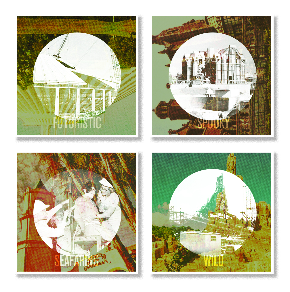
Tomorrow marks the 30th anniversary of Epcot Center. One way to pay homage is a new series of wall decor for your home.


A closer look:


Two of the prints are actual off-set printed in a similar fashion to vintage comic books, with the ink plates slightly off register/offset and various halftones used throughout. The last print follows fashion to the earlier EST. print series seen here on Designerland, incorporating various park maps of the past and playing with positive and negative spaces.

Well that does it for this weeks post. I hope you all had a great weekend and tune into Designerland next weekend as we continue our typography case studies. Have a great week! 


Sunday, January 15, 2012

The Hall of Presidents


The Hall of Presidents is a multi-media audio animatronic spectacular that has been entertaining guests since the Walt Disney World Resort opened its gates back in 1971. The show itself was derived from Disneyland's Great Moments with Mr. Lincoln.  Located in Liberty Square within the Magic Kingdom and resembling Independence Hall in Philadelphia, guests witness all 43 presidents together on one stage in a show that reflects the red, white and blue in all its patriotic glory.


When looking at the typography Disney designers used throughout the attraction on everything from signage and posters to even merchandise, one thing is constant: most all of the typefaces used are known as Classic or Historical typefaces. These fonts have a significance not only in the world of design, but also in the time period in which they were created. One noted typeface used throughout the area is Caslon. If you'd like to know more about William Caslon (the typographer who designed this classic typeface) then click here.  Other noted classifications used for The Hall of Presidents are Serif, Script, Formal, Classic and Historic.


Well that does it for this week's case study. Be sure to check back next Monday for our next Retro '71 World Showcase shirt. Thanks for stopping by and have a swell week.

Tuesday, July 19, 2011

Poster Design

Yesterday we heard more about what would be showcased at the D23 Expo and needless to say I'm excited...really excited. I was so excited I had to create a poster.


I know I'm such a Disney design dork but I'm okay with that!

Monday, June 27, 2011

Poster Design

So in my down time I've been toying around with the concept of vintage posters that play upon construction and the final product. These are just roughs but I really enjoy where they're going. I plan on flushing out the series and have a few others already done but plan on saving them for another post.


In the meantime does anyone have any pictures of Walt Disney World's Pirates of the Caribbean being built/construction photos???? There are tons for Disneyland but none for the Walt Disney World Resort. I've searched everywhere on the net and in most of my theme park books but alas nothing. It's like those sneaky Imagineers just beamed over the attraction. If you know or have any photos you wouldn't mind lending to the project I would be grateful.

Sunday, June 12, 2011

A new poster design

Another poster design, inspired by another graphic designer I happened to stumble across a few days ago. I've noticed as of late I'm stuck on a particular font palette for these posters. I need to change some things up here soon!

Monday, May 16, 2011

Another Poster Design

New poster design. Taking a small break from attractions. This design is based on the Burle Marx - esque layout of the Walt Disney World Resort which was modeled after Walt's own personal sketch. Possibly one of my most favorite pieces of concept work ever done by Disney and if you don't know who Burle Marx is I suggest you look into him...amazing!


Note: Poster is not to scale.

Friday, May 13, 2011

Poster Design Part II

I've created another poster to go along with the set. What do you guys think? More to come! Stay tuned.

Sunday, May 8, 2011

Poster Design

So I'm really missing my normal Case Study posts. It's been hard to pull myself away from them and actually focus on my painting. The good news is that I've made progress! When my painting is in a drying stage I jump on the computer and work on some new designs for the blog... this week I've created two attraction posters in my down time. What do you guys think? Would you like to see more?


 Okay back to the painting. Tune in tomorrow for a new Retro '71 concept.

Thursday, February 24, 2011

Space Mountain


In this week’s case study we take a look at the typography of Tomorrowland's Space Mountain. Space Mountain is the brainchild of WDI legend, John Hench, who began designing the attraction in the early 60's for a revamp of Disneyland's Tomorrowland. With the desire to appeal to an older demographic, Walt Disney World management felt the Resort needed a high-speed "thrill" ride similar to Disneyland's Matterhorn Bobsleds, and Space Mountain was their answer.  After many revisions, the attraction officially opened at the Walt Disney Resort in 1975. Many of Hench's early concept sketches differ dramatically from what was finally built — here is just one example of what could have been: WYW Model.

Space Mountain became an instant classic, and Disneyland soon followed suit with the construction of its own version. Today, Space Mountain appears in every Disney theme park across the globe with a few subtle theme variations.


The typography of Space Mountain, which has evolved over the years due to various refurbishments, falls into three main classifications: Sans Serifs, Art Deco and Retro. We could even go as far as describing the themes, such as techno, LCD, comic, etc.

As discussed in my earlier case study on the Wedway Peoplemover, Sans Serif fonts are the fonts of the future: they’re progressive, sleek, and in some cases, futuristic. Various weights and treatments are present within the font palette of Space Mountain.  In the 90's, designers began to incorporate Art Deco fonts with their elongated x-heights, sharp serifs and terminals which convey both the old (one foot in the past) and the new (one foot in the present). More recently, designers have begun to add retro-themed fonts to help support the comic book/Buck Rogers feel of Tomorrowland. Most of the retro fonts are script-based fonts derived from the Atomic Age of the 1950s and 60s.


The fonts and type used for Space Mountain provides viewers with a glimpse into the unknown that speaks of classic science fiction; a sort of H.G. Wells meets Down and Out in the Magic Kingdom. The steel structure looms in the distance, beckoning guests to Tomorrowland where Mission Control prepares their voyage into the true final frontier.

Well that about does it for this week. Tune in next week for a new Retro 71 shirt concept and case study. Thanks for coming by.

Thursday, February 3, 2011

DCA Attraction Posters


This week, I'm stepping away from the Magic Kingdom to look at some new Disney typography from the all new Disney California Adventure attraction posters.

A few versions are floating around out there, so we can only speculate on which posters will make the final cut. The first set of three were released for public viewing on the official Disney Parks blog, but these have clearly undergone a few edits, which are evident in the newer three over at the Blue Sky Cellar. Most of the edits are typography-based, and we designers can breathe a collective sigh of relief that they have axed copperplate.

The typefaces used in the designs are true to the time period of Paradise Pier with a few creative liberties taken here and there. Type within these new posters range in classification from Gothic and Art Deco to Carnival/Tuscan and 1920/30s.


 It took me four days to track down the fonts used on the new posters—some of the fonts were rather tricky to locate. I had almost thrown in the towel on one of the fonts until Sunday evening. I was on my way to dinner when I passed a well-known chain restaurant and noticed they had used that same font in their signage. With a bit of light searching, I finally found that one elusive font.

Stylistically, the posters are great. I really appreciate Disney ushering back the classic attraction poster. Speaking of which, there's rumor of a new Disney publication, set to release this spring, which focuses on attraction posters from the parks. I have yet to see anything on Amazon about said book, but I know one guy who will be buying three copies when it finally is released! 


Be sure to tune in Monday for a very special, non-t-shirt Retro 71 concept. Thanks for stopping by and have a good weekend!

Thursday, January 27, 2011

Big Thunder Mountain


In this week’s case study, we look at one of the wildest rides in the wilderness, Big Thunder Mountain.

A Disney park wouldn’t be a Disney park without Big Thunder Mountain. Big Thunder was designed by an Imagineer I truly admire, Tony Baxter. I've had the pleasure of meeting him twice and have even dined with him on one occasion. It was a dream come true to spend a good hour plus with someone I felt I could truly relate to. After dinner, as we parted ways, he said he looked forward to hopefully working with me one day. I almost died. It's still one of my dreams to work under him, like a humble apprentice shadowing a great sorcerer.

What's great about Big Thunder Mountain in type take is the use of some amazing fonts and typefaces, which happen to be some of my all-time favorites. The typography used in this land pays homage to a time when the bold was big and the wide was wild! Throughout this land, you can find variations of such classic type specimens as Slab Serif, Antique, Clarendon, Latin/Antique Tuscan, Tuscan and Egyptian typefaces.  These fonts were all popular during the 1800’s when gold was discovered in Southwest America, turning Big Thunder Mountain and the small community of Tumbleweed into a thriving mining town. These typefaces are known for their distinct weight and serif treatments.


In typography, a slab serif is a kind of serif typeface characterized by thick, block-like serifs. Serif terminals may be either blunt or angular. Because of their bold appearance, they are most commonly used in large headlines and advertisements and are seldom used in body text.

You’ve probably seen these types of fonts used in other places around the parks. Adventureland has a few scattered here and there, mainly within the Jungle Cruise queue. Using these same styles of typefaces for a tour down the Nile River was actually quite accurate, because slabs aren't just for the Wild West. Slab serifs, which are also known as Egyptian/Egyptienne, were so named not because they look like something inscribed in the halls of the great Egyptian pyramids—they where called so because when King Tutankhamun was discovered, the newspapers, handbills, and posters of the day used these big, bold typefaces to draw reader attention to Howard Carter’s discovery. Slab serifs also have their place in the steampunk genre as they evoke an Industrial Revolution-era feel. With that said, you could probably think of a few other lands where this classification of type would fit nicely.


Well that's it for this week. Tune in next week for more adventures in terrific type and thanks for stopping by!

Thursday, January 20, 2011

It's a Small World


This week we look at a Disney theme parks time-honored classic: It's a Small World! So climb aboard and let’s sail with the happiest set of typefaces that ever sailed!

When it comes to Small World, people tend to love it or hate it.... personally, I love it. I love it even more now as an adult, especially as a designer. As a child I tended to focus on the children from around the world, the fun yet repetitive theme song by the Sherman Brothers, and the copious amounts of glitter (be honest, who doesn't love glitter?). But now as an adult, I'm more intrigued by how this one attraction is a perfect example of the elements and principles of design.

One of the primary designers of It's a Small World was artist, designer and Imagineer Mary Blair. I believe Mary's success was due to her understanding of classic design elements and principles, along with her stylistic approach and background in fine art. Her style was somewhat avant-garde for the time and if she were at WDI today, her style would still be considered innovative. To be honest, I don't think anything would get green lit if the storyboards looked like some of Mary's concept treatments . . . my how the times have changed!


Over the years, from the original Small World designed for the 1964 World's Fair to Hong Kong Disneyland's version, It's a Small World has used a variety of fonts and typefaces to brand itself. From posters to merchandise, the stylistic approach in terms of type has changed over the years. Italics, bolds, curls, serifs, sans serifs and display fonts have all been used in conjunction with this attraction. Currently, a whimsical childlike display font sets the tone for the main signage. I believe this is a custom typeface designed in-house by Disney's design team. Sometimes designers will design just the characters needed to spell out the attraction name for the logo or signage—they usually never create the entire alphabet, punctuation marks, numerals or glyphs (there are exceptions and we'll discuss that later on when we look at the Indiana Jones case study).

Lucky for us, we have typographers who are Disney dorks!!! These typographers, paying homage, have created entire fonts (including some amazing glyphs) based on their appreciation and love for Disney attractions. Their designs come close in matching what you see in the parks—they are usually about 95% accurate and could fool most any viewer. Disney has even gone so far as to purchase some of these re-imagined fonts to go back and use in the parks.  As a designer and Disney dork, I could only imagine the thrill of walking into the parks and seeing a font of my creation in use.

Aside from the main signage of It's a Small World, the only other type treatments seen on or near the attraction are closure signs that pop-up from time to time, and the final show scene of the attraction itself. The last show scene consists of various languages bidding riders farewell. What better way to use typography than to match the good-byes in a font found from that native country?


Well that about does it for this week. Tune in next week and thanks for stopping by!

Sunday, January 16, 2011

The Wedway Peoplemover


This week’s case study is the Wedway Peoplemover. As well all know, the Peoplemover was rebranded back in 1994 and reintroduced as the Tomorrowland Transit Authority (TTA). Then, in 2010, it was magically changed back to the Peoplemover. Well…sort of. The name today is the Tomorrowland Transit Authority Peoplemover. I still call it the Wedway or the Peoplemover for nostalgic reasons.

For this case study I focused mainly on Disneyland and the Walt Disney World Resort's Peoplemover prior to 1994. Call me a traditionalist, but personally, I prefer the early Tomorrowland look (right down to the even fonts) to what is now present in the parks.

In the world of fonts nothing says “Tomorrowland” like sans serif typefaces. Back when Disneyland, and even Walt Disney World, were being built, sans serif typefaces where used to convey simplicity, modernism and the future. Sans serif typefaces are fonts that lack the small features called "serifs" at the end of the strokes. The term comes from the French word sans, meaning "without".  All sans serif typefaces have relatively little stroke contrast and are highly legible as display, and with added spacing, are successful as text. Today, however, more sci-fi themed display fonts are being used throughout the land. Because sans serif fonts are plentiful in today's world, simply using one would not convey the same message as it did back in the day.


I began looking at both Wedway Peoplemover attraction posters before starting my font hunt. What is interesting about Disneyland's poster is that the designer used a typeface similar to that of the attraction’s sponsor, Goodyear, seeing how it utilized the propulsion system of rotating Goodyear tires. If you jump over to the Disney Park Attraction Posters Blog you can see a comp of Disneyland's original Wedway poster. Notice the main typeface of the Peoplemover does not resemble the Goodyear font at the time of it's conception.

 Walt Disney World's Peoplemover opted for new technology. Instead of using tires, they used state-of-the-art linear induction motors. Disney World's attraction poster uses the display font, Geometric Stencil (originally designed by the famous typographer Paul Renner), but manipulated it to look like it has been italicized.  Designers sometimes use italic fonts to imply movement or speed with their diagonal stress.  This was a simple but effective solution by the designer.  However, some may consider the use of italic fonts to convey that something is fast or speedy to be a sort of designer’s crutch. This same type treatment is then used for Disneyland's Peoplemover through the Super Speed Tunnel poster by Jim Michaelson, which was designed a few years after the creation of Disney World's Peoplemover attraction poster.


Signage and fonts are limited when it comes to the Wedway Peoplemover, but through my research and various closure signage I was able to design this simple yet futuristic case study poster. Well, that's about it for this week. Once again thanks for visiting and see you back here next week!

Thursday, January 6, 2011

Jungle Cruise


This week's case study is the world famous Jungle Cruise. When talking type treatments, the Jungle Cruise is a prime example of how fonts can really help "plus" an environment and support the storyline in further detail.

Most, if not all, the typography found on the Jungle Cruise has been hand rendered/generated. Back in the day you couldn't just jump on dafont or myfonts and easily find a distressed, aged, vintage or hand painted looking display font. Disney designers had to painstakingly paint all the copy by hand, then distress it to achieve that worn look. The process sounds amazing and is still carried out to this day for certain projects.

So if the fonts have been created by hand, how can we find the ones designers used throughout the attraction?


Well, you see, most of these hand rendered/generated fonts have characteristics of the original in which it derived from.  If we pay close attention these characteristics act as subtle clues that will help in our detective work. If you look at the main sign for Disneyland's Jungle Cruise, we begin to notice certain details such as triangular serifs, sharp pointed terminals, extended legs that drop down into the descender line and so on. These character characteristics are specific to various classifications in the world of typography such as Slab Serif, Latin, Egyptienne, Arts and Crafts, Spurred Serif, etc. These classifications reflect time periods, themes and so forth. Still with me? Good.

Most of the logos used for attractions within the parks have also been manipulated by designers. Logos usually are meant to be one of a kind and extremely unique. In order to make a logo unique designers sometimes start with a base or root font. The designer will then take that font into illustrator (or by hand) and begin to manipulate it so that it becomes unique and not so off the shelf. With the above characteristics and some basic history of type we can assume the font used for the Jungle Cruise sign isn't something we can just readily find as we see it on the marquee of the attraction.

Through my research I have come close to finding a few commercial fonts that may be the root/base font the designer used as reference. Some of the typography throughout the attraction is straight forward, while some is completely one of a kind. Next time you're in line, try to count just how many different fonts are used; the number is overwhelming. . .but not as overwhelming as Main Street USA!


Thanks again for visiting! Be sure to tune in next Friday for the another installment of the font case study posters where I'll look at another amazing Disney attraction. See you real soon!

Friday, December 31, 2010

The Haunted Mansion


When I began the journey of hunting down fonts used in the parks I started with one of my favorite attractions. Let's just be honest, the Haunted Mansion is one of everyone's favorite attractions.  I've ridden the Haunted Mansion too many times to count.

I began looking for fonts used in the ever-so-popular attraction posters, signage used in the parks and various consumer products (both present and past merchandise). Unfortunately, I've not tracked down ALL the fonts used in the various Haunted Mansion branding...but I have a good start.


The Haunted Mansion font palette is an interesting one. Fonts can actually tell us a lot about something such as a time period. They can also convey themes and even invoke moods from us, the viewers.

Let's look at just one font used in the Haunted Mansion. The "The" in the Haunted Mansion's main sign on the gate is one of my favorite fonts of all time. Bookman Swash (used throughout the park) tells us about the time period this certain signage was created.

Bookman Swash became highly popular in the 70's and is a variation of the classic font Bookman. We die hard fans know that Disneyland's Haunted Mansion opened on August 9, 1969 and Walt Disney World Resort's Mansion opened in 1971... so did the designers use this font because it was popular for the time or simply because it spoke to them from regions beyond?!?! 

Most, if not all, fonts used by Disney are actually display fonts. Display fonts are known for their decorative characteristics and are usually used only for titles and other BIG billing text. You will find throughout the parks, Disney's designers like to break this basic rule of design and use these display fonts to set entire sections of body copy. This helps keep the theme of an attraction, land or area consistent.
  
Other font themes found in the Mansion can be classified as Victorian, Art Nouveau and even Celtic.


Tuesday, December 28, 2010

Walt Disney Imagineering


I've decided to give you all a taste of things to come. Here's my first "test run" of my typeface case study poster designs. 

Starting on the first of January I'll begin with actual attractions found within the parks but for now I give you my dream: Walt Disney Imagineering.

I, like most Disney dorks, have dreamed of being an Imagineer since I was young. I've tried extremely hard to become one and I will continue to keep that dream alive but in the mean time let's talk type.

For this case study I began by looking at mostly logos and signage. My main focus was on the classic WED Enterprises Logo. Who doesn't love that mod retro design, right? Sadly it's not a real font. It was hand generated by one of the designers at the time...but who????

Well according to Mr. Roland Crump the designer of the original WED logo was none other than Paul Hartley. You see, being so obsessed with this logo I got together with another designer who specializes in custom made typefaces and they designed a font based on it for me at a said price. I even contacted Rolly and asked him is he created the WED Enterprises logo. I thought he'd shed some light on the topic seeing how the Tower of the Four Winds model that resides in the Contemporary Resort has that same D character from the WED logo.

Rolly actually enjoyed the typeface and provided some great feedback. As for now, the designer of this reimagined font has not went public with it yet, but if and when they do I'll let you know.

Other than the custom WED typeface, the poster displays fonts found in the current WDI logo, the WDI ImagiNations logo and website, The Blue Sky Cellar, and a few WDI Construction signs that have popped up in the parks.