Sunday, February 26, 2012

Concept Design

This weeks post was to start a 3 part series on the typography of Main Street but that will have to wait for a few more weeks. While I have more than 85% of the fonts and typefaces found I have not had time to work on a the posters and write up.

Instead I figured I'd showcase the second edition to the fine writing pen set I did for the Haunted Mansion, which I posted a few weeks back.

After designing the Haunted Mansion pen set the I design a series for the Pirates of the Caribbean.


So what do you think? With the 45th Anniversary of Pirates of the Caribbean right around the corner would you through down to have this pen set?

You asked for it!!!!

I'm happy to report my first shirt design I did along side Casey Jones of the Disney Design Group has been released in the parks!!!!!


I was asked to create a shirt celebrating the time honored park snack, the churro. I appropriated the original Casa de Fritos poster from Disneyland and placed the sugary snack in the hands of our wild west outlaw.

What do you think guys? Be sure to pick one up the next time your at the parks and shoot me a photo!
I also want to thank Casey for snapping this photo and tweeting it! 

Monday, February 20, 2012

Please vote

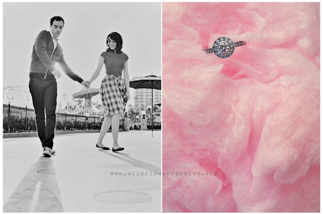
The Disney Wedding Blog is hosting a contest for the best Engagement photos and it just so happens one of my friends has made the cut! Please take a quick moment to jump over to the blog and vote for Colin and Crystal. The photos, shot by Wildflowers Photography are simply stunning.


VOTE NOW FOR THE CUTEST COUPLE BY CLICKING HERE!

World Showcase: Phase One Apparel Recap Map


CLICK MAP FOR DETAILED VIEW!


Mexico

Our journey comes to an end this week (or does it) with our final Designerland EPCOT World Showcase Apparel design....

Rising in a series of great steps above the World Showcase Promenade, a monumental pyramid beckons us to Mexico. (Its style reflects Mexico's ancient cultures.) Inside, we'll find an exhibit of pre-Columbian artworks as well as old emblems of contemporary Mexico.

Beyond, we enter the Plaza de Los Amigos in the midst of a moonlit Mexican village where street vendors with carts piled high with crafts add to the exciting atmosphere.

In the background, we can embark on a boat ride along "El Rio del Tiempo" - "The River of Time" - where we'll explore the heritage of Mexico's ancient, colonial, and contemporary eras. The tale is told by Audio-Animatronic singers and dancers, motion pictures and three-dimensional sets as our excursion boat glides along. We may even catch a glimpse of a nightly firework display.


Once again keeping consistent with the Retro '71 apparel brand, this week’s design incorporates Mexico's logo in a similar fashion as the previous shirts. The colors are inspired by the flag of Mexico. Finishing the design is some slight wear and tear with a textured finish.
 
I want to thank you for for accompanying me on this journey. Tune in next week as we begin looking at the wonderful typography of Main Street USA. Until next time, thanks for stopping by and have a great week.

Thursday, February 16, 2012

Sorcerers of the Magic Kingdom: Part 3

I knew I was jumping the gun when I decided to do the Designerland typography case study on the Sorcerers of the Magic Kingdom as I knew more fun fonts would appear...and that they did. Four more fonts have been discovered today, these all come from the new signage above the Firehouse on Main Street.


Mad props go out to the designer for manipulating the main display font. Well played good sir, or madame!

In the Wild

Allison sent me this picture from her most recent trip to Walt Disney World. Thanks for sending this my way and for sporting the ever popular tiki pineapple whip shirt.

Monday, February 13, 2012

In the Wild

The Crossman Family sent a new photo of them sporting their tiki pineapple whip shirts, this time the family photo comes from the Walt Disney World Resort. They're the first family to sport their shirts at both parks and send in photos for us here at Designerland. I want to send out a BIG thank you once again for being such a great support to me, my blog and my crazy designs/ideas. Thanks guys!

Concept Design

A special Sunday bonus for all my readers and followers...

While I love designing softlines and apparel my other passion when it comes to consumer products is social stationery. My first job out of college was working in the social stationery category as a product developer, line designer and licensing coordinator (I wore many hats). I worked on a daily basis with such fun companies like Disney Consumer Products, DreamWorks Animation, Sony Animation and Nickelodeon.

When I'm not dreaming up Retro '71 apparel designs I'm dreaming up other products such as social stationery that goes along with the brand. Here's a concept for a set of fine writing pens based on retro art and logos for one of our all time favorite attractions, the Haunted Mansion. While the designs are complete, I've not had time to work up the packaging, but I envision a coffin shaped, spring-hinged box with purple velvet lining. The coffin case would be black leather with the Mansions logo embossed, possibly with some Rolly Crump-esque Mansion flourishes.


So what do you think? Would you through down 40 bucks for this Haunted Mansion Frighteningly Fine Writing Pen set? Let me know in the comments section! I have another series based on another attraction but I'll save that for another time.

Sunday, February 12, 2012

Autopia, Grand Prix Raceway, Tomorrowland Indy Raceway, etc.

Welcome back to another Designerland typography case study. This week we will look at the fonts and typefaces used to brand Autopia, aka Grand Prix Raceway, aka Tomorrowland (Indy) Speedway, aka Grand Circuit Raceway. As you can see, this one attraction has gone through a series of names and rebranding, depending on which park you're visiting.

The original attraction, Autopia, was designed for Disneyland for opening day in 1955. The attraction allows guests to drive through an enclosed track in specially designed cars from  
legendary Imagineer, Bob Gurr. Each incarnation across the globe is stationed in Tomorrowland . . . except for Disneyland Paris, which features its version in Discoveryland. Over the years, the sponsors changed hands, and therefore so did the look, mostly in the signage and place-finding graphics.


When looking back at the signage and posters, Disney's designers stayed true to the branding for Tomorrowland with the classic modern sans serif typefaces. However, when the Walt Disney World Resort opened in the 70's, the designers also snuck in a few 70's futuristic and groovy display fonts. The classic typefaces and fonts stood the test of time until the early 90's when both Disneyland and Walt Disney Worlds' attractions received an update. Designers now used heavily-modified display fonts that incorporated both a futuristic feel as well as fonts that conveyed the feeling of high speed.  The branding of this attraction seems to be all over the place, from retro to classic, display to modern. This one attraction has seen almost every kind of font. 


Well that does it for this week’s case study. Tune in next week for another Retro ’71 shirt, which is the final installment of our Epcot World Showcase series. I look forward to seeing you soon and have a great week.

Saturday, February 11, 2012

In the Wild

Cory tweeted me this pic of himself enjoying a tasty pineapple float so I thought I'd share it with you all.  Thanks for shooting it my way and for the support. 


I still get about 5 emails a week in regards to if I'm ever going to do another run of the shirts...it's getting to the point that I might just consider it. ;)  I have ideas for some new shirts that would be able to buy come this spring. Stay tuned and see you tomorrow evening for a new Designerland Attraction Typography Case Study!!!!

Sunday, February 5, 2012

China


Welcome back to another edition of the Retro '71 Apparel Line. This week our Journey around the World Showcase almost comes to an end but before the adventure is complete we have two countries left to visit.  This week we'll be visiting China.

Look upon the splendor of the scene - an enchanted garden with bamboo, willows, lotus ponds, and meandering walkways set against a graceful backdrop of buildings with Oriental tiled roofs of blue, green and ochre, all framed by the great "Gate of the Golden Sun." We have arrived in China, ageless and enticing.

Let the "Hall of Prayer for Good Harvests" (modeled after the celebrated structure at the Temple of Heaven Park in Beijing) beckon us, for inside it, the 8th century poet-storyteller Li Bai magically appears on screen to guide us on a magnificent journey - Wonders of China. Here we'll see rare views of the dramatic landscapes, architecture, and culture of China, even a glimpse inside the "Forbidden City."

And be certain to find the "Street of Good Fortune," for along it, a calligrapher will be happy to show you how your name looks when it's written in Chinese.


Once again following suit, this week’s design incorporates China's logo in a similar fashion as the previous shirts. The colors are inspired by the Chinese flag . Finishing the design is some slight wear and tear with a textured finish, which ties it into the branding and overall vision of the Retro '71 apparel line. 

But wait there's more to this weeks post!!! After doing my research and being inspired by the clever brochure copy I decided to create a companion piece for China, very much like my Canada post. For my second shirt I designed a tongue-in-cheek concept based on the "Street of Good Fortune" found within China's pavilion. 


I incorporated some cliche elements into this shirt but feel that it stays true to the vintage Retro '71 apparel line.  

Well that does it for this week’s edition of the Retro '71 World Showcase shirts. Looking forward to seeing you back here next Sunday as we delve into another attraction typography case study from the Magic Kingdom. Thanks for stopping by and have a great week!

Saturday, February 4, 2012

New Look for a New Year

Thoughts? It took me some time to get Bookman Swash to work for me when designing the new logo. Overall I think it's a nice homage to the Magic Kingdom logo.