
This week’s Retro 71 concept is an homage to the dreamers and doers of the Disney Theme Parks: The Imagineers.
It has been my dream since I was 12 to become an Imagineer—I would make my parents take me to the bookstore so I could drool over the pages of the Architecture of Reassurance and Building a Dream. I've mentioned before how it's one of my goals to work for WDI. Back in 2005, I got my first taste of WDI when I was chosen as a finalist in the Walt Disney Imagineering ImagiNations Design Contest. Being a finalist and winner solidified the fact even more. I have tried really hard to get my foot in that door at 1401 as well as WDW's campus. No luck thus far, but one doesn't just give up on their dreams.

Most all Disney dorks know that the only place to score official WDI merch is at Mickey's of Glendale, and if you ever get the privilege to shop there, I suggest you have a hefty amount of spending money on your person. It's spectacular. I will add that Disney is missing out on a HUGE market by only selling WDI merchandise in this one store, but it makes complete sense. The store is designed for the employees, although D23 has opened it up to a select few fans in the area. I would love to find a small line of WDI/WED merchandise within the parks for which some of the Imagineers would design limited edition shirts. I know Imagineers create limited edition items for Mickey's of Glendale, so I have to ask, why not for the parks?!?!? It would create an entirely new segment within the park merchandise and I feel the category would be well received.
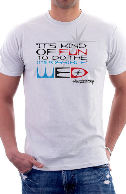
This week’s concept is a shirt design that I imagine would sell at a place like Mickey's of Glendale. The shirt is inspired by the vintage WED line from a few years back. I used one of my favorite Walt Disney Quotes on the front that really sums up what Disney and his Imagineers did and still do to this day. I then signed the quote with the original WED Imagineering logo. As you can see, the quote is set in the same typeface the WED logo was created in—what a brilliant typeface! The overall design is simplistic and crisp in a very 1950's/1960's fashion.
Well that does it for this week’s Retro 71 installation. I hope you've enjoyed it as much as I have. Until Friday, have a great week and see ya soon!