In this week’s case study we'll be looking at a wall. What's so special about a wall you ask? Well a wall at Disney Theme Parks is usually hiding something truly amazing behind it: a new attraction, a refurbishment or even a whole new extension of Fantasyland. WDI has realized as of late that they're wasting valuable market space with just blank construction walls when they could be promoting, enticing and even teasing guests with what's about to come to the theme parks. Their solution to this problem was to theme these walls with various graphics and signage to really get the guests excited about what's to come. In this case study we'll look at one wall in particular, the Storybook Circus wall that's currently up between Fantasyland and the old walk way to Mickey's Toontown Fair.
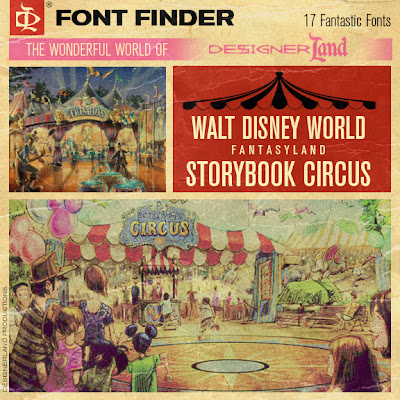
Before we talk type, let's talk about inspiration. It seems I may have tracked down WDI's reference photo for the Storybook Circus wall. In comparing the photo with the Storybook Circus wall, I can find 13 similarities between the two, which leads me to suspect that the wall’s designer looked to this very photo for inspiration. Do you see the similarities?

We all know that I enjoy a good Slab Serif font, so when I saw this wall's teaser "billing" art I got excited. The overall graphic has a disjointed look: predominately type-oriented sections are broken up by large illustrated concept art. It’s my theory that the illustrated portions were done in Glendale and the typography portions were done by WDI in Orlando. Why do I think this? When studying type, there's a BIG difference between Glendale's campus and Orlando's WDI campus. As of late, it appears WDI Glendale has been using free fonts from such sites as dafont.com and abstractfonts.com, whereas WDI Orlando tends to use professional, commercial fonts for their signage. The sections of the wall that are mainly type-heavy use a variety of classifications: Slab Serifs, Western, Tuscan, and Woodblock. These same classifications can be seen in Frontierland, which is fitting because they all have a Wild West look to them. Traveling circuses were extremely popular in the late 1800's and early 1900's—the same time period from which many of these “Western” typefaces originated. As for supporting my theory, it just so happens that all of the fonts featured on the Storybook Circus wall can be found in the Western section of the type foundry from which WDI purchased most of their commercial fonts.
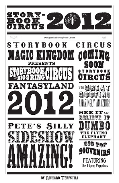
In comparing the type with other vintage circus posters from the time period as well as the reference photo, the designer(s) paid a great deal of attention to detail. I hope that WDI continues the theme of a late-1800s-to-early-1900s traveling circus with the signage in this extension of Fantasyland. I'm excited to see what typographical wonders show up when this new section finally opens. Well that about does it for this week's case study. Tune in on Monday for an all new Retro 71 concept. As always, thanks for visiting and I hope to see you back real soon!