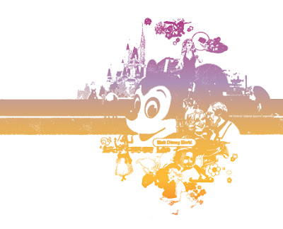
This week’s Retro 71 shirt design is based on 1980's Walt Disney World Resort branding. This branding was used mainly on gift store boxes and bags within the Magic Kingdom.
At a certain point in time it was a Terpstra tradition to search the shops of Main Street U.S.A. to find the perfect souvenir for my grandmother. As I recall, my mother had one particular shop she enjoyed, the name of which eludes me. I never shopped with my mother when I was little – I would probably have been found across the street with my dad in the Magic Shop. But each year it seems my mom would purchase these delicately hand-painted Italian porcelain flowers for my grandmother. These object d'art sit in my grandma’s formal living room to this day with WDW price tags still fixed to the bottom.
At a certain point in time it was a Terpstra tradition to search the shops of Main Street U.S.A. to find the perfect souvenir for my grandmother. As I recall, my mother had one particular shop she enjoyed, the name of which eludes me. I never shopped with my mother when I was little – I would probably have been found across the street with my dad in the Magic Shop. But each year it seems my mom would purchase these delicately hand-painted Italian porcelain flowers for my grandmother. These object d'art sit in my grandma’s formal living room to this day with WDW price tags still fixed to the bottom.

It wasn't until I was older and rummaging around my grandma's closets that I came across the package that one of those flowers came in. I remember picking up the box in amazement – not only did it bring back memories of those early trips to the kingdom, but now, as a student with an interest in design, the pattern blew me away! The color palette was shocking and vibrant with its bright yellows, pepto-bismol pinks, warm oranges and cool purples. The design was vacation-driven with images of what all Walt Disney World Resort had to offer; a hula dancer from the Polynesian Village, the majestic tower of the Contemporary Resort, Cinderella’s Castle, a Space Mountain vehicle rocketing through the air, the iconic architecture details of one the shops from Lake Buena Vista Village, Dumbo taking flight, the Monorail, and of course Mickey Mouse.

The layout and composition of the collage makes me think of all my past vacations – small venues of magic and happiness.
